Comic Biblical Book-Endings (Or Lack Thereof)

"Amazing Tales of the Bible: Noah's Ark" by Zachary Kanin in The New Yorker Nov 1, 2010: The Cartoon Issue; pgs. 84-87 (Viewable, with digital subscription, here.)

Humor and imagination can get you a long way.

I've always loved The New Yorker, both for its prose and its cartoons and, increasingly now, comics. They both have the ability to tickle your funny bone and wrinkle your brain. And Zachary Kanin is among the new talents to draft and draw in the footsteps of Peter Arno and Charles Addams as a New Yorker cartoonist.

It seems that since R. Crumb can make a comics adaptation of the book of "Genesis" and get pages of it published in The New Yorker so can any sequential artist. The New Yorker released the first preview the public ever saw of Crumb's "Book of Genesis" project in their June 8th issue of last year: the Summer Fiction issue. (Truthfully, I suspect that it was because of Crumb's successful adaptation of Biblical material that this new work even exists. "If it worked once...!")

Furthermore, comics adaptations of the Bible are hardly a new concept: "The Picture Bible", everything on this site, the SISTINE CHAPEL CEILING. That list goes on forever. That is surely why the title includes "Amazing Tales of the Bible", as an in-joke about the existence of so many crude Bible comics out there.

All that said, Zachary Kanin's short and jocular adaptation of the story of Noah and the flood is far from bad. It's light and fun material and any fan of either Bill Cosby's or Eddie Izzard's hilarious stand-up bits recounting the story of Noah will find much to enjoy here. Kanin packs a lot of great stuff into four pages. Stuff like the two panels in which Noah is revealed to be a nose picker and the narrator declares "Well, not totally righteous" followed immediately by a panel where God says: "But good enough!" The effect is a bit of humanizing while poking fun at a Biblical figure.

The best moment is unquestionably the 'cut-away' image allowing us a peek into the ark, jam-packed with pairs of animals, all squished up against each other. Cartoon reality: bones of all kinds are flexible and pliable in all directions!

Why the damn comic ends with its worst moment I'm sure I will never know, because I'm sure Kanin doesn't know: The story takes a left turn and Noah meets another strange speedo-wearing (hispanic?) vassal of god on the high seas who asks Noah if he wants another wife, because on this other ark there's a surplus. Noah doesn't answer. Then I turned the page... and discovered there was no more to the comic. (Nonsensical and sexist?)

The art is simple cartooning, to its benefit, with subtle grey washes. The simple alterations in the lines of Noah's face giving us a look of determination as he decides if he is to get all his mating pairs he MUST PUNCH OUT A RHINO is a deft use of the tools in the cartooning toolbox. The first panel on the fourth page where Noah's eyes are so large as to be out of proportion to the rest of his face... not so much.

THE LONG AND SHORTBOX OF IT?
"Amazing Tales of the Bible: Noah's Ark" is hilarious with hit or miss art.

The problem is that, like a lot of New Yorker cartoonists, Kanin just doesn't seem to care about giving his work an ending. He leaves without finishing. It's a problem seen literally a few pages previous with the only other comic in this Cartoon Issue: "Self Effacing Man" by Alex Gregory. It, too, has no ending, but it is a vignette. A short series of three thematically related moments in time. "Noah's Ark" is a series of gags and that's totally fine, but it lacks a final punchline.

A good comic, like any work of narrative art, should have a beginning, a middle and


~ @JonGorga

See what I mean?

Marvel Day-And-Dates The Ultimate "Death of Spider-Man"

What does THAT mean? Just that Marvel Comics announced plans this morning for a further flirtation with simultaneous digital and paper release of a comic-book at the same paper cost ($3.99) and this time with all the issues in a short but high-profile crossover 'event': namely the "Death of Spider-Man" from their Ultimate Comics imprint.

Those easily alarmed take NOTE: The Peter Parker in "Ultimate Comics Spider-Man" isn't the same Peter Parker in "the Amazing Spider-Man". "Twice the Spider-Man!" said the marketing people in the year 2ooo and we've had two separate ongoing universes ever since.

And in the words of those marketing people: "Marvel is proud to announce that every issue of the hotly-anticipated DEATH OF SPIDER-MAN will be available day & date on the Marvel Comics app, available via iTunes for the iPad, iPhone & iPod touch."

CBR.com's article by Kiel Phegley reprinted that press release with a few comments from the main writer of the upcoming story, Brian Michael Bendis, and the interesting comment: "the issues mark the first event comics – a driving force in comics retail for the past decade – to be offered day-and-date online, though Marvel has been experimenting with high profile releases in this format including the recent 'Invincible Iron Man' Annual and the 'Ultimate Thor' mini series."

The first issues in the "Death of Spider-Man" story are to release in comics retail stores and on the iPad, in February of 2o11.

[via ComicBookResources.com]

And what of those comics retailers? Should they be worried? The crossover 'event' has meant big bucks for them for a long time. I've written on this very site about how much better suited the crossover is to digital simply because it the eliminates the: "Damn! I won't know how this story ends without reading a DIFFERENT comic-book? What the HELL!?" Press a button, problem solved much faster. Or could this prove one of the failings of digital comics? No ACTUAL HUMAN BEING to point to a comic-book and say: "Oh, I've already flipped through that, if you want the whole story you'll have to read THIS first."

However, whether or not "Death of Spider-Man" is a crossover 'event' at all is questionable to me because one of their defining characteristics is the multiplicity of inter-locking comic-book series. Not just one or two. I think one character (or set of characters) appearing in another's book is a guest appearance, two sets of characters appearing in the other's books for one story is a crossover, but a crossover 'event' requires a wider net. Those definitions are far from all-encompassing, I know, but are worth mulling over if for no other reason than nobody else seems to! Why has Phegley specified that "Death of Spider-Man" is an "event" not a "crossover event"? What does he mean when referring to other comics as "high profile" as opposed to "events"?

Is the entire family of terms: crossover, event, and crossover 'event', just marketing hype pure and simple? Perhaps this is all best left to the comics historians of the next generation to worry about, because by just about any definitions you can't call it a crossover 'event' until it's over and done. We will all have to wait and see.

~@JonGorga

P.S. ~ Josh and I have a little plan in the works to probe the nature of digital day-and-date releases in a series of reviews in the coming year!

An Opportunity I'm Not Library To Pass Up

I don't like winter break very much. It's not that I don't like the time off (I do), and it's not like I don't like my family (I love them, that's why I come home), there just isn't very much to do in Chicago's north suburbs in late December and early January. Rather than find things to occupy me, then, I have often to make them.

Luckily, my local library has a pretty sweet graphic novel and collected comics collection. It's growing, too: when I started checking books out as a freshmen in high school, the whole shebang occupied maybe four bookshelves. Today, when I walked into the library for the first time in probably about a year, it took up four whole bookcases.

Clearly, someone at the Highland Park public library likes me very much.

I always use the opportunity of being home to read some stuff I wouldn't have read otherwise; things that just aren't my speed enough to buy, or things that are just too big, unwieldy or expensive for me to consider purchasing on a normal occasion. This vacation, I've chosen three things to read, all of which encompass both categories of comics I borrow from the library.

The first, Fantagraphics' complete collection of Gilbert Hernandez's Palomar, is my introduction to Los Bros Hernandez. That I've read nothing of their work means that I have a pretty big hole in my comics knowledge, and I hope the experience of this tale, which originally ran in the Bros' Love and Rockets anthology, is as fantastic as everyone says it is. The HPPL also has Luba, Locas I and Locas II, so it's possible I'll also get to at least one of those before the break is over.

The second, Top Shelf's collection of Eddie Campbell's Alec comics, entitled The Years Have Pants, is something I've thought about buying a couple times, on the strength of recommendations alone. It's a huge, beautiful, book- I hope I enjoy reading it as much as I enjoy looking at it.

The last maxi-sized comic currently on loan to me is Brian Wood and Ryan Kelly's Local, which looks about as perfect a comic for me as there ever was. If Wood's Demo proved anything, it's that he writes a great short comics story and this collection of twelve interconnected ones, about a girl who sets out from Portland, Oregon and just travels around the country, looks perfect. And pretty.

I'm hoping to review each of them; I'm curious how their massive size and quality paper changes the experience of reading comics. I'll let you know how it goes.

The Memory's Telling of the Journey is the Worthier Part

"Serenity: The Shepherd's Tale" from Dark Horse Comics

If you are at all a fan of Joss Whedon's ongoing sci-fi story: TV's "Firefly" and its feature film sequel "Serenity", you have been waiting for this comic even if you didn't know it, because you've been waiting for this story for a long time. And it does not disappoint. If you're not familiar with Joss Whedon's 'verse this may very well be the place to start.

Chris Samnee's art is wonderful. Clean-lined and smooth, alive and full of delightful human imperfection. His work retains that feeling of being hand-made (what the art historians call gestural artwork) and the result is great cartooning. But somehow his stuff is also realistic enough that it holds some weight. His people look like their bodies are moving over real terrain and through real air. Samnee (@ChrisSamnee) is one of those fantastically rare visual artists who is perfect for comics: smartly cartoony and fluid with strong recognizable shapes that build volume and give a realitic feel to the entire product.

There really are just a handful of them alive and working in the American comics industy at any given time: Dean Haspiel and Erik Larsen are the only other two that come to my mind.

Samnee's art is never a weak link in making visual narrative art. He was unknown to me when I first saw his name attached to this project, but after I saw the preview images [like the one above] and his work on Marvel's "Thor: The Mighty Avenger" series I had no fear about his art doing justice to the brilliant work of Joss Whedon and the original cast of the TV show that started the franchise in 2oo2.

Just look at the sketches from his blog, taking the actor's face and extrapolating the character's younger self(ves). How cool is that?
Now that I sufficiently sound like I'm obsessed with Chris Samnee and you think he's paying The Long and the Shortbox Of It money for these positive reviews both Josh and I have given him now... let's move on to the story.

To clearly depict a character's emotional journey is a tough act in any narrative art medium. To do so with a character who was already well-established and defined in a completely different art medium by a writer, actor, costumers, and cinematographers? And to then do it IN REVERSE?

That's remarkable.

Just as Samnee had to reverse engineer Ron Glass' face in the character of Shepherd Derrial Book, so too did Zack Whedon (@ZDubDub) find himself challenged with crafting a single linear story (a backwards linear story) that presents us his brother's notes on the character's life-story at all different stages from childhood to the middle-aged man we met in the show's first episode when he said: not the destination, but "how you get there is the worthier part." All this material was probably intended to be revealed bit by bit over two seasons of television. Remarkably, the resulting story is smart, unnerving, and emotional. Especially on the re-read.

THE LONG AND SHORTBOX OF IT?
"The Shepherd's Tale" is an exceptionally well-written and well-drawn character biography in reverse. Buy it. Read it. Read it again.

If you've been wondering about whether these Serenity comics from Dark Horse are worth your time, this is one you should have no doubt about. If you were a fan of Joss Whedon's original TV series or the movie sequel you should not hesitate to buy and read this graphic novella. Even if you've never heard of the stuff, you can find something you will love here.

Go get one at your local comic shop! And try to enjoy your trip there because life is wonderful but will be over all too quickly and "how you get there is the worthier part"!

~ @JonGorga

The Secret Is Out

Secret Avengers is a pretty damn good comic book.

I was pretty sure it was going to be, with Brubaker writing it and all, but still, months ago, I was worried: what if it isn't any good? What if Brubaker can't write a team book? And isn't Mike Deodato's work a little stiff?

And, at the beginning, some of those fears were justified. Brubaker's writing was a little slow, at the start, and it just felt like he was being weird for the sake of being weird. Awesome weird, but still- it didn't really seem to have much of a point.

By the end of that first arc, though, Brubaker really hit his stride. By the time he hit the second arc, after an interlude drawn by David Aja and Michael Lark, he was really hitting it out of the park: now that he's playing with Shang-Chi and the Prince of Orphans, things seem really fluid and each piece fits together perfectly. Fluidity, too, is not something I was expecting from Mike Deodato Jr. and, while I guess "fluid" is probably the wrong word, there's a certain energy in his art. I can't place my finger on its source, precisely, and it doesn't help that his figures still look like, well, action figures. Action figures articulate, though, and you can look at them from all sorts of angles, which is precisely what Deodato does. The art here is good. Really good. The stiff look isn't usually my thing, but it's impossible not to appreciate the work and not only because he's clearly good (maybe even the best at this sort of style). Mostly it's because he's just so damn good at presenting it, with panels and page layout that are fluid and dynamic in a way that his pencils aren't. The way we look at it moves, even if what we're looking at doesn't and that's just utterly brilliant.

This aspect of Deodato's work is front and center in Secret Avengers #8, the third part of a five part story centering around the return of Shang-Chi's father, a character who can't be named for copyright reasons, but who I'm more than happy to tell is Victorian villain Fu Manchu. Brubaker finds plenty of clever ways around that particular obstacle, just like he does some pretty cool stuff with what is essentially a book-long fight scene. It goes maybe a mite too fast for my liking, and I'm concerned that he's used Sharon Carter as a damsel in distress two storylines in a row, but everything else seems spot on. He knows his characters, and not a word seems out of place or out of character. If he keeps writing the book like this, and Deodato keeps drawing and designing the hell out of it, I'm all in.
----------------------------------------------------

Also, here's to hoping Brubaker keeps Prince of Orphans around. He's a fantastic character, one of my favorite minor ones, and he's been in stasis too long. Would it be too much to ask for a mini-series or something?

Quote of the Week 12/24/10

The war was much on my mind in those days, and it was almost entirely the one being fought on movie screens and in the pulp pages of "funny books," known as comic books in other parts of the country. Both names were misleading for the kind I liked, the ones featuring costumed vigilantes who made violent swoops on spy rings and gang hideouts, with no Miranda palaver. Along with Superman and Batman, there were many others, now largely forgotten, such as Bulletman, Plastic Man, The Sandman, Doll Man (a fighting homunculus about six inches tall, in a red cape), The Human Torch, Daredevil, Blue Beetle, Captain Marvel, Captain Midnight, and Captain America. Under any name the books were quite a bargain early on, at sixty-four pages in color for a dime. Or a kind of color. The palette was limited; Superman had blue hair. I never tired of the repetitive stories or the familiar scenes that were enacted over and over again.
Charles Portis, author of True Grit, for The Atlantic in 1999.

(As an aside, the Coen Brothers True Grit came out on Wednesday and it's pretty good. Not great, much better for Jeff Bridges' acting as Rooster Cogburn, but still very good. Worth going to see, anyway, even if it won't rock your world or anything.)

Portis, probably without realizing it, has articulated precisely the problem with the Modern Age of comics. Comics readers, on the whole, never tire of those familiar scenes, the ones enacted over and over again. In fact, far from tiring of them, comics readers on the whole beg to see the same scenes reenacted repeatedly, and continuously.

Actually, I'm wrong. This is the behavior of comics fans.

I think I've mentioned before that I am ill content with the label of "fan." One of my professors never fails to remind us that "fan" is short for "fanatic," and, as much as I sometimes bristle at his insistence, he's right. I'm not a Captain America fanatic, nor an Iron Fist fanatic, nor even a comics fanatic. I like these things. It may be that I even love these things, but I am not fanatical about these things. There are no characters or stories that I love so much that they are sacrosanct, no notions, no costumes, no thing about comics that is so important to me that I would prefer to preserve it than to see it change for the sake of a good story.

There is nothing wrong with that way of looking at things. In point of fact, most readers of mainstream comics are "fans" and far be it from me to tell them that they're doing it wrong: it's just not the way that I want to do it. I would much rather see writers and artists do what they do well than see Captain America live forever.

Heed the warning that Planetary left us with a little over a year ago: there are so many places to go. Rather than keep re-reading the past, why don't we ride right on into the future?

Here's to what's interesting, ladies and gentlemen, here's to what's new.

Have a merry Christmas and a happy new year.

Only in a World of Sequential Art

24 frames-a-second? No, I prefer thinking in panels-per-page myself. More flexible.

Poetry or Prose? No, I can choose between romantic or constructivist, photo-realistic or cartoony, impressionist or classical as I build my story (or afterward). More variety that way.
"I really think comics are more fun when they play to their strengths, and do the things that movies can’t do, and go to places in the imagination where movies can’t go. Let’s take up the type of storytelling that movies daren’t do, you know? Why are we conforming to Hollywood storytelling styles and losing sales when we can do anything? ... Comics begin with a guy, with a pencil and an imagination, or a guy at his word processor, and after that anything can happen. And so rarely does."
~ Grant Morrison interview in Comic Foundry, final issue, Spring 2oo9 (& readable here)
Comics are not 'movies on paper'. Nor are comics 'visual literature'. Those statements aren't strictly speaking wrong, they are close to the truth-- a version of it. But comics are something else entirely and to limit them by what other media can't do is... just limiting.

Josh's recent post about investigating form and a recent conversation with comicsmith Jason Little at the Brooklyn Comics and Graphics Festival has got my brain flowing with old academic thoughts. "More academic than usual," I hear the multitudes scream? Yes, more academic than usual.

Can you imagine the distinct world of the comics medium?

the opening pages of the Luna Brothers' "Girls" #1
Image: A young man in the throws of orgasmic physical pleasure. Image: A young woman lays with her clothes in disarray. What just happened? Not what you think.
The magic of comics is in the 'sequential' part of sequential art. Two images in sequence create a moment of time, but a moment made up of two frozen images can create particular illusions other mediums can't. A momentary trick that makes the status of the Lunas' main character painfully obvious. The second panel is a close-up. He holds a pornographic magazine and not a woman's love, as he wishes he did.

the faux-prose at the end of "Watchmen" #1-11 and "Superman: Earth One" and probably thousands of places
Whenever a comic visually displays something with text in the fictional world in such a way that it can be read as if it were actually prose, something unique has happened. A film that zooms in so close that the viewer can read some text on the screen would be awkward and slow the film's pace to horrible effect. (It was common in the 1940s, sure, but it was awkward.)

In a comic, the reader can stop to read the text as if it were prose, give it a quick scan, or choose not to read it at all and simply accept it as another two-dimensional prop existing in the world of the comic (at peril of missing out on part of the story, of course).

the typewriter sound effects in Jason Lutes' "Berlin" #3
The "tak" "takketa" "takka" sounds coming from Kurt Severing's typewriter transform suddenly into snippets of words being pounded out by the writers across the street, at least in Severing's imagination. All in typewriter font.

Environmental onomonopeia becomes a representation of a character's perception of the world in the very image of the environmental element's effects on paper! Or something like that. Either way, it's beautiful. Almost as beautiful as the moment where musical notes in the air become birds in flight.

the entirety of Jason Little's "Jack's Luck Runs Out"
The WHOLE THING is drawn in an imitation of the classic playing-card illustration style, everything from the characters and their props in the foreground to the environment of Las Vegas in the background.


The same stiff poses, the same blank stares from your game of 52 pick-up, but now in the service of a disturbing narrative about vacuous gamblers, show girls, con-men and the spiteful things they do.

the 'thought balloon-storm cloud' in Brendan Leach's "Pterodactyl Hunters in the Gilded City"
As a young man walks the streets of New York City circa 1904 turning over and over in his mind the current events of his life (like we all do) snippets of the last conversation he took part in dance around his head, mixed up like a tiny abstract poem surrounded by rough, uneven, random lines.


Comics can use any visual art styles or tools, any design elements, any written languages, and any typographic fonts the creator chooses! These examples I've given are only a fraction of the tricks and experiments out there that could only have been done in a comic.

Can you imagine the world of sequential art? A world where time exists frozen forever in snap shots, yet feels animated in sequence? A world where text can be read like prose, but the story can be told in bold visuals like film? A world that moves without motion and speaks without sound.

I can, and it is so damn beautiful.

~ @JonGorga

Quote of the Week 12/16/10


"The characters were not Kirby characters- he famously grumbled about getting the Losers assignment, as he told stories about winners- and in most of the stories our heroes are barely distinguishable from each other: Captain Storm is more monocular, Gunner is younger, Sarge is tougher and Johnny Cloud is, well, marginally more Navajo.

But it doesn't matter. They became four everymen, standing in for all of us. And it's rarely about them."

-Neil Gaiman, from his introduction to the Jack Kirby Losers omnibus.

Towards An Understanding of the Form

For a little over a year now, Jon, Clare and myself have been working on this blog, what we've come to call The Long and Shortbox Of It. For me, the site was born out of a crappy summer and the need to do something with myself, to think and to write.

That summer is long past, and the ennui and sorrow that made it so miserable have passed with it, but the need, and the blog, remains. I'm proud of what we three have built here, and I'm glad to say that now, a year and some change in, we have a small but growing dedicated readership, and a place within the online comics community. We have forged something great.

But for most of the past few months, I have been absent. I've been gone for a whole myriad of reasons, none of them particularly interesting or important, but now, I think, I'm ready to return to regular updates. With me, I bring not only a new energy, a new fire to think about comics, but also a manifesto- I am looking towards an understanding of comics as a form.

Those of you who have had the misfortune of sitting through one of my talks at comics studies conferences are well aware that, intellectually, I've become obsessed with form, with style and function. This has mostly manifested itself so far as an interest in how collecting comics changes them, and I think I may have finally hit on something interesting and important, something that says something about the way we understand comic books. It will have to wait until my next presentation or paper but, suffice it to say, I think it will be big.

With that in mind, though, if we zoom out of my own personal interests for a moment, we can see that, in the bigger picture, the form is standing at a crossroads. What it is, precisely, that we want out of the way our comics are presented is a much more important question now than it ever has been before, with the proliferation of digital comics in particular. From here on out, then, most of my work here is going to focus on the questions that such changes raise. Look for posts on reading comics on the iPad. Look for a series about the difference between the original run of Casanova and its rerelease. Most importantly, though, look for these posts to exist as part of a conversation with the form, with the content, with the quality of the work. These issues don't exist in a vacuum, they exist as a larger series of questions, questions that I want to use this space to explore.

I hope you guys don't mind if I take you along for the ride.

Excelsior!

Hard Truths in Smooth Drawings

Since 1990, the Kentler International Drawing Space has showcased "important... work on paper" in their small gallery. The current exhibition, up until just this Sunday December 12th (yes, that's TOMORROW!), celebrates Vertigo's recent release: "Cuba: My Revolution", a graphic novel drawn by Dean Haspiel that recounts the harrowing, but ultimately triumphant, story of the writer, and Haspiel's friend, visual artist Inverna Lockpez. "Cuba: My Revolution" details her indoctrination to, faithful service in, and eventual escape from communist Cuba. Her path brought her torture and loss before finally bringing her to freedom.

On display at the Kentler is Haspiel's early character sketches, and the original page layouts and final pre-production art for a handful of pages from the graphic novel as well as the 1960s pencil work of Inverna Lockpez herself. Her drawings from the period are featured as a part of the comic's narrative and are used to mark each chapter's beginning. A small pamphlet with an essay accompanying the exhibit written by PW Beat's Calvin Reid is only available at the gallery. The space isn't used as well as I might imagine, but the works themselves and the way they are organized makes the trip well-worth it. Haspiel's work reminds me of Steve Rude's: a delicate touch with pencil but a strong smooth hand with ink. Pretty much the whole artistic package. Or at least what I think of as the whole package: A mastery of both of the two tools most utilized to make comics. Seeing Haspiel's strong line in person is a TRIP. Even better is seeing the progression from sketched outline to finished comics page right in front of your eyes. And to see Lockpez's striking abstract drawings that are only here thanks to a network of secret art saviors who rescued some of the work confiscated by Fidel's regime is no laughing matter either. Her images remind me of the graphic style of one comics art giant of the 1960s and 1970s, Jack Kirby. The exhibit is small and a quick walk-through is more than enough, leaving you with a hunger to read the graphic novel itself and learn about one of the saddest political crises of the Cold War era.

Again, this exhibit is only going to stay open tomorrow, Sunday, between 12 noon and 5 PM. The Kentler International Drawing Space sits at 353 Van Brunt St in the Red Hook neighborhood of Brooklyn, NY and admission is free to all.

If you're in NYC, do yourself the favor and check it out.

~ @JonGorga

Building a Better Universe: On Marvel's Architects Intitiative


Yesterday, Marvel released the following press release, detailing their new Architects initiative:

The very fabric of the Marvel Universe is changing and the Architects are the ones leading the charge! Marvel’s Architects initiative spotlights the writers and artists telling the most exciting and impactful stories that rock the Marvel Universe to its very core every month.

But just who are the writers in Marvel’s Architects?

·Brian Michael Bendis, writer of AVENGERS, NEW AVENGERS, Death of Spider-Man, the upcoming MOON KNIGHT and an upcoming top secret project

·Matt Fraction, writer of THOR, INVINCIBLE IRON MAN, and a top secret upcoming event

·Ed Brubaker, writer of CAPTAIN AMERICA, SECRET AVENGERS and top secret upcoming new series

·Jonathan Hickman, writer of FANTASTIC FOUR, S.H.I.E.L.D. and a top secret upcoming new series

·Jason Aaron, writer of WOLVERINE, ASTONISHING SPIDER-MAN & WOLVERINE and a top secret upcoming new series

“These are five of the top writers in comics and they’re writing some of the best Marvel comics ever” said C.B. Cebulski, SVP Creator & Content Development. “Each of their projects lays the groundwork for the future of the Marvel Universe and in 2011, their plans—which are being seeded in their current work as we speak—will come to fruition. There’s never been a better time to be a Marvel fan.”

Stay tuned to Marvel.com for more news on Marvel’s Architects, including interviews and the unveiling of the artists redefining the Marvel Universe!

Jason Wood, over at iFanboy, believes that press releases like this send the wrong message (he, by the way, makes a couple of very good points), I'm more interested in a couple of the other hints that they seem to be dropping:

The absence of Uncanny X-Men under the titles that Fraction writes is curious, since he's been the lead on that since the summer of 2008- almost as long as he's been writing Invincible Iron Man. Does this mean that recently announced co-writer Kieron Gillen (whom, you will remember, is one of the few writers I adore as much as I adore Fraction and who's series S.W.O.R.D was canceled far too soon earlier this year) will be the new director of the X-Verse? Fraction's run on the title has been hit and miss, but I suspect that has more to do with the artists he's paired with more than anything else. Is he jumping ship? Or at least stepping back to focus on whatever this top secret event is?

Speaking of top secret, each of these writers is writing a "top secret" something or other. So, that's news, I guess. My one big hope is that Brubaker's unannounced project is a Steve Rogers: Super Soldier ongoing- that was some of the best comics all year, and it let Ed do some straight up espionage comics, which was fun to see.
Most interestingly, though, is the inclusion of Jason Aaron on this list- every other writer is involved with a major aspect of the Marvel universe, but Aaron's big title right now is Wolverine, which I've heard is very good but usually seems to exist in its own space: finding out what his big upcoming project is going to be is extremely exciting, if for no other reason than it suggests that its going to be huge. The little work of Aaron's that I've read (Scalped and a few issues of PunisherMax before I just couldn't handle the violence of that comic any more) was fantastic, and I'm having trouble containing my curiosity.

May We All Never Forget Where We Came From

My father, Carmine Gorga, turns 75 years old today.

First of all: That's amazing.

My father has somehow survived three-quarters of a century (mostly in the horrifying Twentieth Century no less): through the tail end of the Great Depression, World War II, the proliferation of nuclear weaponry, and the M.A.D.ness of the Cold War. After all that I have no doubt that the 9/11 terrorist attacks seemed rather tame. 'Someone else may or may not be trying to kill me and my family? Well, at least it's not the Nazi troops AND the American army AND Mussolini's government at the same time like it was when I was eight-years-old.'

He came to America, paid the bills, found love with an American girl and built a life with her, got married, had a kid, raised his foolish son somehow, and successfully centered his life around a noble cause: economic justice for all.

You know who else turned 75 this year? DC Comics. The company was formed in 1934, but the first comic they published "New Fun" #1 came out in 1935, the same year my dad was born.

Wow, right?

There was yet no Superman. When my dad was born, the superhero genre didn't exist. Comic-books barely existed. Comics were really only in the newspaper (both in America and in Italy) and in other sequential art forms they've always existed as: church ceilings, for example.

The Sistine Chapel ceiling looks pretty sequential to me.

My father's people had comics when most didn't because of things like Michelangelo's Sistine Chapel ceiling and the multiple-walled story-frescos of Giotto. As Paul Levitz is fond of saying: "Comic-book writers and artists are doing the same thing that story-tellers did drawing pictures on the caves at Lascaux, we're using story to create context for life."

The sequential story art commissioned by powerful people for the internal walls of Catholic churches are essentially huge, complicated comic-strips, make no mistake.

[Images from Wikipedia's "Sistine Chapel ceiling" entry.]

Both Josh and I have been shocked at the low-number of people who turn out to show appreciation to the older comics creators and have said so publicly on this blog and elsewhere. Inspired men who worked in bad conditions for little pay and worked their backs and hands and eyes and brains and don't get the respect they deserve.

People like Superman's creators: Jerry Siegel and Joe Shuster. Jack Kirby. Harvey Kurtzman. Bill Everett. Wally Wood. Al Williamson, Dick Giordano, Mike Esposito, and Harvey Pekar (all four gone this year). People both passed but, especially, those still with us.

People like Joe Simon. Co-creator of Spider-Man: Steve Ditko. John Romita, Sr. Marie Severin. Her brother, John Severin. Murphy Anderson. Gene Colan. Jack Davis. Joe Kubert. Mort Walker. Jim Steranko. Al Feldstein. Trina Robbins. Roy Thomas. Jean 'Moebius' Giraud. Al Jaffee. Kazuo Koike. Ramona Fradon. Albert Uderzo. The creator of the Joker, Alfred, and half of what makes Batman a great character: Jerry Robinson. Russ Heath. Jules Feiffer. And Carmine Infantino.

All those comics creators are just at, or over, three-quarters of a century old and still alive and capable of taking your admiration and appreciation. The Eisner Award Hall of Fame is great, but you should not pass-up a chance to speak with these people, shake their hand, tell them that something they made meant something to you. And the corporations still making money off the fruits of the genius of these ladies and gentlemen could do a little better by them, and their legacies as well.

My point is simple: Respect your elders. They have memories you never will. And hopefully, they've put them to good use.

Happy birthday, Dad.

I love you and I'm lucky to have you in my life.

~ @JonGorga

Festive Curated Conventioneering

I love 'comic-cons'. From stories of Phil Seuling's New York Comic Art Conventions of the 1970s to the current annual monster known as San Diego Comic-Con or attending the wonderful annual Museum of Comic and Cartoon Art Festival in Manhattan, events to celebrate the comics medium have, and still do, vary in surprising ways. Gail Simone (@GailSimone) just wrote on Twitter about a new convention in LA specifically to celebrate LGBT comics creators and fans called Bent-Con[be warned, some stuff on their site is sexually explicit].

At the Brooklyn Comics and Graphics Festival!The concept of the comics convention is evolving into some interesting avenues, and a new example of what it can be was put-up for the public this past weekend: The Brooklyn Comics and Graphics Festival. Entirely supported by Brooklyn, NY comics shop Desert Island Comics and publisher PictureBox, who together sent out requests for participation only to the creators, collectives, and publishers whose work they most enjoy. This allowed the event to be small, curated, and best of all FREE for all to attend since no fee was exacted from the exhibitors or artists to hold a table!

Why? In the words of the organizers themselves:
"It’s good to try new approaches to old models! We like this approach better than your standard free-for-all, and it makes a better experience for the random spectator, which is good for comics in general. It’s less like a typical small-press fair and more like an art fair or edited comic anthology. It’s frankly an expression of our own interests, which is intended as a positive contribution to the larger comic and art world." (from the festival website)
But if the Brooklyn Comics and Graphics Festival is an experiment, it appears to be a highly successful one as this is the event's second year and everyone I communicated with had a great time. That's, both, on the exhibitor floor and on Facebook and Twitter after the fact.

One of the many pleasant shocks of the Brooklyn Comics and Graphics Festival for me was the discovery that the Jack Kirby Museum offers, as a reward for membership sign-up, a mini-comic version of the singular example of the famous Jack Kirby making comics without editorial interference: "Street Code". It's about Jack growing up in New York City in the 1920s and it had never before been printed as a stand-alone comic. This is the guy who co-created characters like The Hulk, Captain America, and Darkseid bringing his fantastic design sense to the gang violence within, and the architecture of, the ghettos he grew-up in.

This is the museum's Rand Hoppe holding the comic in question:
Rand Hoppe of the Jack Kirby Museum holding a very important comic: "Street Code"!

I also saw the excellent comicsmith Jason Little (@beecomix) [who's in the above photo to the right] and spoke with him about publishing in print after publishing on the web, and bought his brand new mini-comic "Gimmick Illustrated" #1! And I saw and bought comics from the fine folk of Sparkplug Comic Books and the people who work together on the Sundays Anthology.

Bill Kartalopoulos (@bkny) ran SIX creator discussion panels from about 1 PM till just 40 minutes before the show's close at 9 PM. All the panels were held in the basement in which was built an impromptu stage and a screen with a small projector.

One of them was an introduction (for me) to the work of comicsmith Anders Nilsen. Guy creates some smart comics. He recently released "Big Questions" #15. (Nilsen maintains a website here.) This is Bill and Anders talking while the screen displays a page from a previous issue of "Big Questions":
Folk listening to Bill Kartalopoulos ask questions of Anders Nilsen (comicsmith of "Big Questions")!

Another of the panels was on the concept of editing comics. Who better to get than Francoise Mouly, the woman who edited her husband's famous comic "Maus". And another on hyper-detailed or hyper-textured art and whether or not it disturbs the flow of the reading experience in the comics medium. The answer-like thing we got was: No matter what the art looks like, the eye must be somehow guided though the images or the comic will fail to be readable. Which makes sense and is damn key to understanding comics!

The exhibitor hall (well technically it was a basketball court but who's counting?) was closing down as I was leaving and I took this photo on my way out the door:
Closing time for the Brooklyn Comics and Graphics Festival

I had a damn good time!

As I've said many times before, the fact that there are different kinds of comics is healthy and keeping that variety will depend largely on people being interested in them.

As such?

Events like this are important and I'm glad this one was packed.

~ @JonGorga


P.S.

The day afterward there was a nice festival tie-in event around the corner at The Knitting Factory:
Mark Newgarden's 35mm reels "Cartoonists and Comics On Camera: 1916-1965"
[12/9/2o1o EDIT: Make that 16mm!]
35mm Cartooning 101 (2)
This was in "How to Draw Cartoons #3 - Expression" with Fred G. Cooper from 1944.

Very... edu-taining.

Godly Movements and Maimings

"Dawn of the Black Age" Part 1 from Shapeshifter Comics

The first thing that jumps out at you about this self-published comic isn't the gorgeous painted artwork. It's the production quality. Slick paper just shy of the quality Marvel and DC publish their corporate comics with, at the size of a double-sized issue (by the Big Two's standards). Plus the art reproduction is fine, the colors are sharp and the line-work clear. But there is a serious problem with the production involving the text and its integration with the page distracting the reader from the art and, more importantly, the story, that I'm going to explain later.

That said, the fully-painted Renaissance-style Jack Kirby-design influenced art itself is absolutely breathtaking. Especially on the splash pages: It seems that the wider a canvas Zack Stella has to play with, the more remarkable the result. Makes lots of sense if he is using actual oil-paint, as it sometimes appears he is. The visual storytelling on the simpler pages is also very strong, a sign not only of Stella's skill but the inspiration in writers Daniel Agatino and Nicholas Franco. An early page composed of just four panels shows Umbra, one of the gods in the multi-cultural pantheon Franco and Agatino have brought together, turning into the villain of the piece. [The page above is the one before this transformation; although it is also a fine example.] Sliding steadily into darker visuals and more vengeful dialogue, both directly inspired by Lucifer's turn away from the Christian god in the opening chapters of John Milton's epic-poem "Paradise Lost".

Even better is this moment in which the archangel Mithra stands and challenges the corrupted god Umbra:


The art that sold me on the comic-book is on pages 2-3, a double-splash page revealing the pantheon presiding over multitudes of angels. Another standout splash page is the supreme moment of betrayal when an angel spills the blood of an archangel for the first time. (I suspect it won't be the last before the story is done.) And all of those pale in comparison to the introduction of the Broken Tower, Umbra's base of operations in the celestial city of Prana. My god, this art! Unbelievable work. Stella undoubtedly brings a 'fine art' sensibility to the comic.

Although, the smaller panels cramp Stella's art and details have a smudgy look to them. It was once said that the proof-in-the-pudding of the medium of comics would have been a comic-script written by Shakespeare with visual art by Michelangelo, in the words of good ol' Stan 'the man' Lee:
"If Shakespeare and Michelangelo were alive today, and if they decided to collaborate on a comic, Shakespeare would write the script and Michelangelo would draw it. How could anybody say that this wouldn't be as worthwhile an artform as anything on earth? Comics are merely a method of telling a story through words and art." (Stan Lee Conversations, 105)
"Dawn of the Black Age" is as close as we are ever going to get! The weird thing is... it's a rough mix: the ornamental prose gets ahead of itself and covers the art at times when the visuals could use space to breathe and the paints are occasionally ostentatious and squeeze the text out from its proper placement. Comics is not "merely a method of telling a story through words and art", but a separate medium requiring visual storytelling, and as such the visual progression from moment to moment needs to be clear and smooth. Agatino, Franco, and Stella hit that sweet spot on several pages, but not consistently.

Truly the worst thing about the book is the lettering. Not the actual letters, mind you, but the text-containers and their placement are awful. The choice to letter the entire comic with basic text fonts and photoshopped balloons and boxes made of unique colors is not a bad one (in fact, every god character gets a unique color, balloon-shape, and font and that's AWESOME), but when your text containers are carved out of the rest of the image instead of drawn free-hand, the balloon tails are going to look awkward. Worse still, in showcasing the art, the dialogue and narration was sometimes moved to the edges of panels or right into adjacent ones! [See examples at left.]

If you don't think speech balloon's tails and placement are important in comics, imagine trying to watch a movie so badly sound-mixed that you can't tell which character is speaking, when, or from where! [Again, see left.] No bueno.

THE LONG AND SHORTBOX OF IT?
This work is proof that good comics can come from the mixture of visual art and literature, but truly exceptional comics come from a careful synthesis of different skills that make something else entirely. "Dawn of the Black Age" itself is exciting, gorgeous, and smart, even though it's missing one of the key production/design elements of a good comic: lettering. I am being critical specifically because there is quality and professional effort in every other element.

Shapeshifter Comics needs to solve this problem (by hiring a professional industry letterer, perhaps) because some great material is getting lost inside a muddle of colored balloons and boxes and it keeps this comic from being really great. However, if the true litmus test is whether I'll buy the next part when it comes out next year, I'm too curious as to how this epic tale continues not to. Franco and Agatino have me.
"for neither gods nor angels must ever forget..."
~ @JonGorga

Mr. Spider-Man Goes To Town.

I thought about calling this post "Spider-Man Hits The Big Time, or "It's a Big Time For Webheads, or, even, "Big Time = Big Fun". None of those really rang true, and here's why:

Spider-Man has been big time since Amazing Fantasy #15 hit in 1962. Saying that this is Spidey's big time, that he's hit it big, that now's his moment- well, hasn't it been his moment for almost fifty years? Hasn't Peter Parker been slinging webs and helping offbeat kids get by since JFK was President? Hasn't he been to space? Hasn't he been in the Avengers? Hasn't he worked with the Fantastic Four and fought Galactus and been Marvel's flagship character since then?

Let's just say that I think calling it the "Big Time" era might be a little disingenuous. Still- although the branding might be misguided, the change in status quo must come as welcome to certain corners of Spidey fandom. The Brand New Day era, despite producing some great stories (including a Fred Van Lente written issue featuring the Spot that was one of my favorite comics of 2009), wasn't very well received, mostly because of the poorly conceived story which preceded it also wasn't very received. Getting rid of the brand, then, was probably a huge boon for Marvel marketing and taking solo writing reigns was certainly a boon for writer Dan Slott.

Slott, who had been one of the rotating team of "webheads" responsible for delivering the book on time thrice monthly during Brand New Day, has been given sole writing duties on the book (now bimonthly but at 40 or so pages an issue) for the forseeable future. Given all this, and because I have found Slott to be a singularly entertaining writer of comics, I figured I'd give this new status quo a shot, buy myself the first few issues, see how it stacked up.

Near as I can tell, it stacked up alright. I'm new to the Spidey game (much newer to it then Gorga, at any rate), so I wasn't particularly attached to either the pre- or post-Brand New Day status quos, but my understanding is that poor Peter Parker has really been having a tough time of late, so it's good to see one of the good guys, well, making good. Still, the first part of #648 didn't quite ring true. The character's voices didn't seem quite right- a little stilted, a little overplayed- and this was particularly true of Spidey, who Slott writes, albeit briefly, as just too sloppy and sentimental for my taste. Once we get past the seemingly obligatory team-up (which features a clever, if overwritten, climax), things get a little bit better. Peter's voice is a little stronger, his personality a little more assertive and the pieces just sort of fit together better. It feels like the start of a Spider-Man story rather than a half rate Avengers yarn. There's even a fantastic bit at the end where author and artist Humberto Ramos work together perfectly, and the result is clever use of the comics medium to display precisely what Peter is thinking. Still, Slott goes out of his way to prove Peter's a schmuck (he can't pay his rent! He's been run out of the photojournalism biz!) and then way the other way to remind he's not (Doc Ock, Aunt May and the Human Torch all use the word 'genius' to describe our dear hero).

By the time we hit the second issue, #649, though, Slott's hitting his stride a little bit more. The rise of a new goblin, Pete's first day at his new job, the team-up with Black Cat- it all works. And it all works well. Slott's Spidey may not quite be what we expect, may be a little different from the Peter Parker we've seen around these parts recently, but that's just what we need right now, at the beginning of a new era. Although the characterization is at times ham handed, the author does deftly and subtly make some interesting moves, particularly in suggesting that Peter is a reactive rather than proactive thinker, that he's a situational genius and not one that can work in a vacuum. It's a brilliant thought- let's see where he takes it.

Ramos works great for this story, too, which helps turn the pages even when Slott doesn't hit his mark. His work is both kinetic and blocky, a synthesis of two styles that I love which are rarely integrated very well. The thick black lines are complemtented by brilliantly cartoony and just-this-side-of garish colors that really bring out parts of the storytelling, parts that might go unnoticed otherwise.

So, how is the new status quo so far? Pretty good, by my reckoning, but not quite good enough. I've got faith in its creative team and it is quite a lot of fun, so I'll hang on for a few more issues to see how it goes, but unless they step it up (and, to be honest, I'm expecting they will) we may need to wait a little longer for Spidey to really hit it Big.

(Sorry.)

A Whole Lot O' Nothing

Over at CBR today there's a brand new Cup o' Joe interview with Marvel EiC Joe Quesada.

It's the most boring interview I've ever read. Quesada doesn't actually say anything. He doesn't really answer any of the questions and, for the most part, he seems alright with that. This is alright, I guess; he can't comment, he doesn't want to give anything away, whatever.

I wonder why we still even care what this schmuck has to say. I don't say that because I don't like Quesada- I think he's a fine artist, and that he's made some mistakes, but so has everybody else. My problem is that, not as a creator but in his capacity as EiC, he never actually says anything interesting, anything of value. That's his job, and I get that, but when do we bite back? When do we say enough is enough? But treating any of these guys like they're actually going to tell us something, we're just selling ourselves short. They know they've got us, because we hang on their every word even when they aren't actually saying anything.

Like everything else in this business, it's a great scam if you can get it going. But I, for one, can't take it anymore. Don't want to go to panels where everyone cheers for comics they aren't reading and read interviews with editors who hem and haw about the cancellation of books or the death of a character. I get it, it's a business. The companies have to make money. But we treat them like they owe us something, and then we go back for more anyway when they give us nothing.

I have no idea what we do about this except cease caring. And I don't want to do that. And I know none of you want to do that. Because we love comics. But I think maybe it's time we reevaluate our relationship with the companies- maybe it's time we vote not with our voices but with our dollars. Don't like the new price points? Walk away. Don't think Quesada says anything in an interview? Don't click on the next one.

But I don't know how we are ever going to get them to treat us like real customers until we stop treating them like fanboys and start treating them like a business. They don't owe me anything, and I don't owe them anything.

And that's how it should be.

---------------------------------------------
A quick aside: this is why Rich Johnston is really the only comics reporter worth a damn. There are plenty of fantastic comics analysts, interviewers and reviewers, but if you want the straight dope on a rumor or a rumble, Bleeding Cool is where you'll get it. Sometimes I wonder why I even bother to go to CBR or Newsarama anymore.

Talking Over Balloons: artist Reilly Brown

In the strange, painful, but wonderful career of comic-book penciling perhaps the most strange, painful, but wonderful job you can get is to draw a small 'tie-in' part of a larger ongoing crossover 'event' story. With dozens of comic-books arriving on different weeks, all expected to create one multi-angle story, scripts change, continuity flows, schedules are tight and the number of corrections any one artist must make to keep that ongoing continuity mostly accurate in any one comic could be staggering. And undoubtedly makes for a challenging assignment.

So The Long and Shortbox Of It has secured an interview with Reilly Brown, Marvel artist who was himself recently put into this challenging position. Reilly's (@Reilly_Brown) work can be seen in this year's Hercules "Heroic Age: Prince of Power" mini-series, the wonderful back-up story that appeared in "Chaos War" #1 and the upcoming "Chaos War: Alpha Flight" one-shot written by Jim McCann (@JimMcCann) hitting comic-book stores everywhere tomorrow!

Jon Gorga: Let's get right into the delightful muck of continuity right away, you drew the back-up feature in "Chaos War" #1 that explained where one of the central characters, Hercules, has been cosmically stuck since the events of "Assault on New Olympus" and you also drew the "Alpha Flight" one-shot coming out this week that ties-into the larger "Chaos War" 'event'. Now, as I understand it, despite the fact that you've had an involvement with the past and the present of this story as well as the character himself you would still probably find that if you draw Hercules into a page of "Chaos War: Alpha Flight" you would find some surprising notes about how he looks NOW: wounds, hair, bags under his eyes, damage to his costume and any number of crazy other things that can happen to a demi-god in the Marvel Universe. Without giving away anything you can't, is that an accurate assessment of the game?

Reilly Brown: The majority of the coordination of these events takes place with the editors and writers, so if you really want the nitty gritty on planning a crossover event, you should ask them.

For my part I'm mostly at the mercy of what's in the script, which do contain certain notes about characters to keep me up to date. For instance in the Chaos War event, Mikaboshi the Chaos King is constantly growing throughout the story, and that's something that the script for Alpha Flight mentioned, but I really didn't feel that was any different than any other note I might get in a story set in a shared universe like Marvel's. For instance, scripts frequently have reference photos attached to them, usually containing images of character's most recent appearances, so as long as I use that as a guide, I should be in the clear.

The most specific note I've seen went to another artist based on something I drew. The short Hercules story that appeared in Chaos War #1 was originally planned to appear in an earlier comic, so I actually drew it a while ago, while the last Incredible Hercules story, "Assault on New Olympus" was going on which was drawn by Rodney Buchemi. In the final issue, there's a scene where Typhon is breaking Hercules' bones, and the script was written to specifically match how I was drawing my story, with his left arm and right leg being the ones that were broken.


JG: That's an impressive display of continuity editing right there: two stories showing the same moment drawn in a different order than they were published, but specifically coordinated to match. Reilly, explain to us, for the hell of it and for anyone who isn't a huge follower of mainstream superhero comics, what is a crossover 'event'? Or perhaps, if you prefer, what are these things that Marvel and DC Comics produce that involve lots of different ongoing comic-books and mini-series woven together? I'm curious about the artist's point-of-view in this narrative machine.

RB: Ha! Does anyone not know? You can't even avoid them these days!

The simplest way to describe a comics "event" is to say that it's a story that takes place in more than one comic book series, and lately the main way to do that is to launch several new series that are specifically based on that event, such as my comic that's spinning off of Chaos War, Chaos War: Alpha Flight.

It's a story that doesn't just affect a single character, but an event that happens in the fictional world that effects everyone, and several characters will have their own stories about how they're dealing with the event.

In the end, if the characters were to meet up later, they could ask each other "what were you doing when the Chaos King attacked?" and we'd have their answer.


JG: That is about as succinct an explanation I can imagine, so tell us how "Chaos War: Alpha Flight" fits into the larger story of the main "Chaos War" mini-series?

RB: Without giving too much away, at one point in Chaos War #3, we've seen that the Chaos King attacks all the pantheons of the world, including all those pantheon's equivalents to heaven and hell. As Alpha Flight fans know, Snowbird is the daughter of an Inuit goddess, so this attack effects her directly. Also as Alpha Flight fans regretfully know, many prominent Alphas are dead, so when heaven and hell get attacked, this effects them as well.

JG: Did you communicate with the other artists like the main series' artist Khoi Pham and the artist on the excellent one-shot "Chaos War: Chaos King", Michael William Kaluta, about how they are drawing the characters, scenarios, objects and on and on required to make the story tick? Is simple comic-to-comic continuity for the things like where a shirt is torn or what time of day it is at any given time managed purely by the writers and editors or some combination of everybody? Where do those continuity notes come from?

RB: Keeping everything straight is really a team effort, but like I said before, it's the writers and editors who figure out most of the nitty gritty. From time to time I'll read the script and ask for more information about things, and the editors are always happy to provide it.

As Chaos War got bigger, someone put together a database with all the scripts and all the art that had been turned in at that point for easy reference, and that was really useful. Also, I'm good friends with Khoi Pham, so we're in frequent communication anyway, so I was always aware of what he was up to.


JG: Have you begun to feel a special connection with the son of Zeus? You've drawn him now in the "Prince of Power" mini-series and a few other places.

RB: Yeah, I've been drawing Herc on and off for a while. First in the Hulk vs Hercules 1-shot, then the infamous "Replacement Thor" story in Incredible Hercules (which was actually reprinted recently in a Thor vs Hercules greatest hits collection, which is pretty cool), then a few fill-in pages in "Assault on New Olympus," and the Agents of Atlas backup stories in the Hercules: Funeral for an Avenger issues, and then Prince of Power and the recent Chaos War short, including designing his new costume.

So yeah, me and the Lion of Olympus are pretty tight at this point!

Fred Van Lente and Greg Pak are great to work with, and have been doing an awesome job with all their Hercules stories, and honestly, working on Herc's the most fun I've had at Marvel since working on Cable & Deadpool a few years back, and some of the stuff I'm most proud of.


JG: That's always great to hear a creator say! I'd imagine after re-designing his costume yourself, you must have a rather detailed understanding of how it would be affected by different circumstances. Tell me, I'm also curious about the other end of the spectrum. What if you suddenly have to draw a corporate Marvel character you've never drawn before? Do you have an official character sheet from a database of some kind to use as reference? Or are you just expected to Google everybody as best as you can?

RB: Ha! Google really is the best reference you could ask for! The writers and editors are pretty on top of things as far as getting reference to me, and I can always ask if there's something else I need to know, plus I typically do my own research anyway-- usually based on Google and Wikipedia. AlphaFlight.net was a significant resource to both me and Jim McCann while working on the new issue.

So to any fans out there-- keep your Marvel fanpages up to date!! The creators ARE looking to you for reference!


JG: That is very funny to me, because the first two sites I ever built were Spider-Man fan pages. I was probably twelve-years-old at the time! Are there more short back-ups coming from you in the "Chaos War" 'event'? What's next on your drawing board?

RB: Alpha Flight's the last Chaos War-related thing you'll be seeing from me. Next up for me are a couple of Amazing Spider-Man backup features, a cover to an upcoming Thor issue, as well as a creator owned thing I've been slowly working on over the past year that I'm almost ready to come out with. Expect to hear more about that in the new year.

JG: That is very exciting, Reilly! The Long and Shortbox Of It wishes you luck in expanding into this new stage of your comics career! New creator-controlled characters and stories are the backbone of any narrative art. We also thank you for making the time to do this for us, of course!

RB: It was my pleasure! Thanks for the interest in the project! We'll have to do this again sometime. And don't forget--Chaos War: Alpha Flight comes out on Wednesday! Look for it at finer comic book stores near you!

_________________________________________
And there you have it Long and Shortbox readers! The artistic side of shared universe storytelling in its glory and complexities. A whole lot of work goes into them funny-books, right? When a crossover 'event' is carefully structured, marketed, scheduled, edited, written, drawn and colored, it is one of the most alive forms of fiction out there because it moves and changes on schedule with the real world!

Check out Reilly Brown's blog at Outpost 51 here on blogspot and his work in the Alpha Flight one-shot out tomorrow!

I carry with me at all times a near-perfect recipe for making new comics readers:

Good comics.

That is the best way to convince people this stuff is worth their time. By showing them. But a random confluence of events has brought together some particular comics in my shoulder bag. These comics together represent many of the talking points I think might help people to recognize comics as the separate, viable, wonderful art medium it is. And as I walk the streets of New York City I thought I would share with you what they are and why I think they might work as somebody's 'first comic'.


Some of these I bought just recently, some of them were given to me as birthday presents, some of them I have because I'm reading them, some of them because I am or was reviewing them, or both the former and the latter:

"Electric Ant" #1
From Icon (an imprint of Marvel Comics), David Mack's and Pascal Alixe's adaptation of Phillip K. Dick's prose novel

Opening a comic such as this one can lead to thoughts like: Oh, a smart adaptation of a prose novel? It's really not a new edition is it? Comics isn't just illustrated prose. It's a different experience of the same story. Not a translation, an adaptation. Just the idea that a book can become a comic in the same way a book can become a film encourages one to think of it as smart mass media entertainment instead of junk. And it's by David Mack (@davidmackkabuki), of "Kabuki" fame. So you know it's good.

"Captain Swing and the Electrical Pirates of Cindery Island" #2
From Avatar Press, Warren Ellis' and Raulo Caceres' steampunk crazy time

Well... This one's crazy and perhaps not great for most new readers. Shocking an old lady with bloody violence and guns that shoot tiny light bulbs for bullets probably won't endear her to my beloved sequential art. But someone who digs steampunk, someone who likes things off the beaten path. Pirate ships flying on electric oars? They should see this stuff. The imagination owned by Warren Ellis (@warrenellis) has few equals in the field of comics. The evidence of vibrant imagination in the art-form is priceless to an argument that it should be appreciated. I bought issue #1 on a whim and I'm glad I did.

"Superman: Earth One"
DC's experimental graphic novel written by J. Michael Staczynski and drawn by recent L & S interviewee Shane Davis

This one has blown not only individual brains but the entire industry straight to the ground. A depiction of Superman as a 20-year-old young man with the problems of the average modern American 20-year-old: what the fuck do I do with my life? how the fuck do I do it? why am I doing it? To see a superhero character made so simply and easily relatable would no doubt be a major eye-opener to many who see superheroes (most particularly ones like Supes) as dumb jocks in a cape. No, the main genre found in the medium isn't only punching and explosions. My review of this just went up days ago.

"Captain America: Man Out of Time" #1
A new series from Mark Waid and Jorge Molina about one of Marvel's first superheroes

Speaking of recent comics re-telling a superhero's story from their own point of view, this is another great-looking work. Captain America is, in the perception of the mainstream, probably the only more prissy superhero than Superman. But, as usual, the mainstream is missing the new trees because it is expecting to see an old forest. I was sold on this issue the moment I saw the way Waid (@markwaid) brought Cap from World War II through his frozen state to the present in two successive splash pages. Someone who doesn't know what mainstream superhero comics are actually like will be amazed to see so 'goofy' a character as Captain America presented with such imagination and gravitas.

"Amazing Spider-Man" #648
With a three-year debacle behind him (mostly) Marvel's Spider-Man moves on to the "Big Time" with Dan Slott and Humberto Ramos

Well... I haven't read this yet. But it ISN'T "Brand New Day". So it might be more new reader-friendly than Spider-Man has been for a few months to a few years, depending on your point-of-view. Dan Slott (@danslott) has a great ability with humor. Anybody with a funny bone would probably enjoy Slott's writing and thus prove that the Joss Whedon style of dramedy can be found in comics, further proving that it's capable of anything.

"Falling for Lionheart"
A glorious mash-up of the two worlds of American comics by Ilias Kyriazis, released on the same day as "Superman: Earth One" from IDW

Not having actually read this, I can only comment on what it looks like. But it looks like one of the best graphic novels of the year and maybe the best 'first readers' graphic novel I have ever seen. It tells the story of Lionheart, a super-powered man on a state/corporate-approved team of superheroes. It is also the story of a man who feels that something about this life is hollow and chooses to make autobiographical mini-comics to express his ennui. None of that is new material (superheroes beholden to centers of authority, characters who make comics about their lives), except of course the brilliant twist that these men are one-and-the-same! Yes, "Falling for Lionheart" is about a superhero who is also an underground comicsmith. A tortured artist superhero love story. The two strongest arms of American comics re-introduced in one slim volume. I'm going to LOVE it. Look for a review soon.


I hope this silly list serves a few purposes for you, dear L&S readers:
1. I hope it has laid out just a little bit more of the incredible variety available in the medium of sequential art.
2. I hope you now know that you can ask me for reading material, if you ever see me on the street!
3. I hope you have some ideas about how to get that special STUBBORN someone in your life to give comics a chance. Lord knows there's plenty of them left out there...

~@JonGorga

21-Year-Old Clark Kent "had to save the Earth. And at the end it's believable."

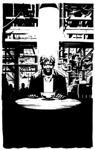
"Superman: Earth One" from DC Comics

Penciler Shane Davis said that to me when I interviewed him early last month at New York Comic-Con. I suspect that we, as humans, are designed to only believe that which we see before our eyes. That is why the promotional tagline for the 1978 "Superman: The Movie" was "You Will Believe a Man Can Fly". But Superman is a do-gooder. He makes the choices we all think we would make thrown into extraordinary circumstances. Often without reservation or hesitation. As Bradford Wright said in the History Channel documentary "Comic Book Superheroes Unmasked": "We couldn't accept a goodie-goodie coming down and doing things just because they were good, but we could accept somebody who felt some twisted emotional need to fight evil." The question has been raised: 'How believable is that "goodie-goodie"?' J. Michael Straczynski's and Shane Davis' graphic novel "Superman: Earth One" attempts to give us new answers in a new story unburdened by either old Superman stories or the 22-page monthly comic-book format. Possibly even as a first step toward an ongoing series of graphic novels with the gravitas of something like a big-budget film franchise.

The scope is certainly cinematic, in fact it's more like a Hollywood action movie than any comic I've ever read. That means it's exciting, action packed, smartly structured, and visually stunning, with just a splash of powerful emotion but it also means it all moves too fast leaving a few emotions, circumstances, and characters without full development. Clark Kent is introduced on page 1, he displays superpowers on page 5, we have a threat introduced on pages 37 to 45, fighting begins on page 74 and lasts until page 104. This threat, an alien invasion with ties to Clark's original home planet of Krypton, is (mostly) resolved and a status quo is established by the final page clocking in at 124. The people who interpreted the promotion and design to indicate a 'sensitive' Clark Kent, an emo Superman, just about couldn't have been more wrong: BIG explosions, punching, flying, and dramatic hero vs. villain talking moves along, broken only by flashbacks, for 60 pages. A little bit under half, but a little bit too much for my liking.

That leaves only about 35 pages of pure character development. Just a third of the book, and a little bit short for my liking. 'How sad,' I thought when I hit the 40th page of the graphic novel, flipped ahead, and saw that the quiet scenes were mostly behind me. We get 30 pages of character, 60 pages of fighting, and 20 pages of set-up for the sequel? Or so I thought. Amid those pages of superhero fighting in the skies of Metropolis there's 13 pages of very emotional flashback to Clark's babyhood on Krypton or Smallville-style teenage years of being raised by Ma and Pa Kent in images and highly effective dialogue. OKAY, ENOUGH NUMBERS NOW. All of that should not stand against the simple fact that there is still more character moments than the average superhero comic.

The beauty of the story is in those flashbacks to Clark's conversations with Jonathan Kent. We're given some wonderful, sad, meaningful dialogue about growing-up, taking risks, and choosing your path in those snippets. "That's when we wake up. That's when we know who we are. That's when people will show up and take your side-- When you decide what it is you stand for, when standing is the hardest." Straczynski with all the headlights on, forging ahead into darkness. This is what I was looking forward to for the past year.

The beauty of the book itself is in the art: there are moments in here where Shane Davis' pencils and Barbara Ciardo's colors are at a caliber second to none. I compare it to John Cassaday and Laura Martin's work on "Planetary". (Yes, THAT good.) The splash page of the little ship holding baby Clark as he shoots past collapsing buildings in the last moment before Krypton's destruction. Davis and Ciardo firing on all cylinders, making other worlds appear. That is the thing I didn't predict I would love so much.

And the moments in which the storytelling synergy of script and pencils come together: Clark flies in a series of relative POV panels all the way into the stratosphere, the moment Superman wakes up in free-fall remembering his father's words encouraging him to "fly". They are magnificent.

But there are moments where it didn't all come together for me. Moments that were a little too easy. Dramatic, but over-played. Clark becoming a reporter for The Daily Planet at the end, putting on the suit for the first time in the middle:


That said, I think the final effect is that we do have the most believable Superman we have ever seen in a comic. And, as a direct result, the most heroic. He does make difficult decisions about his purpose and you can imagine a young man in his position making his choices. He must make a choice with the possibility of sacrificing what he wants personally for what he perceives is needed in the world according to his ability. And when he puts his own needs aside to make those choices, a financial, social, and emotional sacrifice is made. My generation is making that decision every day. Clark Kent really becomes a SuperMAN. Jimmy Olsen is replaced with James Olsen and this new grown man of a character speaks some inspirational words. (This is amazing if you've seen enough 1940s-50s Superman comic-book covers.) Olsen almost steals the show. Perry White is a newspaperman in a world of dying newspapers. He refuses to give up. Lois Lane seems, to me, to be the owner of the short end of the stick. She seems the same.

The question of whether an out-of-continuity graphic novel implying a series of new-continuity graphic novels featuring a well-known superhero could sell enough to warrant those sequels actually being greenlit has been answered. Another Superman Earth One graphic novel will arrive and the sales numbers have been clearly stated as the reason. [via DC: Source blog] And the Long and Shortbox Of It would like to congratulate J. Michael Straczynski and Shane Davis for those sales and being allowed to continue this project together because of those sales numbers.

But is the comic good?

There is no question that what has been created here is a full-length work, a movie on paper, a novel in pictures: a graphic novel by just about any definition you can throw at it. It's over 100 pages. It has a beginning, a middle, and an end. It was created and published in one push by a single creative force consistantly responsible for what is on the page. It depicts a character in a moment of true emotional difficulty and growth. It stands as a work by itself, but with the potential for sequels and prequels. My answer to whether or not the graphic novel was good is: Yes. It is in fact, great. But no, it is not exceptional. Being a graphic novel, it competes on a different playing field against things like last year's "Asterios Polyp", "Blankets", and the Scott Pilgrim series but it opens up new worlds of possibilies.

More high quality graphic novels from Marvel or DC, either with superheroes or other genres, featuring established characters or new ones, in-continuity or out-of-continuity?

Possibilities I look forward to. And in the meantime, we have a beautiful Hollywood-style graphic novel in "Superman: Earth One".

~ @JonGorga