Although many comics, including a vast majority of superhero comics, are collaborative efforts, the major share of the credit for such books goes to the writer and the penciler. It's their names on the front, and when big announcements are made when creative teams change, those are the folks that everybody wants to know about. For a while, though, I've been toying with the idea that a colorist can either cement the look and tone that the penciler was going for or, even with the best of intentions, he or she could ruin it. Cartoonist Scott Kurtz, who's behind the long running webcomic PvP, recently made a change to his comic that is demonstrative of how important coloring can be.
Although
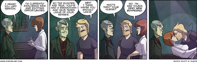
PvP was originally a black and white comic which utilized color only occasionally, for the last two or three years Kurtz has self-colored his comics. Here, for example, is his strip from
Thursday, August 2nd:

One of the joy's of
PvP is the way that Kurtz has, over his comic's fourteen year run, managed to maintain a very simple look, one that is clean and flat. In part, this is because Kurtz relies on his pen rather than his colors to add depth and perspective to his panels, so, while Kurtz often and successfully takes risks with his pencils, he rarely makes similarly risky decisions with his crayons, so to speak. When he does, the results are usually strips like the one above. If you look, in the first panel, at Max Powers's hair (Max is the blonde one, in the middle) or Lucille's face, you can tell that both are sort of off-colored, paler than they are in the other panels, bluish almost. I think Kurtz was trying to give his panel the feel of the club the three characters are in, but he can't quite pull it off-- look at Lucille's shirt in that first panel, or at wholes of the other two panels. It sort of looks like Kurtz gave up on the idea of a "club feel" two thirds of the way into the first part of the sequence, and decided to rely instead on the background alone to indicate setting. And so the strip, while not bad, exactly, is
more muddled than Kurtz's usual work, which has this wonderful pop off of the screen.
The next day (8/3), Kurtz utilized a colorist other than himself:
Kurtz decided to ask Mary Cagle, his onetime intern and the proprietor of the webcomic
Kiwi Blitz, to do the coloring while he worked on building a strip buffer, so the differences in color are individual artistic choices rather than a conscious adjustment, but I think they're demonstrative anyway. You can see, for example, the way that the color tones on the faces changes slightly as the characters move around inside the three dimensional space represented by the two dimensional panel. This solves the problem that Kurtz had encountered the day before, and I think that the punchline panel is actually much subtler and more effective than it would have been if Kurtz had colored it. Much more importantly for the general appearance of the comic, however, is the fact that Cagle uses shadow in a way that Kurtz doesn't, imagining an off panel light source and then changing the tones on certain parts of the figures (again, look at the faces), which gives the panels a lot more depth than Kurtz's colors do, at the cost of some of his pop.
I want to reiterate that, while the timing of the coloring changeover fixed a certain problem that Kurtz was having with a specific setting, I generally think he's a very good colorist, particularly because he made his strip in black and white for almost a decade before switching over to color on a regular basis and somehow managed to keep the strip feeling the same after the switch-- simplicity in coloring goes a long way. Cagle, too, is very good, and, because neither Kurtz's nor Cagle's color work is peculiar or distracting, a preference for one or the other ia a simple matter of taste. For what's its worth, I actually think that I like the former better than the latter, if only because, somewhat ironically, the realism that Cagle adds by making the panels deeper makes some of Kurtz's character design less amusing, and more
sort of bulbous and silly. Whichever one you prefer, though, there's little doubt that color changes the strip, changes the way pencils are perceived. Those pencils might be direct a comic's look, but the color confirms it, and a good color artist can rescue a poorly drawn strip the same way that a poor colorist could ruin a good one.


