
Hi all. I'm sorry I've been away-- finals are here and I've needed a little time to focus on some other stuff. Back soon.
Wednesday's New Things: Open Rebellion
This is the week we take what's ours. Click on the covers for a preview, where I could find one.

Convergence #1, written by Jeff King and Scott Lobdell, art by
Carlo Pagulayan and Jason Paz, colors by Peter Steigerwald
I've bought only a few DC comics since the relaunch, which is now approaching the four year mark, and I haven't exactly been quiet about what I think about the general quality of those books, which is to say that they're largely bad. This linewide Convergence event pits characters from different iterations and eras against each other and was necessitated by the publisher's ongoing move to the West Coast, though, does have the potential to be a little fun. In some ways, the kinds of comics being put out here-- much like the comics that Marvel will put out during Secret Wars a few months from now-- are my favorite kinds of superhero comics, remixes of characters and ideas into something recognizable but different. This kind of recycling is precisely what superhero comics do well, and here there are actually stakes within stories because the stakes involved in publishing are so unbelievably low-- this event is going to do whatever kind of business it does, since it'll only run for two months, and then it'll be over and there won't be any consequences. It's a quick, broad version of Marvel's old Exiles series, great because it's fun to see what creators come up with when the editorial reigns are a little looser. I may try out a couple of these books if any catch my fancy-- and the Chip Kidd variants do look good. At $5, though, I'll leave the main event book on the shelf.

All-New Hawkeye #2, written by Jeff Lemire, drawn by Ramon Perez, colored by Ramon Perez and Ian Herring
This is a good comic book, everything I hoped it would be. Lemire is running a kind of two-stories-at-the-same-time gig, something he's been experimenting with for a while, and it allows the book to run at two emotional registers at the same time. One of the reasons it works so well is that Perez is drawing the hell out of the both stories and in much different styles. Unlike the similar thing they've been trying on Bucky Barnes, though the two styles aren't so wildly different as to be jarring, with the more traditional superhero comics pages united with the dreamy flashbacks through, most prominently, the color palate. Looking forward to more of this one.

Jupiter's Circle #1, written by Mark Millar and Wilfredo Torres
A spinoff of Millar's much delayed collaboration with Frank Quitely, Jupiter's Legacy, this is a retro-styled styled comic with relatively simple art sporting flat colors, which makes explicit reference to the old Superfriends cartoon, the kind of intertextual element that's supposed to point you to a certain way of feeling about the book, which, presumably Millar will then juxtapose with a fair amount of sex, drugs, and other adult stuff. From the preview, it's got a similar effect to the Criminal: Last of the Innocent mini, which takes a similar perspective on Archie, transforming those comics into a site of everything Frederich Wertham was afraid of. This is therefore slightly less trod ground than the kind of superhero realism Millar is trying with this book's parent, at least insofar as it's work is formal as well as narrative; I think it might work better.

Nameless #3, written by Grant Morrison, drawn by Chris Burnham, colors by Nathan Fairbairn

Rebels #1, written by Brian Wood, drawn by Andrea Mutti, Jordi Bellaire
I haven't read a book by Brian Wood in a while, but I remember liking DMZ a fair bit, at least in the early going. As an American Studies grad studies currently TAing for the first half of the American cultural history survey, this one may prove a little too hard to resist. Probably I'll spring for the first issue, just to see if I might want to try it in trade, later.
Wednesday's New Things: It's a Hit!
This week, crime comics next big thing is back... click on covers for a preview, where my cursory googling could find one


.jpg)

Hit: 1957 #1, written by Bryce Carlson, art by Vanesa Del Rey, colors by Nikos Guardia, letters by Ed Dukeshire
Hit was one of my favorite books from 2013, a worthy, if a stylistically stilted, entry into the crime comics genre drawn by then-new comer Vanesa Del Rey, whose super thin line and hyper awareness of shape was the real attraction. Set in Los Angeles, it's got clear vibes from Chandler and Chinatown, which could have been a real stretch, but the book worked, enough that I think it's one of the great crime comics of the last few years. Having retroactively titled that book Hit: 1955, Boom's brought the series back as Hit: 1957, I guess with the idea being that it'll move forward in time, sort of a Mad Men gimmick. As before, even if this genre doesn't do it for you like it does for me, take a peek for the sake of Del Rey. I could look at her art forever, and comics can only be better when such a talented artist is a proven sale.
The Autumnlands #5, written by Kurt Busiek, art by Ben Dewey, colors by Jordie Bellaire, letters by Comicraft
The Empty #2, by Jimmie Robinson
They're Not Like Us #4, written by Eric Stephenson, drawn by Simon Gane, colors by Jordie Bellaire, letters by Fonografiks
The Wicked and the Divine #9, written by Kieron Gillen, drawn by Jamie McKelvie, colors by Matt Wilson, letters by Clayton Cowles
A quartet of quality books from Image this week. Autumnlands has been quietly very good, particularly since Busiek dumped some of the details that were a little too cute from the first issue. A sprawling fantasy piece of the first order, it's worth a looksee if you like Redwall or a politically oriented, vaguely retrofuturist kind of fantasy. The Empty is worthwhile, although the first issue was a little inconsistent and very on the nose; I'm interested to see where it goes. They're Not Like Us is a neat deconstructionist riff on the X-Men, and, although it's surprising to say this since superhero deconstruction is thirty years old, it's pretty fresh. I've been wanting to write about a particular physical element of that book that I really love, so maybe this week's the week I do that, and it may also be the week I write about how crazy issue #8 of WicDiv was. After largely avoiding the formalism that made Young Avengers so interesting, Gillen and McKelvie went all out last issue. Even if this book doesn't feel as vital as their work sometimes does, I'm all in here, particularly if they're headed back towards forward formal thinking.
Past Aways #1, written by Matt Kindt, drawn by Scott Kollins, colors by Bill Crabtree
Something sort of fun from Dark Horse, a sort of Booster Gold-style time travel story, with an exploring the past kind of angle. Parts of it seem a little trite, but Scott Kollins's art is simple and slick, and the colors are bold. Writer Matt Kindt is always best when he's working as his own artist (and his art is really something), but its good to seem him get work like this.
Nemo: River of Ghosts, written by Alan Moore, drawn by Kevin O'Neill
New Alan Moore is always news (did you hear we're finally going to see his million word novel Jerusalem? Can you imagine holding the damn thing?! In hardcover?! Coming 2016). I'm really pleased that he's still playing in the League of Extraordinary Gentleman sandbox; in some ways, Moore's real talent is for taking the elements of mainstream superhero comics, tearing them down to their base parts, moving them around or redressing them, and then turning something recognizable and also somehow unrecognizable back out into the world. I would have figured that he was bored with that by now, but there's something about doing patchwriting with literature that keeps him going, and I'm very glad for it.
Wednesday's New Things: Trapped In A Blog He Never Made!
It's a slow week, so I'm going to get the duck on with it already. Click for a preview, where I could find one.

Howard the Duck #1, written by Chip Zdarsky, drawn by Joe Quinones, colors by Rico Renzi
I think that Howard the Duck may be the hero my generation needs. Trapped in a world we never made? Check. Have to endure articles about how terrible we are based in part on lazy reporters looking in the wrong place? Also check. In fact, I think what we really might need is Steve Gerber's version of the character but, in Chip Zdarsky, we've got someone who's interpretation is going to be anywhere from passable to good. Zdarsky, who came to prominence working with Matt Fraction on Sex Criminals, has a very well developed sense of humor and comically exaggerated, probably affected, sense of self importnace that leads him to do things like throw his own little convention, dedicated to himself, in a Toronto park. He is, in other words, more or less the perfect person to write a contemporary Howard the Duck. Some of the jokes in the preview do fall a little flat, but I think they'll probably play better in a form that's got actually context and flow, unlike a comic book preview. And he might need a few issues to get his sea legs anyway; this book, more than most, probably needs an investment of a few issues before deciding whether or not to keep pulling it. Joe Quinones's art is good, relatively simple and straight cartooning, but lacking the design influenced and retro style of Paolo Rivera, Javier Pulido or Marcos Martin. In a good example of form following function, though, Quinones's cartoony style does sign a particular kind of humor and irreverence even if, like Zdarksy, he might need a couple of issues to get his sea legs.

The Surface #1, written by Ales Kot, drawn by Langdon Foss, colors by Jordie Bellaire, letters by Clayton Cowles
Ales Kot, who seems to have exploded into comics 18 months ago or so and just taken off since then, is working here with his Bucky Barnes colleague Langdon Foss, who's straight style, sort of like the vaguely Euro-look of Frank Quitely or Nick Pitarra but with a smoother line, is weirdly matched with Marco Rudy's experimentation on that book. Here, they're working on a soft sci-fi/hacking adventure story set in Africa, which seems like it's worth a look.

Southern Cross #1, written by Becky Cloonan, drawn by Andy Belanger, colors by Lee Loughridge
Wednesday's New Things: The Man From Essex County
A rare small week. Click on the covers for previews, where I could find one.
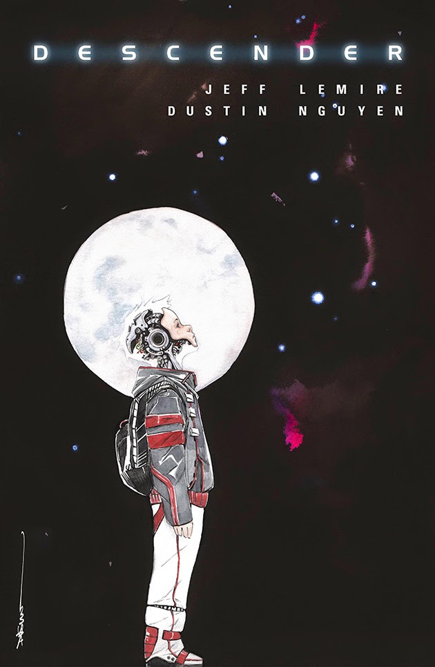


Descender #1, written by Jeff Lemire, art by Dustin Nguyen
All-New Hawkeye #1, written by Jeff Lemire, art by Ramon Perez
Two new books from cartoonist extraordinaire Jeff Lemire, who seems to have settled in to the role of mainstay mainstream funny book writer quite nicely. The sci-fi Descender is the heir to his creator owned Sweet Tooth and Trillium books and seems, in particular, to pick up on the themes of the latter. He's working with Dustin Nguyen, who has painted all of the art. Painting seems like a sort of weird strategy for attacking sci-fi and, in general, I find painted art to be static and ugly, but Nguyen's is beautiful, and subtle, adding a soft atmosphere and has a nice texture. That it's dissonant with the tone of the scene in the preview only serves to make that scene that much eerier. More interesting, if only because it's kind of out of left field, is Lemire's All-New Hawkeye. The series that he's following, Matt Fraction and David Aja's very well regarded Hawkeye, has been released at inconsistent intervals since about six months in, and isn't concluding until next month. Despite it's frustrating pace, Fraction and Aja's work is very well liked, in part because it's about how unglamorous super heroics can be; in terms of genre, its an espionage cloak covering a story about what happens when Marvel's vaunted man on the street happens to be so skilled at one particular thing that he can use it for good. It's also deeply, deeply engaged with comics as a form, with the extraordinarily talented artists Aja and Annie Wu, along with colorist Matt Hollingsworth, breaking the form and putting it back together on a semi-regular basis. Thankfully, Marvel seems to have figured out that it's not just the character that's bringing people to the book, and by tapping Lemire and artist Ramon Perez (the kind of worthwhile and intriguing creator choices they were making a year ago before abruptly pulling up), they've put themselves in a position to maintain a fair bit of the audience they've built up. Perez's art is slick and cartoony, with a little bit of Bruce Timm influence, and Lemire is well aware that this book plays to his strengths, which are more in the realm of thick characterization than in traditional superheroics. Part of the book is going to be flashbacks to Clint Barton's childhood and about his relationship with his brother Barney, which makes me hopeful that what we're getting is the other side of Lemire's work on Essex County, just with the Marvel insignia on the front cover. If, in fact, that's what's in store, then we'll have a transcendent comic book on our hands, the fulfillment of Lemire's promise as a writer of mainstream comic books.
Big Man Plans (1 of 4), written by Eric Powell and Tim Weisch, art by Eric Powell
The Goon's (man, I just love the Goon) Eric Powell turning his attention to a more or less straight crime comic? That's something sweet.
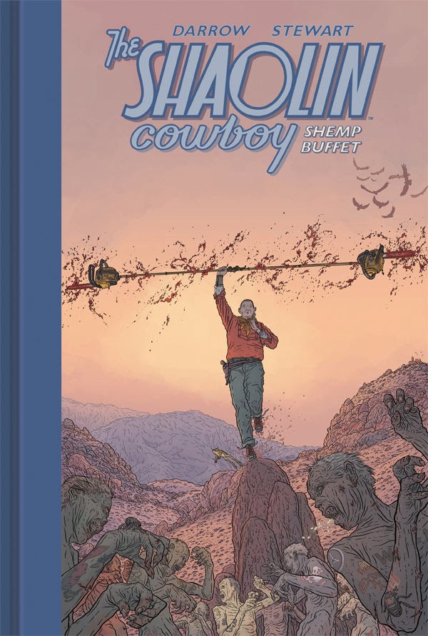
The Shaolin Cowboy: Shemp Buffet, by Geoff Darrow with colors by Dave Stewart
Princess Leia #1, written by Mark Waid, pencils by Terry Dodson, inks by Rachel Dodson, colors by Jordie Bellaire
Subscribe to:
Posts (Atom)