Yeah, it's been a while. 2o11 passed. DC rebooted. Everything went crazy. I really still need to get this out there, so: These are my picks for the best comics I read last year.
To qualify, a work must be comics and must have become publicly available in its entirety, in English, and for the first time, either in print or on the web, between 1/1/11 and 12/31/11. The selections are presented by category, but not in any ascending or descending order.
BEST GRAPHIC NOVELS (over 100 pages)
"Scenes From an Impending Marriage" from drawn & quarterly (@DandQ)
written and drawn by Adrian Tomine
Imagine the bride and groom standing up straight and looking prim and proper. Ready to take the next big step in their lives. Except they probably don't feel ready at all. They probably feel exhausted and stupid and hungry. A comic originally made as a gift for the guests at his own wedding, one of Adrian Tomine's most personal auto-biographical comics, edited and expanded as "Scenes from an Impending Marriage" is funny, human and was the first comic to put me on the verge of tears with laughter last year.
"Habibi" from Pantheon Books (@PantheonBooks)
written and drawn by Craig Thompson
Was there any question when Craig Thompson releases a new graphic novel that it ends up on all the best of the year lists? Not in my mind. Thompson has Will Eisner's versatility in character design, Harvey Pekar's observational acumen, Jack Kirby's ability to enliven a line on the page, and an emotional intensity that I can find no analog for in my memory. "Habibi" is the story of two orphans surviving together and apart in a Middle Eastern country never named in a century never named. It is haunting, beautiful, and an education in itself.
BEST GRAPHIC NOVELLA (under 100 pages)
"Batman: NOEL" from DC Comics (@DCComics)
written and drawn by Lee Bermejo (@ljbermejo)
This book may not be the best Batman graphic novel I've ever read but it holds a spot somewhere in the top 10. Retelling Charles Dickens' "A Christmas Carol" with the DC Universe characters sounds absolutely fucking crazy but by making the role of Scrooge ambiguous (is it The Joker, is it Batman?) Bermejo created a unique work of playful originality and breathtaking visuals.
BEST MINI-SERIES
"The Intrepids" #1, 2, 3, 4, 5, 6 from Image Comics (@imagecomics)
written by Kurtis J. Wiebe (@kurtisjwiebe); drawn by Scott Kowalchuck (@scottkowalchuk)
If Stan Lee and Jack Kirby had made the 1960s "X-Men" today it might have looked something like this: Smart, fun, action-packed, well-told. The characters are written on a tightrope balanced between unbelievability as teenagers and unbelievability as super-secret-agents, but you know what? I believed them somehow. Issue after issue, these kids react genuinely to their uncanny situations and convinced me of their wants and their worries again. Sometimes even in a somewhat moving way. That coupled with the 60s retro-future design work, the comics-pop colors, and the simple 'yellowed paper' flashbacks make this the best mini I read in 2o11. Or could it be because the book is just so much fun? Possibly, but then... that's the artistry of it.
BEST INDIVIDUAL COMIC-BOOKS (either from an ongoing or limited series)
"The Lil Depressed Boy" #1 from Image Comics
written by S. Steven Struble (@struble); drawn by Sina Grace (@SinaGrace)
I saw this slice-of-life book on the shelf and was immediately very, very impressed. Few comics succeed in being so entertaining with so little sensationalism. And the design of the main character (a simple puppet-like figure conceived for the original LDB webcomic) makes all the difference.
"Invincible Iron Man" #500.1 from Marvel Comics (@Marvel)
written by Matt Fraction (@mattfraction); drawn by Salvador Larroca
Man, if you have a character who is famous for, among other things, being an alcoholic and you are offered the chance to give him a side-story moment that only needs to sell in comic shops and not on newsstands... I should hope you would do an entire issue of your main character in a Alcoholics Anonymous meeting. And I would pray you were as talented as Mr. Fraction. Every third page seems to add another layer of meaning to Tony Stark's sad life-long battle against the "Demon in the Bottle," indeed to his entire story.
"Daredevil" #1 & #4-5 from Marvel Comics
written by Mark Waid (@MarkWaid); drawn by Paolo Rivera (@PaoloMRivera) & Marcos Martin
Really, really impressive superhero comics. Playing off of Bendis' (@BRIANMBENDIS) work from years ago (outing Matt Murdock as the vigilante superhero Daredevil in the tabloid press thereby making it publicly questioned but not publicly provable), but taking it one step further into reality: if everyone knows you may or may not be a superhero vigilante you wouldn't be able to step foot in a court room. What's an enterprising genius-attorney-secret/public superhero to do? Become a consulting law firm, an organization that teaches the common man in need of legal advice how to represent themselves. Genius. And somehow touching.
"Catwoman" #1 from DC Comics
written by Judd Winick; drawn by Guillem March
Yes, this book is drawn to 'gratuitously large proportions'. It is a superheroine/supervillainess comic with a lot of T&A but it's also a book with a lot of brains and a lot of heart. The dialogue breathes and rushes and pauses again between breaths. Kinda like that feeling of running down a hill into open land faster than your legs can safely carry you but you just barely avoid tumbling at the bottom and you push right on...
Did I mention this book is fun?
"Supergirl" #1 from DC Comics
written by Michael Green and Mike Johnson; drawn by Mahmud Asrar (@MahmudAsrar)
If "Catwoman" is the hooker with the heart of gold, "Supergirl" is the feisty little five-year-old who will bite you if you piss her off. Choosing to put this newest version of Kara-El into a more delicate situation (Kara wakes up from suspended animation on Earth with no memory of the destruction of Krypton) we see and 'hear' her freaking out on multiple levels at once. The portrayal of a teenager thrown into a situation she doesn't understand is more than competent and Asrar's art is a joy to read.
"Batman" #3-4 from DC Comics
written by Scott Snyder (@Ssnyder1835); drawn by Greg Capullo (@GregCapullo)
Scott Snyder has suddenly risen to the comic-book writing A-list last year and a large part of the reason is his head-turning writing with the Batman character, first on "Detective Comics" and then in this run of "Batman".
"Animal Man" #1-2 from DC Comics
written by Jeff Lemire (@JeffLemire); drawn by Travel Foreman
Completely re-imagining a superhero character is so old hat in a world post "Squadron Supreme" in the 70s/"Watchmen" in the 80s/"Planetary"in the 00s that nowadays it almost seems more impressive to simply take the elements already present and do it better than it's been done in a long, long time. Lemire's "Animal Man" is family-centered, high-concept, body-horror superhero comics that works, and it deserves accolades for that alone.
"the Amazing Spider-Man" #673 from Marvel Comics
written by Dan Slott (@DanSlott); drawn by Stefano Caselli
I almost declared the entire "Spider-Island" quasi-crossover-event the best story-arc of the year because it's very good, possibly among the best Spider-Man stories in a decade. But I was rather taken out of it by how silly it was at times. Too silly. In this epilogue issue Dan Slott's humor feels right however, like a great release after a terrifying ordeal.
"Sweet Tooth" #24 from Vertigo (@vertigo_comics)
written and drawn by Jeff Lemire (@JeffLemire)
Man, this book is just so damn beautiful. Death has never looked so good. Go read it.
"Diablo" #1 from DC Comics
written by Aaron Williams; drawn by Joseph Lacroix
Never-before-seen: A video game adaptation comic-book of real substance. A father-and-son story set against a fantasy back-drop.
"Northlanders" #36 from Vertigo
written by Brian Wood (@brianwood); drawn by Becky Cloonan (@beckycloonan)
"The Girl in the Ice" Part 2 is harrowing. Wrongly accused Jon must serve his community, even if what his community clamors for is a scapegoat. The clearest example I've read in the "Northlanders" series that the reality of life in the northlands at the turn of the last millenium was cold indeed.
"Criminal: Last of the Innocent" #1 from Icon
written by Ed Brubaker (@brubaker); drawn by Sean Phillips (@seanpphillips)
Although the following issues of this mini bored me slightly, this first issue rocked my socks off with its terrifying vision of modern American marriage combined with the loss of innocence we all must experience dramatized by the dirty scratchy art of the present day 80s and the smooth cartoony art of the main character's flashbacks/dreams of the 60s.
"Atomika" #12 from Mercury Comics
written by Andrew Dabb; drawn by Sal Abbinanti (@SalAbbinanti)
Atomika, the god of... something that by this point is a little unclear finally overcomes his treacherous father figure Aronhir in the last issue of this monumental series started in 2oo5. The final denouement was not the quite what I wanted as I felt a lot more emotional effect from the previous issue way back in 2oo9. But the epilogue-type stuff in here about humanity continuing on got me quite choked up. I hope this gets released in a single package one day- it'll read well and it might just get some major recognition.
"Spontaneous" #1 from Oni Press (@OniPress)
written by Joe Harris (@joeharris); drawn by Brett Weldele (@BrettWeldele)
Before the DC re-boot, this team had concocted the best first issue of the year. Quick, without feeling rushed, fun without feeling pointless, scary without being over-the-top, this unique story is told with Weldele's great watercolor style accenting a dark tale of obsession. But the real draw is Harris' dialogue for his female lead. Smooth and quirky, I fell in love at the first scene.
"ZEGAS" #1 from Copra Press
written and drawn by Michel Fiffe (@MichelFiffe)
Strikingly beautiful artwork, the kind that immediately grab your eyeballs and won't let go, is sadly rare in this world of comics. The balance required to make something VISUALLY beautiful while telling a story in tiny pictures WELL is incredibly difficult. Somehow Michel Fiffe can do this.
"A Skeleton Story..." #4 from GG Studios (@GGSTUDIO)
written and drawn by Alessandro Rak; translated by Adam McGovern (@AdamMcGovern)
This simple tale of crime-noir in the afterlife is so beautifully drawn that it might have won a spot by that alone, but the character designs, storytelling, and good old fashioned Disney-ish heart of this comic won me over pretty bigtime.
BEST SHORTS (under 22 pages)
"BOOM" on CartoonMovement.com
written by David Axe (@daxe); drawn by Ryan Alexander-Tanner (@ohyesverynice)
When I stumbled across this short but powerful webcomic, it felt like a little revelation. The current horror of IEDs and their ability to destroy more than mere lives on the battlefield. [I reviewed it here.]
"Bahrain: Lines in ink, Lines in the sand" on CartoonMovement.com
written and drawn by Josh Neufeld (@JoshNeufeld)
Truth about political difference demonstrated by two political cartoonists' work from the point-of-view of one American comicsmith. Powerful stuff.
"What Every Woman Should Know" on CartoonMovement.com
written and drawn by Susie Cagle
An intense presentation of the realities of abortion clinics in California in illustrations and sequential art. Regardless of where you may fall on the subject, things are not as they seem. Read it, educate yourself.
"State of Palestine" on CartoonMovement.com
written and drawn by Sarah Glidden (@sarahglidden)
It's only four pages and it tells the story of a clever political artist. Go read it.
The whole website is wonderful. Journalistic comics on the web, for free, easily shared. CartoonMovement.com deserves a medal. Four comics made my list.
“A Brief History of the Art Form Known as ‘Hortisculpture’” from "Optic Nerve" #12
written and drawn by Adrian Tomine
Choosing to give up on your dreams for your family and your own well-being is one of the hardest things an adult has to do. Sad, true, ridiculous, petty, human. All of these describe the main character of this sad, heart-warming, smart short tale.
"The White Room" from "Strange Adventures" #1
written by Talia Hershewe; drawn by Juan Bobillo
Beautiful and terrifying; short but haunting. This is excellent sci-fi psychological stuff. Go track it down and keep your eye out for those two names. I know I have.
"The Clock" from "Crack Comics" #63 (The Next Issue Project)
written and drawn by Paul Maybury (@pmaybury)
The pure Dick Tracy-high-impact-four-color-fun of this short piece is not to be reckoned with. The note the main character delivers to the bad guys on page one tells us what's going to happen, but it only makes the ride all the more fast and fun.
"I'll Never Let You Go" from "Amazing Spider-Man Spider-Man: Infested"
written by Dan Slott; drawn by Giuseppe Camuncoli
A more human presentation of the relationship between Peter Parker and his Aunt May has rarely been seen. In flashback and in the present we see their love grow: the short opens on the day May and Ben become his legal gaurdians and he yells "You-- you're not my mother!" but the adult Peter in the present says to Mary Jane (for the first time I can remember) "She's my mom, MJ."
"this one is not a dream" from "Dream Logic" #4
written and illustrated by David Mack (@davidmackkabuki)
A comic by David Mack about the death of his father. Abstract, yet human, unique in style. Heartbreaking.
Lil Depressed Boy: "My Life is Starting Over Again"
written by S. Steven Struble (@struble); drawn by Sina Grace (@SinaGrace)
Essentially the last entry in the old-style of the webcomic version of LDB tells a story about making your home, your fun, making your life-- wherever you can.
"Finder: Third World" Chapter 1 from Dark Horse Presents v2 #1
written and drawn by Carla Speed McNeil
My first introduction to "Finder" and the work of Ms. McNeil. Sharply realized characters in strange situations, all well-drawn. Even context-less (for me) I could tell there's cool stuff going on here.
BEST STRIPS (1 page)
"November in the North of England" in "Thought Bubble 2011" published in the US by Image Comics
written by Andy Diggle (@andydiggle); drawn by D'Israeli
Time travel. Crime. Morbid. Funny. All in a page.
untitled published in the US in "Jason Conquers America" from Fantagraphics
written and drawn by Jason
This little piece was finally released in the US last year in a slim one-shot collection of stuff Jason made that was never released in the US before: Man visits lover's grave. Man is shocked to find his lover's skeleton is having a picnic with -gasp- another skeleton! Shocking? Scandalous! Hilarious!
"on the way back DOWN"
written and drawn by G.M.B. Chomichuk
Take a second to look at this one-pager and tell me it's not gorgeous.
"I Can"
written and drawn by Jess Fink (@JessFink)
Inspiring, no?
"A Softer World" #727
written by Joey Comeau (@joeycomeau) and photographed by Emily Horne (@birdlord)
Yeah... I think.
"A Softer World" #724
written by Joey Comeau and photographed by Emily Horne
Oh yeah! Equally exciting and disturbing.
"A Softer World" #701
written by Joey Comeau and photographed by Emily Horne
I like it because I can't help but agree.
"A Softer World" #666
written by Joey Comeau and photographed by Emily Horne
All of us who've loved and lost can relate to this one.
"A Softer World" #661
written by Joey Comeau and photographed by Emily Horne
This one is among the few times "Softer World" leans more on the visuals than the writing. Both parts are awesome though.
"A Softer World" #628
written by Joey Comeau and photographed by Emily Horne
Funny because it's probably true of most of us if we're really honest with ourselves.
xkcd: "Sharing"
written and drawn by Randall Munroe (@xkcd)
Among the best things I read on the web last year. This simple, six-panel webstrip says everything about freedom, piracy, and 'sharing' by referencing the current terror over digital comics piracy (any kind of digital piracy really), against a well-regarded work of sequential art: the famous children's book Shel Silverstein's "The Giving Tree".
xkcd: "Depth Perception"
written and drawn by Randall Munroe
Just... wow.
xkcd: "Lanes"
written and drawn by Randall Munroe
As I have a few people who've survived cancer in my life, this was a bit chilling but very much eye-opening.
_______________________________________________________
And finally, graphic novels I wanted to read (or finish) but didn't:
"Anya's Ghost"
"His Dream of the Skyland"
"Marzi"
"Mangaman"
"Vietnamerica"
"The Homeland Directive"
"RUST"

We all only have so much time in a year. You just got a (literal and figurative) snapshot of how many comics I read with mine.
Strange, last year I couldn't wade through all the graphic novels and barely had enough single issues to choose from, this year the reverse! The industry in America is in flux. Digital seemed to be slowly becoming the standard method of consuming comics, but we now know that it actually only accounted for about 10% of comics sales in North America last year. [ICv2 source.]
~ @JonGorga
P.S.:
"One Soul"
published by Oni Press, written and drawn by Ray Fawkes (@rayfawkes)
To qualify, a work must be comics and must have become publicly available in its entirety, in English, and for the first time, either in print or on the web, between 1/1/11 and 12/31/11. The selections are presented by category, but not in any ascending or descending order.
BEST GRAPHIC NOVELS (over 100 pages)
"Scenes From an Impending Marriage" from drawn & quarterly (@DandQ)
written and drawn by Adrian Tomine
Imagine the bride and groom standing up straight and looking prim and proper. Ready to take the next big step in their lives. Except they probably don't feel ready at all. They probably feel exhausted and stupid and hungry. A comic originally made as a gift for the guests at his own wedding, one of Adrian Tomine's most personal auto-biographical comics, edited and expanded as "Scenes from an Impending Marriage" is funny, human and was the first comic to put me on the verge of tears with laughter last year.
"Habibi" from Pantheon Books (@PantheonBooks)
written and drawn by Craig Thompson
Was there any question when Craig Thompson releases a new graphic novel that it ends up on all the best of the year lists? Not in my mind. Thompson has Will Eisner's versatility in character design, Harvey Pekar's observational acumen, Jack Kirby's ability to enliven a line on the page, and an emotional intensity that I can find no analog for in my memory. "Habibi" is the story of two orphans surviving together and apart in a Middle Eastern country never named in a century never named. It is haunting, beautiful, and an education in itself.
BEST GRAPHIC NOVELLA (under 100 pages)
"Batman: NOEL" from DC Comics (@DCComics)
written and drawn by Lee Bermejo (@ljbermejo)
This book may not be the best Batman graphic novel I've ever read but it holds a spot somewhere in the top 10. Retelling Charles Dickens' "A Christmas Carol" with the DC Universe characters sounds absolutely fucking crazy but by making the role of Scrooge ambiguous (is it The Joker, is it Batman?) Bermejo created a unique work of playful originality and breathtaking visuals.
BEST MINI-SERIES
"The Intrepids" #1, 2, 3, 4, 5, 6 from Image Comics (@imagecomics)
written by Kurtis J. Wiebe (@kurtisjwiebe); drawn by Scott Kowalchuck (@scottkowalchuk)
If Stan Lee and Jack Kirby had made the 1960s "X-Men" today it might have looked something like this: Smart, fun, action-packed, well-told. The characters are written on a tightrope balanced between unbelievability as teenagers and unbelievability as super-secret-agents, but you know what? I believed them somehow. Issue after issue, these kids react genuinely to their uncanny situations and convinced me of their wants and their worries again. Sometimes even in a somewhat moving way. That coupled with the 60s retro-future design work, the comics-pop colors, and the simple 'yellowed paper' flashbacks make this the best mini I read in 2o11. Or could it be because the book is just so much fun? Possibly, but then... that's the artistry of it.
BEST INDIVIDUAL COMIC-BOOKS (either from an ongoing or limited series)
"The Lil Depressed Boy" #1 from Image Comics
written by S. Steven Struble (@struble); drawn by Sina Grace (@SinaGrace)
I saw this slice-of-life book on the shelf and was immediately very, very impressed. Few comics succeed in being so entertaining with so little sensationalism. And the design of the main character (a simple puppet-like figure conceived for the original LDB webcomic) makes all the difference.
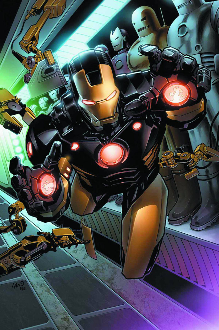
"Invincible Iron Man" #500.1 from Marvel Comics (@Marvel)
written by Matt Fraction (@mattfraction); drawn by Salvador Larroca
Man, if you have a character who is famous for, among other things, being an alcoholic and you are offered the chance to give him a side-story moment that only needs to sell in comic shops and not on newsstands... I should hope you would do an entire issue of your main character in a Alcoholics Anonymous meeting. And I would pray you were as talented as Mr. Fraction. Every third page seems to add another layer of meaning to Tony Stark's sad life-long battle against the "Demon in the Bottle," indeed to his entire story.
"Daredevil" #1 & #4-5 from Marvel Comics
written by Mark Waid (@MarkWaid); drawn by Paolo Rivera (@PaoloMRivera) & Marcos Martin
Really, really impressive superhero comics. Playing off of Bendis' (@BRIANMBENDIS) work from years ago (outing Matt Murdock as the vigilante superhero Daredevil in the tabloid press thereby making it publicly questioned but not publicly provable), but taking it one step further into reality: if everyone knows you may or may not be a superhero vigilante you wouldn't be able to step foot in a court room. What's an enterprising genius-attorney-secret/public superhero to do? Become a consulting law firm, an organization that teaches the common man in need of legal advice how to represent themselves. Genius. And somehow touching.
"Catwoman" #1 from DC Comics
written by Judd Winick; drawn by Guillem March
Yes, this book is drawn to 'gratuitously large proportions'. It is a superheroine/supervillainess comic with a lot of T&A but it's also a book with a lot of brains and a lot of heart. The dialogue breathes and rushes and pauses again between breaths. Kinda like that feeling of running down a hill into open land faster than your legs can safely carry you but you just barely avoid tumbling at the bottom and you push right on...
Did I mention this book is fun?
"Supergirl" #1 from DC Comics
written by Michael Green and Mike Johnson; drawn by Mahmud Asrar (@MahmudAsrar)
If "Catwoman" is the hooker with the heart of gold, "Supergirl" is the feisty little five-year-old who will bite you if you piss her off. Choosing to put this newest version of Kara-El into a more delicate situation (Kara wakes up from suspended animation on Earth with no memory of the destruction of Krypton) we see and 'hear' her freaking out on multiple levels at once. The portrayal of a teenager thrown into a situation she doesn't understand is more than competent and Asrar's art is a joy to read.
"Batman" #3-4 from DC Comics
written by Scott Snyder (@Ssnyder1835); drawn by Greg Capullo (@GregCapullo)
Scott Snyder has suddenly risen to the comic-book writing A-list last year and a large part of the reason is his head-turning writing with the Batman character, first on "Detective Comics" and then in this run of "Batman".
"Animal Man" #1-2 from DC Comics
written by Jeff Lemire (@JeffLemire); drawn by Travel Foreman
Completely re-imagining a superhero character is so old hat in a world post "Squadron Supreme" in the 70s/"Watchmen" in the 80s/"Planetary"in the 00s that nowadays it almost seems more impressive to simply take the elements already present and do it better than it's been done in a long, long time. Lemire's "Animal Man" is family-centered, high-concept, body-horror superhero comics that works, and it deserves accolades for that alone.
"the Amazing Spider-Man" #673 from Marvel Comics
written by Dan Slott (@DanSlott); drawn by Stefano Caselli
I almost declared the entire "Spider-Island" quasi-crossover-event the best story-arc of the year because it's very good, possibly among the best Spider-Man stories in a decade. But I was rather taken out of it by how silly it was at times. Too silly. In this epilogue issue Dan Slott's humor feels right however, like a great release after a terrifying ordeal.
"Sweet Tooth" #24 from Vertigo (@vertigo_comics)
written and drawn by Jeff Lemire (@JeffLemire)
Man, this book is just so damn beautiful. Death has never looked so good. Go read it.
"Diablo" #1 from DC Comics
written by Aaron Williams; drawn by Joseph Lacroix
Never-before-seen: A video game adaptation comic-book of real substance. A father-and-son story set against a fantasy back-drop.
"Northlanders" #36 from Vertigo
written by Brian Wood (@brianwood); drawn by Becky Cloonan (@beckycloonan)
"The Girl in the Ice" Part 2 is harrowing. Wrongly accused Jon must serve his community, even if what his community clamors for is a scapegoat. The clearest example I've read in the "Northlanders" series that the reality of life in the northlands at the turn of the last millenium was cold indeed.
"Criminal: Last of the Innocent" #1 from Icon
written by Ed Brubaker (@brubaker); drawn by Sean Phillips (@seanpphillips)
Although the following issues of this mini bored me slightly, this first issue rocked my socks off with its terrifying vision of modern American marriage combined with the loss of innocence we all must experience dramatized by the dirty scratchy art of the present day 80s and the smooth cartoony art of the main character's flashbacks/dreams of the 60s.
"Atomika" #12 from Mercury Comics
written by Andrew Dabb; drawn by Sal Abbinanti (@SalAbbinanti)
Atomika, the god of... something that by this point is a little unclear finally overcomes his treacherous father figure Aronhir in the last issue of this monumental series started in 2oo5. The final denouement was not the quite what I wanted as I felt a lot more emotional effect from the previous issue way back in 2oo9. But the epilogue-type stuff in here about humanity continuing on got me quite choked up. I hope this gets released in a single package one day- it'll read well and it might just get some major recognition.
"Spontaneous" #1 from Oni Press (@OniPress)
written by Joe Harris (@joeharris); drawn by Brett Weldele (@BrettWeldele)
Before the DC re-boot, this team had concocted the best first issue of the year. Quick, without feeling rushed, fun without feeling pointless, scary without being over-the-top, this unique story is told with Weldele's great watercolor style accenting a dark tale of obsession. But the real draw is Harris' dialogue for his female lead. Smooth and quirky, I fell in love at the first scene.
"ZEGAS" #1 from Copra Press
written and drawn by Michel Fiffe (@MichelFiffe)
Strikingly beautiful artwork, the kind that immediately grab your eyeballs and won't let go, is sadly rare in this world of comics. The balance required to make something VISUALLY beautiful while telling a story in tiny pictures WELL is incredibly difficult. Somehow Michel Fiffe can do this.
"A Skeleton Story..." #4 from GG Studios (@GGSTUDIO)
written and drawn by Alessandro Rak; translated by Adam McGovern (@AdamMcGovern)
This simple tale of crime-noir in the afterlife is so beautifully drawn that it might have won a spot by that alone, but the character designs, storytelling, and good old fashioned Disney-ish heart of this comic won me over pretty bigtime.
BEST SHORTS (under 22 pages)
"BOOM" on CartoonMovement.com
written by David Axe (@daxe); drawn by Ryan Alexander-Tanner (@ohyesverynice)
When I stumbled across this short but powerful webcomic, it felt like a little revelation. The current horror of IEDs and their ability to destroy more than mere lives on the battlefield. [I reviewed it here.]
"Bahrain: Lines in ink, Lines in the sand" on CartoonMovement.com
written and drawn by Josh Neufeld (@JoshNeufeld)
Truth about political difference demonstrated by two political cartoonists' work from the point-of-view of one American comicsmith. Powerful stuff.
"What Every Woman Should Know" on CartoonMovement.com
written and drawn by Susie Cagle
An intense presentation of the realities of abortion clinics in California in illustrations and sequential art. Regardless of where you may fall on the subject, things are not as they seem. Read it, educate yourself.
"State of Palestine" on CartoonMovement.com
written and drawn by Sarah Glidden (@sarahglidden)
It's only four pages and it tells the story of a clever political artist. Go read it.
The whole website is wonderful. Journalistic comics on the web, for free, easily shared. CartoonMovement.com deserves a medal. Four comics made my list.
“A Brief History of the Art Form Known as ‘Hortisculpture’” from "Optic Nerve" #12
written and drawn by Adrian Tomine
Choosing to give up on your dreams for your family and your own well-being is one of the hardest things an adult has to do. Sad, true, ridiculous, petty, human. All of these describe the main character of this sad, heart-warming, smart short tale.
"The White Room" from "Strange Adventures" #1
written by Talia Hershewe; drawn by Juan Bobillo
Beautiful and terrifying; short but haunting. This is excellent sci-fi psychological stuff. Go track it down and keep your eye out for those two names. I know I have.
"The Clock" from "Crack Comics" #63 (The Next Issue Project)
written and drawn by Paul Maybury (@pmaybury)
The pure Dick Tracy-high-impact-four-color-fun of this short piece is not to be reckoned with. The note the main character delivers to the bad guys on page one tells us what's going to happen, but it only makes the ride all the more fast and fun.
"I'll Never Let You Go" from "Amazing Spider-Man Spider-Man: Infested"
written by Dan Slott; drawn by Giuseppe Camuncoli
A more human presentation of the relationship between Peter Parker and his Aunt May has rarely been seen. In flashback and in the present we see their love grow: the short opens on the day May and Ben become his legal gaurdians and he yells "You-- you're not my mother!" but the adult Peter in the present says to Mary Jane (for the first time I can remember) "She's my mom, MJ."
"this one is not a dream" from "Dream Logic" #4
written and illustrated by David Mack (@davidmackkabuki)
A comic by David Mack about the death of his father. Abstract, yet human, unique in style. Heartbreaking.
Lil Depressed Boy: "My Life is Starting Over Again"
written by S. Steven Struble (@struble); drawn by Sina Grace (@SinaGrace)
Essentially the last entry in the old-style of the webcomic version of LDB tells a story about making your home, your fun, making your life-- wherever you can.
"Finder: Third World" Chapter 1 from Dark Horse Presents v2 #1
written and drawn by Carla Speed McNeil
My first introduction to "Finder" and the work of Ms. McNeil. Sharply realized characters in strange situations, all well-drawn. Even context-less (for me) I could tell there's cool stuff going on here.
BEST STRIPS (1 page)
"November in the North of England" in "Thought Bubble 2011" published in the US by Image Comics
written by Andy Diggle (@andydiggle); drawn by D'Israeli
Time travel. Crime. Morbid. Funny. All in a page.
untitled published in the US in "Jason Conquers America" from Fantagraphics
written and drawn by Jason
This little piece was finally released in the US last year in a slim one-shot collection of stuff Jason made that was never released in the US before: Man visits lover's grave. Man is shocked to find his lover's skeleton is having a picnic with -gasp- another skeleton! Shocking? Scandalous! Hilarious!
"on the way back DOWN"
written and drawn by G.M.B. Chomichuk
Take a second to look at this one-pager and tell me it's not gorgeous.
"I Can"
written and drawn by Jess Fink (@JessFink)
Inspiring, no?
"A Softer World" #727
written by Joey Comeau (@joeycomeau) and photographed by Emily Horne (@birdlord)
Yeah... I think.
"A Softer World" #724
written by Joey Comeau and photographed by Emily Horne
Oh yeah! Equally exciting and disturbing.
"A Softer World" #701
written by Joey Comeau and photographed by Emily Horne
I like it because I can't help but agree.
"A Softer World" #666
written by Joey Comeau and photographed by Emily Horne
All of us who've loved and lost can relate to this one.
"A Softer World" #661
written by Joey Comeau and photographed by Emily Horne
This one is among the few times "Softer World" leans more on the visuals than the writing. Both parts are awesome though.
"A Softer World" #628
written by Joey Comeau and photographed by Emily Horne
Funny because it's probably true of most of us if we're really honest with ourselves.
xkcd: "Sharing"
written and drawn by Randall Munroe (@xkcd)
Among the best things I read on the web last year. This simple, six-panel webstrip says everything about freedom, piracy, and 'sharing' by referencing the current terror over digital comics piracy (any kind of digital piracy really), against a well-regarded work of sequential art: the famous children's book Shel Silverstein's "The Giving Tree".
xkcd: "Depth Perception"
written and drawn by Randall Munroe
Just... wow.
xkcd: "Lanes"
written and drawn by Randall Munroe
As I have a few people who've survived cancer in my life, this was a bit chilling but very much eye-opening.
written and drawn by Anne Emond (@comeeks)
A really wonderful and unique use of color to represent a feeling in lines. This is exactly the type of tool-building I want to support for the medium, this is the reason I write this list every year. Synesthesia is the key to good art. And here it's amazing.
And that's a good place to end.
And that's a good place to end.
_______________________________________________________
And finally, graphic novels I wanted to read (or finish) but didn't:
"Anya's Ghost"
"His Dream of the Skyland"
"Marzi"
"Mangaman"
"Vietnamerica"
"The Homeland Directive"
"RUST"
We all only have so much time in a year. You just got a (literal and figurative) snapshot of how many comics I read with mine.
Strange, last year I couldn't wade through all the graphic novels and barely had enough single issues to choose from, this year the reverse! The industry in America is in flux. Digital seemed to be slowly becoming the standard method of consuming comics, but we now know that it actually only accounted for about 10% of comics sales in North America last year. [ICv2 source.]
~ @JonGorga
P.S.:
"One Soul"
published by Oni Press, written and drawn by Ray Fawkes (@rayfawkes)
Eighteen lives. One Soul.
Fawkes' graphic novel uses the Ditko-style nine-panel grid x2 to create a double spread that give each character their own narrative space that is then repeated as the characters age. It's about life and death.
It doesn't hang together as well as I wanted it to.
It's not the best graphic novel I read last year. But it came close. Blame Craig Thompson for releasing his second major graphic novel in the same year. It's a unique and daring work. You should read it.


.jpg)


.JPG)
.JPG)

.JPG)
.JPG)