Hard Truths in Smooth Drawings

Since 1990, the Kentler International Drawing Space has showcased "important... work on paper" in their small gallery. The current exhibition, up until just this Sunday December 12th (yes, that's TOMORROW!), celebrates Vertigo's recent release: "Cuba: My Revolution", a graphic novel drawn by Dean Haspiel that recounts the harrowing, but ultimately triumphant, story of the writer, and Haspiel's friend, visual artist Inverna Lockpez. "Cuba: My Revolution" details her indoctrination to, faithful service in, and eventual escape from communist Cuba. Her path brought her torture and loss before finally bringing her to freedom.

On display at the Kentler is Haspiel's early character sketches, and the original page layouts and final pre-production art for a handful of pages from the graphic novel as well as the 1960s pencil work of Inverna Lockpez herself. Her drawings from the period are featured as a part of the comic's narrative and are used to mark each chapter's beginning. A small pamphlet with an essay accompanying the exhibit written by PW Beat's Calvin Reid is only available at the gallery. The space isn't used as well as I might imagine, but the works themselves and the way they are organized makes the trip well-worth it. Haspiel's work reminds me of Steve Rude's: a delicate touch with pencil but a strong smooth hand with ink. Pretty much the whole artistic package. Or at least what I think of as the whole package: A mastery of both of the two tools most utilized to make comics. Seeing Haspiel's strong line in person is a TRIP. Even better is seeing the progression from sketched outline to finished comics page right in front of your eyes. And to see Lockpez's striking abstract drawings that are only here thanks to a network of secret art saviors who rescued some of the work confiscated by Fidel's regime is no laughing matter either. Her images remind me of the graphic style of one comics art giant of the 1960s and 1970s, Jack Kirby. The exhibit is small and a quick walk-through is more than enough, leaving you with a hunger to read the graphic novel itself and learn about one of the saddest political crises of the Cold War era.

Again, this exhibit is only going to stay open tomorrow, Sunday, between 12 noon and 5 PM. The Kentler International Drawing Space sits at 353 Van Brunt St in the Red Hook neighborhood of Brooklyn, NY and admission is free to all.

If you're in NYC, do yourself the favor and check it out.

~ @JonGorga

Building a Better Universe: On Marvel's Architects Intitiative


Yesterday, Marvel released the following press release, detailing their new Architects initiative:

The very fabric of the Marvel Universe is changing and the Architects are the ones leading the charge! Marvel’s Architects initiative spotlights the writers and artists telling the most exciting and impactful stories that rock the Marvel Universe to its very core every month.

But just who are the writers in Marvel’s Architects?

·Brian Michael Bendis, writer of AVENGERS, NEW AVENGERS, Death of Spider-Man, the upcoming MOON KNIGHT and an upcoming top secret project

·Matt Fraction, writer of THOR, INVINCIBLE IRON MAN, and a top secret upcoming event

·Ed Brubaker, writer of CAPTAIN AMERICA, SECRET AVENGERS and top secret upcoming new series

·Jonathan Hickman, writer of FANTASTIC FOUR, S.H.I.E.L.D. and a top secret upcoming new series

·Jason Aaron, writer of WOLVERINE, ASTONISHING SPIDER-MAN & WOLVERINE and a top secret upcoming new series

“These are five of the top writers in comics and they’re writing some of the best Marvel comics ever” said C.B. Cebulski, SVP Creator & Content Development. “Each of their projects lays the groundwork for the future of the Marvel Universe and in 2011, their plans—which are being seeded in their current work as we speak—will come to fruition. There’s never been a better time to be a Marvel fan.”

Stay tuned to Marvel.com for more news on Marvel’s Architects, including interviews and the unveiling of the artists redefining the Marvel Universe!

Jason Wood, over at iFanboy, believes that press releases like this send the wrong message (he, by the way, makes a couple of very good points), I'm more interested in a couple of the other hints that they seem to be dropping:

The absence of Uncanny X-Men under the titles that Fraction writes is curious, since he's been the lead on that since the summer of 2008- almost as long as he's been writing Invincible Iron Man. Does this mean that recently announced co-writer Kieron Gillen (whom, you will remember, is one of the few writers I adore as much as I adore Fraction and who's series S.W.O.R.D was canceled far too soon earlier this year) will be the new director of the X-Verse? Fraction's run on the title has been hit and miss, but I suspect that has more to do with the artists he's paired with more than anything else. Is he jumping ship? Or at least stepping back to focus on whatever this top secret event is?

Speaking of top secret, each of these writers is writing a "top secret" something or other. So, that's news, I guess. My one big hope is that Brubaker's unannounced project is a Steve Rogers: Super Soldier ongoing- that was some of the best comics all year, and it let Ed do some straight up espionage comics, which was fun to see.
Most interestingly, though, is the inclusion of Jason Aaron on this list- every other writer is involved with a major aspect of the Marvel universe, but Aaron's big title right now is Wolverine, which I've heard is very good but usually seems to exist in its own space: finding out what his big upcoming project is going to be is extremely exciting, if for no other reason than it suggests that its going to be huge. The little work of Aaron's that I've read (Scalped and a few issues of PunisherMax before I just couldn't handle the violence of that comic any more) was fantastic, and I'm having trouble containing my curiosity.

May We All Never Forget Where We Came From

My father, Carmine Gorga, turns 75 years old today.

First of all: That's amazing.

My father has somehow survived three-quarters of a century (mostly in the horrifying Twentieth Century no less): through the tail end of the Great Depression, World War II, the proliferation of nuclear weaponry, and the M.A.D.ness of the Cold War. After all that I have no doubt that the 9/11 terrorist attacks seemed rather tame. 'Someone else may or may not be trying to kill me and my family? Well, at least it's not the Nazi troops AND the American army AND Mussolini's government at the same time like it was when I was eight-years-old.'

He came to America, paid the bills, found love with an American girl and built a life with her, got married, had a kid, raised his foolish son somehow, and successfully centered his life around a noble cause: economic justice for all.

You know who else turned 75 this year? DC Comics. The company was formed in 1934, but the first comic they published "New Fun" #1 came out in 1935, the same year my dad was born.

Wow, right?

There was yet no Superman. When my dad was born, the superhero genre didn't exist. Comic-books barely existed. Comics were really only in the newspaper (both in America and in Italy) and in other sequential art forms they've always existed as: church ceilings, for example.

The Sistine Chapel ceiling looks pretty sequential to me.

My father's people had comics when most didn't because of things like Michelangelo's Sistine Chapel ceiling and the multiple-walled story-frescos of Giotto. As Paul Levitz is fond of saying: "Comic-book writers and artists are doing the same thing that story-tellers did drawing pictures on the caves at Lascaux, we're using story to create context for life."

The sequential story art commissioned by powerful people for the internal walls of Catholic churches are essentially huge, complicated comic-strips, make no mistake.

[Images from Wikipedia's "Sistine Chapel ceiling" entry.]

Both Josh and I have been shocked at the low-number of people who turn out to show appreciation to the older comics creators and have said so publicly on this blog and elsewhere. Inspired men who worked in bad conditions for little pay and worked their backs and hands and eyes and brains and don't get the respect they deserve.

People like Superman's creators: Jerry Siegel and Joe Shuster. Jack Kirby. Harvey Kurtzman. Bill Everett. Wally Wood. Al Williamson, Dick Giordano, Mike Esposito, and Harvey Pekar (all four gone this year). People both passed but, especially, those still with us.

People like Joe Simon. Co-creator of Spider-Man: Steve Ditko. John Romita, Sr. Marie Severin. Her brother, John Severin. Murphy Anderson. Gene Colan. Jack Davis. Joe Kubert. Mort Walker. Jim Steranko. Al Feldstein. Trina Robbins. Roy Thomas. Jean 'Moebius' Giraud. Al Jaffee. Kazuo Koike. Ramona Fradon. Albert Uderzo. The creator of the Joker, Alfred, and half of what makes Batman a great character: Jerry Robinson. Russ Heath. Jules Feiffer. And Carmine Infantino.

All those comics creators are just at, or over, three-quarters of a century old and still alive and capable of taking your admiration and appreciation. The Eisner Award Hall of Fame is great, but you should not pass-up a chance to speak with these people, shake their hand, tell them that something they made meant something to you. And the corporations still making money off the fruits of the genius of these ladies and gentlemen could do a little better by them, and their legacies as well.

My point is simple: Respect your elders. They have memories you never will. And hopefully, they've put them to good use.

Happy birthday, Dad.

I love you and I'm lucky to have you in my life.

~ @JonGorga

Festive Curated Conventioneering

I love 'comic-cons'. From stories of Phil Seuling's New York Comic Art Conventions of the 1970s to the current annual monster known as San Diego Comic-Con or attending the wonderful annual Museum of Comic and Cartoon Art Festival in Manhattan, events to celebrate the comics medium have, and still do, vary in surprising ways. Gail Simone (@GailSimone) just wrote on Twitter about a new convention in LA specifically to celebrate LGBT comics creators and fans called Bent-Con[be warned, some stuff on their site is sexually explicit].

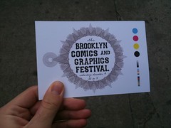
At the Brooklyn Comics and Graphics Festival!The concept of the comics convention is evolving into some interesting avenues, and a new example of what it can be was put-up for the public this past weekend: The Brooklyn Comics and Graphics Festival. Entirely supported by Brooklyn, NY comics shop Desert Island Comics and publisher PictureBox, who together sent out requests for participation only to the creators, collectives, and publishers whose work they most enjoy. This allowed the event to be small, curated, and best of all FREE for all to attend since no fee was exacted from the exhibitors or artists to hold a table!

Why? In the words of the organizers themselves:
"It’s good to try new approaches to old models! We like this approach better than your standard free-for-all, and it makes a better experience for the random spectator, which is good for comics in general. It’s less like a typical small-press fair and more like an art fair or edited comic anthology. It’s frankly an expression of our own interests, which is intended as a positive contribution to the larger comic and art world." (from the festival website)
But if the Brooklyn Comics and Graphics Festival is an experiment, it appears to be a highly successful one as this is the event's second year and everyone I communicated with had a great time. That's, both, on the exhibitor floor and on Facebook and Twitter after the fact.

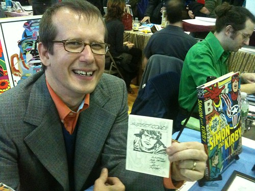
One of the many pleasant shocks of the Brooklyn Comics and Graphics Festival for me was the discovery that the Jack Kirby Museum offers, as a reward for membership sign-up, a mini-comic version of the singular example of the famous Jack Kirby making comics without editorial interference: "Street Code". It's about Jack growing up in New York City in the 1920s and it had never before been printed as a stand-alone comic. This is the guy who co-created characters like The Hulk, Captain America, and Darkseid bringing his fantastic design sense to the gang violence within, and the architecture of, the ghettos he grew-up in.

This is the museum's Rand Hoppe holding the comic in question:
Rand Hoppe of the Jack Kirby Museum holding a very important comic: "Street Code"!

I also saw the excellent comicsmith Jason Little (@beecomix) [who's in the above photo to the right] and spoke with him about publishing in print after publishing on the web, and bought his brand new mini-comic "Gimmick Illustrated" #1! And I saw and bought comics from the fine folk of Sparkplug Comic Books and the people who work together on the Sundays Anthology.

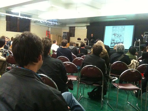
Bill Kartalopoulos (@bkny) ran SIX creator discussion panels from about 1 PM till just 40 minutes before the show's close at 9 PM. All the panels were held in the basement in which was built an impromptu stage and a screen with a small projector.

One of them was an introduction (for me) to the work of comicsmith Anders Nilsen. Guy creates some smart comics. He recently released "Big Questions" #15. (Nilsen maintains a website here.) This is Bill and Anders talking while the screen displays a page from a previous issue of "Big Questions":
Folk listening to Bill Kartalopoulos ask questions of Anders Nilsen (comicsmith of "Big Questions")!

Another of the panels was on the concept of editing comics. Who better to get than Francoise Mouly, the woman who edited her husband's famous comic "Maus". And another on hyper-detailed or hyper-textured art and whether or not it disturbs the flow of the reading experience in the comics medium. The answer-like thing we got was: No matter what the art looks like, the eye must be somehow guided though the images or the comic will fail to be readable. Which makes sense and is damn key to understanding comics!

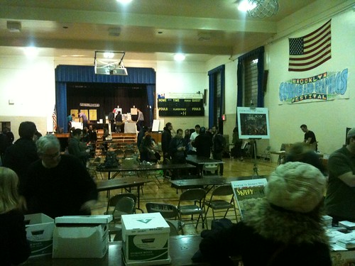
The exhibitor hall (well technically it was a basketball court but who's counting?) was closing down as I was leaving and I took this photo on my way out the door:
Closing time for the Brooklyn Comics and Graphics Festival

I had a damn good time!

As I've said many times before, the fact that there are different kinds of comics is healthy and keeping that variety will depend largely on people being interested in them.

As such?

Events like this are important and I'm glad this one was packed.

~ @JonGorga


P.S.

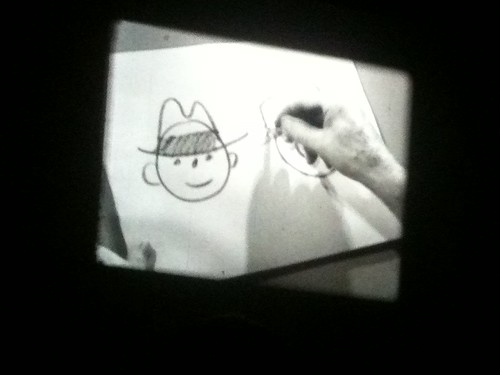
The day afterward there was a nice festival tie-in event around the corner at The Knitting Factory:
Mark Newgarden's 35mm reels "Cartoonists and Comics On Camera: 1916-1965"
[12/9/2o1o EDIT: Make that 16mm!]
35mm Cartooning 101 (2)
This was in "How to Draw Cartoons #3 - Expression" with Fred G. Cooper from 1944.

Very... edu-taining.

Godly Movements and Maimings

"Dawn of the Black Age" Part 1 from Shapeshifter Comics

The first thing that jumps out at you about this self-published comic isn't the gorgeous painted artwork. It's the production quality. Slick paper just shy of the quality Marvel and DC publish their corporate comics with, at the size of a double-sized issue (by the Big Two's standards). Plus the art reproduction is fine, the colors are sharp and the line-work clear. But there is a serious problem with the production involving the text and its integration with the page distracting the reader from the art and, more importantly, the story, that I'm going to explain later.

That said, the fully-painted Renaissance-style Jack Kirby-design influenced art itself is absolutely breathtaking. Especially on the splash pages: It seems that the wider a canvas Zack Stella has to play with, the more remarkable the result. Makes lots of sense if he is using actual oil-paint, as it sometimes appears he is. The visual storytelling on the simpler pages is also very strong, a sign not only of Stella's skill but the inspiration in writers Daniel Agatino and Nicholas Franco. An early page composed of just four panels shows Umbra, one of the gods in the multi-cultural pantheon Franco and Agatino have brought together, turning into the villain of the piece. [The page above is the one before this transformation; although it is also a fine example.] Sliding steadily into darker visuals and more vengeful dialogue, both directly inspired by Lucifer's turn away from the Christian god in the opening chapters of John Milton's epic-poem "Paradise Lost".

Even better is this moment in which the archangel Mithra stands and challenges the corrupted god Umbra:


The art that sold me on the comic-book is on pages 2-3, a double-splash page revealing the pantheon presiding over multitudes of angels. Another standout splash page is the supreme moment of betrayal when an angel spills the blood of an archangel for the first time. (I suspect it won't be the last before the story is done.) And all of those pale in comparison to the introduction of the Broken Tower, Umbra's base of operations in the celestial city of Prana. My god, this art! Unbelievable work. Stella undoubtedly brings a 'fine art' sensibility to the comic.

Although, the smaller panels cramp Stella's art and details have a smudgy look to them. It was once said that the proof-in-the-pudding of the medium of comics would have been a comic-script written by Shakespeare with visual art by Michelangelo, in the words of good ol' Stan 'the man' Lee:
"If Shakespeare and Michelangelo were alive today, and if they decided to collaborate on a comic, Shakespeare would write the script and Michelangelo would draw it. How could anybody say that this wouldn't be as worthwhile an artform as anything on earth? Comics are merely a method of telling a story through words and art." (Stan Lee Conversations, 105)
"Dawn of the Black Age" is as close as we are ever going to get! The weird thing is... it's a rough mix: the ornamental prose gets ahead of itself and covers the art at times when the visuals could use space to breathe and the paints are occasionally ostentatious and squeeze the text out from its proper placement. Comics is not "merely a method of telling a story through words and art", but a separate medium requiring visual storytelling, and as such the visual progression from moment to moment needs to be clear and smooth. Agatino, Franco, and Stella hit that sweet spot on several pages, but not consistently.

Truly the worst thing about the book is the lettering. Not the actual letters, mind you, but the text-containers and their placement are awful. The choice to letter the entire comic with basic text fonts and photoshopped balloons and boxes made of unique colors is not a bad one (in fact, every god character gets a unique color, balloon-shape, and font and that's AWESOME), but when your text containers are carved out of the rest of the image instead of drawn free-hand, the balloon tails are going to look awkward. Worse still, in showcasing the art, the dialogue and narration was sometimes moved to the edges of panels or right into adjacent ones! [See examples at left.]

If you don't think speech balloon's tails and placement are important in comics, imagine trying to watch a movie so badly sound-mixed that you can't tell which character is speaking, when, or from where! [Again, see left.] No bueno.

THE LONG AND SHORTBOX OF IT?
This work is proof that good comics can come from the mixture of visual art and literature, but truly exceptional comics come from a careful synthesis of different skills that make something else entirely. "Dawn of the Black Age" itself is exciting, gorgeous, and smart, even though it's missing one of the key production/design elements of a good comic: lettering. I am being critical specifically because there is quality and professional effort in every other element.

Shapeshifter Comics needs to solve this problem (by hiring a professional industry letterer, perhaps) because some great material is getting lost inside a muddle of colored balloons and boxes and it keeps this comic from being really great. However, if the true litmus test is whether I'll buy the next part when it comes out next year, I'm too curious as to how this epic tale continues not to. Franco and Agatino have me.
"for neither gods nor angels must ever forget..."
~ @JonGorga