
Showing posts with label Process. Show all posts
Showing posts with label Process. Show all posts


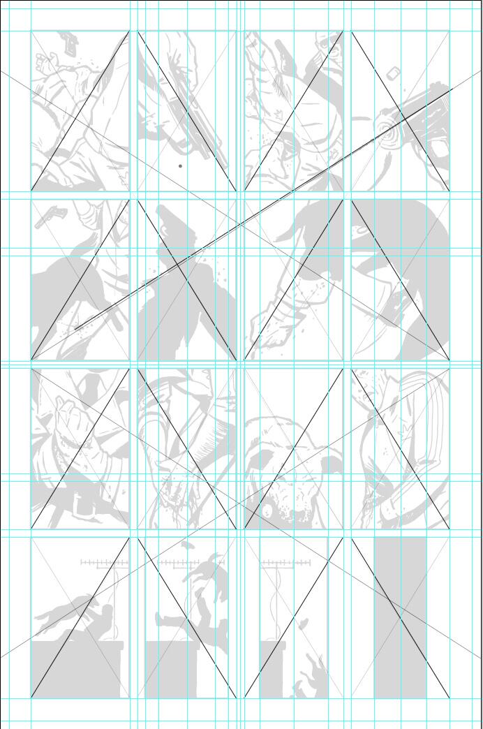
Process: Osamu Tezuka

Ever wondered how Osamu Tezuka came up with those wonderful backgrounds in works like Phoenix (1967-88) or Buddha (1972-83)?
Get a chart! By using established background fills, Tezuka could literally call in the artwork to his assistants. He’d simply indicate which numerical value he wanted for each background zone.
Craig Thompson and Process on Instagram

Earlier today, via facebook, Craig Thompson announced a new instagram, where he's posting pictures of his process for his upcoming all ages outer space adventure, Space Dumplins. I can't post the pictures here, but using that particular popular smartphone application to document a workspace as well as and alongside documentation of his process is clever; it's a good reminder that comics, any art, really, is created by people in places at a certain point in time and that to argue otherwise is contradicted by the evidence at hand.

Process: Vanesa Del Ray


Vanesa Del Ray has posted some stunning unfinished pages for the upcoming Hit, drawn by her and written by BOOM! Studies managing editor Bryce Carlson. Hit hits comic stands on September 4th.
Process: Gilbert Hernandez

From the Fantagraphics tumblr: "Gilbert Hernandez sends his originals to us for scanning, which gives him more time to draw. Here’s his next book!"

Process: Dash Shaw


Dash Shaw shares some process from his upcoming book New School:
A bar scene. I shuffled things around and eventually tilted the angle to make the space feel more dynamic and crowded. The first four photos are 18 X 24” sheets of paper, then the last (final) ink pages in the book are two 8.5 X 11” sheets — but the color layer is still done 18 X 24”. I draw things in stages, try to get fresh eyes on it somehow, sometimes one stage drawn a year after the stage before.

Process: Jason

Over at his blog, Norwegian cartoonist Jason shares some thumbnails from his upcoming detective book Lost Cat. His comics have always seemed to me extraordinarily, almost mystically, simple; his plots don't depend on major turns, he does much with just a few thin lines, and closing the space between them is often only a matter of making a few minor changes, the wholesale movement of a character, a change in expression executed by altering just a single stroke. What's most obviously distinctive about his work, though, is that most of it, in fact, all of the stuff I've seen with outside some strips in the collection of his early work Pocket Full of Rain, is done with bipedal cats, dogs, rabbits, and birds. What's interesting about the Lost Cat thumbnails is just how human some of the figures look, while the ones that don't look human, the ones that belie their final form as anthropomorphic animals, only do so because Jason has added, say, ears, to them. Strikingly, this makes his characters both human and not, and gives the cartoonist the freedom to place them wherever he pleases on the spectrum in between, meaning that great follows from small, that little additions mean great leaps in possibility and, ultimately, meaning.
Process: Bryan Lee O'Malley
Via Bryan Lee O'Malley's tumblr:


rough panel from Seconds.
getting there… hoping to finish the roughs next month and then start inking!!!!!!It's always nice to see an artist's process as they're in process, which is something that happens much more rarely than one would expect, I think. Seconds is O'Malley's long awaited follow up to Scott Pilgrim and its very exciting to see something like this from him, and to hear that he's close to a new phase in its production.

Process: Hawkguy


PAGE NINE - DAVID
CLINT and CHERRY, lit by Kate’s TAILLIGHTS, stare at their wheelman leaving them out to dry.
They look at each other.
CLINT stomps across the street, CHERRY waiting in the shadows. A TRACKSUIT stands outside, not noticing. A couple other STRIPPERS, a few PATRONS mill about the front door of the club. We can all but hear the OONTZ OONTZ music from within.
The TRACKSUIT is bro-ing at one of the strippers as CLINT stomps up, shouting HEY ADIDAS —
— and PUNCHES THE SHIT out of him, knocking the big guy off his stool.
The guy GETS UP in time for CLINT to HIT HIM BACK TOWARDS THE DOOR with that stool, hard —
(How to make HAWKGUY #8 Page 9 by David, Matt, Chris, and Matt)
(MF soundtrack: “Red Dress,” TV on the Radio)
Last week, Matt Fraction shared all of the work, from script to finished page, that went in to page nine of Hawkeye #8. See the rest here.
Shortboxes: Chris Eliopoulos, David Aja, Hawkeye, Matt Fraction, Matt Hollingsworth, Process
Process: Kris Straub

This week, I got caught up on Kris Straub's new Monday Wednesday Friday horror-webcomic Broodhollow. Straub is doing some really interesting formal stuff, stuff that I want to write about, but this morning he gave us a little gift when he posted the above strip, the foundation of the full strip he says he's going to post later today. Seeing stuff like this makes me wonder if anyone's ever done comics work that looks like this when its complete, in blue pencil and so on. I'm relatively sure someone must have but, if no one has, I think it could be a fabulous entrance into some easy experimentation with and commentary on the form.
Anyway, go read Broodhollow. You'll enjoy it.


Transatlantic Exchange
Quickly, I wanted to draw your attention to two pieces of process that cropped up over the last couple of days, one from an American working on a European comic, and the other from a European working on an American one.

.jpg)


.jpg)
The first is from former X-Men and Defenders artist Terry Dodson, who is working on the second volume of his so-far-only-published-in-Europe Songes series. I like Dodson's art because I think it strikes an interesting balance between traditional, stylized, cartooning and a kind of real feel-- I believe it, if that makes any sense. I also really like his process posts; because they tend to follow a particular cover or page from conception to finished product, they're both comprehensive and instructive. In this particular case, the lines in the inked image, on the left, are quite thin, and they give the page a confusing aspect, like there's too much going on. In the colored page on the right, the narrative is significantly clearer, despite the addition of a couple of extra elements even over and above the color. Although I tend to dislike coloring that has so many layers, Dodson's art works because it's complex, that's what makes it dynamic and fun to read, and the coloring adds a kind subtle depth that's lacking in the inked page, particularly when Dodson is using such a thin line.
The second of the posts is from David Aja, who often posts preview of the inked and then colored pages before a new issue of Hawkeye comes out. Now, without getting too deep into the weeds here, this is a great page. I love how well Aja mimics the aesthetic of a side scrolling arcade game, down even to the way that Spider-Man is turned slightly away in that middle panel and the way that Hawkeye falls straight down on the bottom left. I am particularly interested to see what purpose, exactly, a page this referential serves in the greater scheme of an issue, because it's either going to work or, well, it isn't. But the important thing to note here is in the thing itself; while the color clarifies the Dodson art above, here it serves to add pop, while the narrative is perfectly clear from the inked page alone. This isn't to say that the colored page isn't better, just that the color isn't necessary here in the same way it is above. This is because its component panels are devoid of unnecessary ornamentation; while much of Aja's early work on Immortal Iron Fist has exceedingly beautiful, detailed, composition, his work on Hawkeye has tended to emphasize complex page structure and panel interaction even as his what's inside those panels becomes increasingly minimal and crisp. His work, always fluid and kinetic, now consistently demonstrates the narrative clarity and playfulness that characterized the best pages and panels from Immortal Iron Fist.
To put too fine a point on it, I think that Dodson's style is representative of contemporary American (or Anglo-American) comics creation and, although my knowledge of Eurocomics is sad and minimal, I have a feeling that Aja's is similarly representative of a Continental style; to a large extent, I expect that we can trace the former to the energetic maximalism of Jack Kirby, while the latter probably springs from Herge and the limited frills of ligne claire. Of course, Aja's minimalism bears a striking similarity to trends in American art comics, and I think this points to an interesting split in American comics in general. In this context, it's heartening to see Aja's work become so successful, just as its nice to see Dodson make some overtures to the overseas market. I have a feeling that crossover projects like these are going to become increasingly common and, to the extent that they can encourage people like me to expend the extra time and resources necessary to pursue comics either published in Europe or drawn in European styles the same way we try to discover American ones, I think that they're a good thing.
Process: Brandon Graham
Over the last year, I've mentioned, I think probably repeatedly, that I admire the work of Brandon Graham. Graham has recently turned to tumblr, a platform through which he has shared, among other things, process work. My favorite bit of this detritus from this detailing of how the sausage is made is the below layout guide, which Graham sent to artist Giannis Milonogiannis for Prophet #31.*


It's easy to forget that comics is a collaborative process; often, we want a clean division between "writer" and "artist," but I think it's important to remember that many creators are both, even if they are credited as one or the other. Here, Graham is stepping into a part of production that we tend to think of as the artist's purview; elsewhere, like in the Marvel Method, the artist is probably much more responsible for the plot of the book than the writer is. One of the things thats interesting to me about this is the way that each group of creators seems to work differently, so that one particular thing that makes for a successful collaboration between Graham and Milonogiannis might not be useful for Ed Brubaker and Sean Phillips or for Kieron Gillen and Jamie McKelvie. There is, it turns out, more than one way to make good comics.
-----------------
*I don't think I'm going to do a top ten list but, if I were to, chances are that Prophet would be the book of the year. If you haven't checked it out yet, its time to give it a shot.
Subscribe to:
Posts (Atom)