Showing posts with label Bryan Hitch. Show all posts

The Best Way To Promote A Comic?

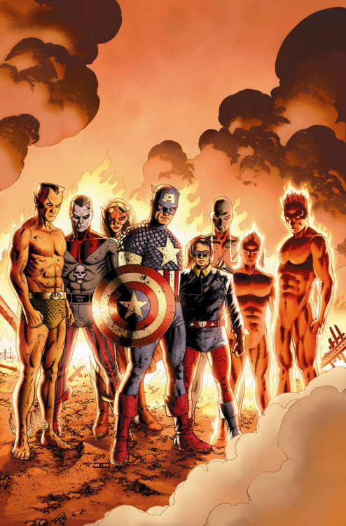
Earlier this evening, Marvel released a trailer for the upcoming Age of Ultron event, written by Brian Bendis and penciled by Bryan Hitch. Rich Johnston has, very kindly, made it embeddable:


In the past, Jon has fantasized about a future in which comics, and not just the movies based on them, are promoted on billboards in prominent locales, but, save that Fables spot that Vertigo ran on the BBC a few years ago, I'm not sure I've ever seen something quite like this. It's interesting for a few reasons, not least of which is that I hadn't realized that Marvel was releasing Age of Ultron at such a fast clip. Three issues a month seems onerous, and I wonder if it might affect the sales of either the crossover or of some the company's other books. I know that, in terms of my own purchasing, it's a lot easier to take an extra $3.99 out of my wallet once in a given month without thinking about it than it will be for me to do it three times in the same span, so I think I'm going to pass. On the other hand, one of my major complaints about crossovers, Marvel's in particular, is that they last so damn long; even shipping twice monthly, waiting for AvX to conclude was numbing. With AU lasting just three months and change, I can return, blissfully, to stories I actually care about much sooner than before.

To return to the trailer itself: I wonder if this is the best way to advertise comics. It is certainly one way of doing it, but it fails to achieve what's really great about the movie preview, which is that it can give a real sense of the thing that it promotes, while also divulging just enough plot detail to hook an audience. Now, there a few ways to nitpick this particular trailer-- it relies mostly on already revealed covers rather than delivering much in the way of the new, the narration is reminiscent of those old commercials for Power Rangers video tapes, it utilizes animation in a way that is even more insipid than most motion comics and, most egregiously, it doesn't do a good job of explaining who the creators are-- but I wonder if even one that was more well made woud be a good way of giving a sense of what a comic would be like.

Part of the reason that I suspect it can't be is that video and comics work on similar, but fundamentally different, visual principles. Each is a kind of window, yes, but, when you watch a film or a tv show, the size of that window, in this case some kind of screen, tends to be the same when you start the thing as when you end it. This seems likes it would be true with comics-- page sizes tend to be internally consistent-- but the base unit of the comic isn't the page; it's the panel. This is not to say that panel sizes can't be consistent, just that they aren't always, and, specifically, that Bryan Hitch doesn't make his that way. Hitch's "widescreen" art style is neat because it gives comics, very small in physical size, a wonderful sort of scale up, making some of his scenes seem grandiose in a way that is much more common in film. That said, the style only really works when there are also many smaller, less grandiose scenes, which is why no one constructs comics out of splash pages alone, and why they didn't even when the widescreen style was in vogue. The AU trailer, which generalizes panel size by mediating panels, not pages, through both editing techniques like the Ken Burns effect and the consistent size of the YouTube screen-within-a-screen, totally robs Hitch's art of what makes it work. Watching the trailer, it is possible to see that some the art takes the wide view and that some of it does not, but seeing that isn’t really the same as understanding it, isn’t the same as being convinced of it. That comics can make meaning through the way that the size of its building blocks relate to each other is one of the things that makes the form unique, one of the things that makes it great.

That the trailer can’t communicate why I might be interested in AU as a piece of art rather than as a particular story is why it fails. I know it might not be for me--it's too general to be coded for people who are already readers of comics-- but the hook isn’t such a great one that a potential reader would be sold on the book on plot alone. If Marvel really wants to bring new people into the fold, shouldn't they emphasizing what makes their product interesting? And if they want people like me to take a risk on a book that we're not otherwise inclined to buy, particularly if they’re going to ask us to shell out $11.97 a month to follow it, I can't help but wonder if there's some way to give us some of what we love.


Actually, the A Stands for Awesome.

I knew it.

I knew Reborn was going to get better. It had to. Brubaker and Hitch are, to say the least, among the best in the business. I have no idea why the last issue of the mini was so damn mediocre, and I have no idea why the art was so unbelievably terrible, but Reborn #4 is a very significant improvement over what I saw last month.

The art, in particular, is a lot better. There's no Namor in this one, so I can't really compare anything to that horrifying image from last month, but the figure-work on the whole is about a thousand steps in the right direction. It still isn't perfect- there are a couple images of Steve that, for whatever reason, aren't quite right- but it is pretty good, and there are several Cap and Bucky in WWII pages that are just fantastic. The way the story is being told through the art, too, has improved immensely. Despite the fact the last issue was such a misstep, I'm glad to see it's not turning into a pattern: Brubaker's story really deserved better, and it certainly got it.

Now, as far as that story goes; it got better, too. Every piece of the puzzle is beginning to come together, and the final roles of each of our players is beginning to become clear (and, in some cases, they already have). Although Brubaker's scope had appeared too broad (and, by the way, I can't believe I was worried about that) he appears to have it well in hand and the story seems to be hurtling towards a conclusion that's going to rock parts of the Marvel Universe- or at least specific corners of it.

For the first time since the end of the first issue, I feel like Reborn is going to be a worthy conclusion to what came before. Hopefully, it's just going to continue to get better.

Let's Compare

This, here, from The Marvels Project #3, is a fantastic piece of comics artwork. Namor is pissed. You can tell because he's shouting "RRRAAAAA" (which is exactly what I would shout, were I both pissed and also the prince of Atlantis). Anyway, the form of the picture is excellent. Steve Epting's figure work is among my favorite in comics and, although its not consistently mindblowing, his art is fantastic.

This, to your right, is another picture of angry Namor (this has potential as a feature. Keep your eyes peeled for ANGRY NAMOR TUESDAY)- but there's a difference. Everything that's right about the picture above is wrong with this picture right here- his muscles are too exaggerated, he lacks majesty, and, most concerningly, he looks like he's going to pop out of the page and eat me. What is he even doing here? I mean, I understand that the text says that he's "lost in rage", which sounds like Namor, but just because he's raging doesn't mean he's a lunatic- and that's how he's drawn.

I know I've dissed Reborn's art in the past, but reading the newest issue of the Marvels Project made it clear to me just how much Brubaker's story is suffering because Bryan Hitch (who's art I've really, really enjoyed in the past) can't seem to get his act together. Like I said yesterday, the writing in Reborn is pretty good- it's not Brubaker's best, but I suspect that despite all of the talk about "this being his plan from the beginning" that he may not have been quite ready to tell that story yet- but I don't think the story is being presented very well. This is vastly unfortunate- while Spider-Man is the publisher's flagship, Captain America is Marvel's most important character and, in many ways, Reborn is the beginning of his second act.

The Death of Captain America arc was a masterstroke- in a career of brilliant comics, I would argue that in many ways the story is Brubaker's crowning jewel- more than any other "event" in the past decade of Marvel continuity, I think it rocked the Marvel universe the most. While there have been plenty of game changers in that time, I think the effects of Cap's death are going to be felt for a long, long time- Bucky's continued presence in the MarvelU being only the least of those changes.

Siege, I think, is going to undo most of what these big events have done- I mean, look at the promo art. Marvel's Big Three are back together on the Avengers for the first time in almost five years. It's the end of Bendis's macro-arc and, like I said yesterday, I have faith it will be pretty good. At it's core, though, its going to be fundamentally about bringing many things back to the way things were- but Cap will never be the same. What I had thought to be clues that Steve was going to have a similair deathspan as Barry Allen, I think are actually clues that Steve's role is going to be different in this new universe.

That, however, is mostly an aside. The point is that I'm enjoying the Marvels Project vastly more than I'm enjoying Reborn, and it has nothing to do with Brubaker. Steve Epting's art, as always, is a joy; Bryan Hitch's is, surprisingly, not.

YOU THINK THIS A STANDS FOR AWFUL?

I want to love Captain America: Reborn #3.

I really do.

Most of you already know that I adore stories about Captain America, as I'm sure you also know that I adore Ed Brubaker, so, as I've said, I want to love Captain America Reborn #3. Except I can't.

Because the art is terrible.

Brubaker, as usual, is doing everything right- he has set up a good story, his characterization is excellent and, although his scope is abnormally large, it really does seem to work: with an event this big and this important, most of the Marvel Universe should be involved and, thankfully, Brubaker slims what could be a bloated monster down into a managable but approprately sprawling tale of being unstuck in time.

Bryan Hitch, however, seems to be mailing it in. I know he's capable of drawing Cap, because he's done it in the past, but here it just seems like nothing works. Everything, it just seems... wrong somehow. The Bucky in the panel above should look like a mess, because he's just been beaten up in the back of an airplane, but thats not why he looks like a mess up there- he looks like a mess because he was drawn t0o fast. This is a moment of victory and a moment of revenge, but Buck doesn't look victorious or vengeful- he looks like someone is about to hit him. And its just all wrong.

There are also too many horrifying images like this terrifying picture of Namor:

I don't know what it is about Hitch's figures here, but they're all terrible- there's an even worse one of Thor that I omitted because I love you.

Anyway. Reborn is good, but not great (but mostly because the art sucks) and it needs to get better, right quick, before what could have been a fantastic ending to a fantastic saga turns into a whole lot of nothing.