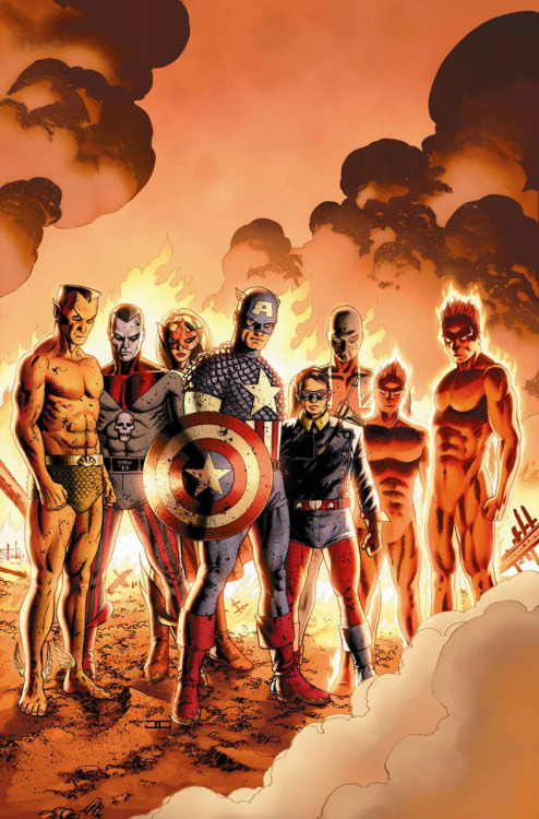
 I want to love Captain America: Reborn #3.
I really do.
Most of you already know that I adore stories about Captain America, as I'm sure you also know that I adore Ed Brubaker, so, as I've said, I want to love Captain America Reborn #3. Except I can't.
Because the art is terrible.
Brubaker, as usual, is doing everything right- he has set up a good story, his characterization is excellent and, although his scope is abnormally large, it really does seem to work: with an event this big and this important, most of the Marvel Universe should be involved and, thankfully, Brubaker slims what could be a bloated monster down into a managable but approprately sprawling tale of being unstuck in time.
Bryan Hitch, however, seems to be mailing it in. I know he's capable of drawing Cap, because he's done it in the past, but here it just seems like nothing works. Everything, it j
 ust seems... wrong somehow. The Bucky in the panel above should look like a mess, because he's just been beaten up in the back of an airplane, but thats not why he looks like a mess up there- he looks like a mess because he was drawn t0o fast. This is a moment of victory and a moment of revenge, but Buck doesn't look victorious or vengeful- he looks like someone is about to hit him. And its just all wrong.
 There are also too many horrifying images like this terrifying picture of Namor:
I don't know what it is about Hitch's figures here, but they're all terrible- there's an even worse one of Thor that I omitted because I love you.
Anyway. Reborn is good, but not great (but mostly because the art sucks) and it needs to get better, right quick, before what could have been a fantastic ending to a fantastic saga turns into a whole lot of nothing.

Heh, those are actually kind of funny they're so poorly drawn.
ReplyDelete