
A Convention By Any Other Promoter Would Smell As...

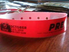
My press wristband for Big Apple Comic-Con 2o1oThis past weekend was the Big Apple ComicCon, a Wizard Magazine sponsored con, and I must tell you -looks left- -looks right- I didn't expect to have as much fun as I did! 

There was some disparaging talk about this con on the net (I'm looking at you @rickmarshall) and I feel the need to say up front and honestly: this con was not polished, this con was not slick. But this con was small enough to allow me to get one-on-one time with several industry giants and many talented unknowns. That's what I care about: comics people. 

Yeah, there were guys dressed as vampires running around making fools of themselves. There were industry creators getting drunk and blowing off steam. There were overweight men in their forties dressed ridiculously. But you know what? All of that is going to be at the bigger polished cons too. It's all in good fun and done by people who love to do it. More importantly, I didn't see even the smallest maliciousness or misogyny. Everybody was having a nice time. 

There was a nice mix of big names like Ethan Van Scriver (who was hilarious), Mark Millar (@mrmarkmillar - who was equally hilarious), J.G. Jones, Leinil Yu, Joe Madureira, guys you may not know like Rodney Ramos, Michael Golden, and Javier Cruz Winnik and some new faces: I met some very excellent and talented young comicsmiths like Brendan Leach (@iknowashortcut - who you WILL be hearing more about from us), Jungyeon Roh (@JungyeonRoh), the team at Pronto Comics (@prontocomics) and ShapeShifter Comics! 

I got really excited when I read Jungyeon's pre-press example of "Miss Eggplant's American Boys" and since it isn't really published yet and I can't review it or link somewhere you can buy it, I took a photo of her with it! 
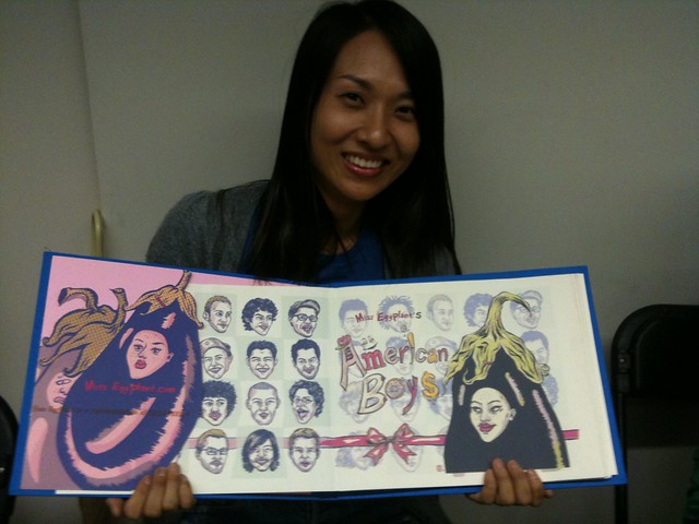
Jungyeon Roh and her short, but wonderful comic: "Miss Eggplant's American Boys".

It's a really cool piece combining the lyrics of the song "American Boy" with the immigrant experience and Jungyeon's character Miss Eggplant, a representation of veganism! It sounds ridiculous and... well it is, but it works thanks to her gorgeous illustration style and sense of fun. She has a site where you can see more here

Most importantly all of this meeting and greeting was done at an event of the perfect size! It really wasn't much bigger than MoCCA Fest, but with a few big names mixed in. 

ALERT -- ALERT -- soapbox moment! 

In the con wars, bigger is not necessarily better. I don't want to have to push through a crowd of Twilight fans to have multiple quality one-on-one conversations with a comicsmith. That said, I also believe there's room for everybody and every passion with proper planning. Big Apple Comic Con was well planned in this respect: the film/TV celebrities were on one floor, the comics dealers/artists/writers/comicsmiths were on the other one, and they shared the panel space on the third. SMART. 

Soapbox moment over. Thanks be to the spaghetti monster. Amen. (Can you tell I went to Catholic school?) 

One of those big names was Shane Davis, and I got a chance to speak to him quickly about "Superman: Earth One", the upcoming Superman graphic novel drawn by him and written by J. Michael Straczynski. Hopefully we will have much more for you about that after next weekend! 
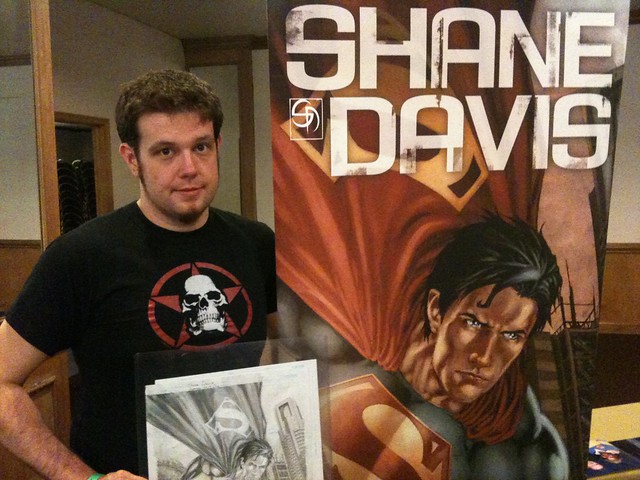
Shane Davis (artist of the upcoming graphic novel "Superman: Earth One")!

I wrote about this project a long time ago on this blog when it was first announced so it's really exciting to see it so near fruition now. 

Wow. A children's book-style comic about a sentient traveling eggplant and an action graphic novel about Superman. Can I get a HELL YEAH for the diversity of material in the medium? 

You know, as weird as this sounds, I think a big part of why this con was so good for me is because this is the first big comics event I've been to since joining Twitter. Being able to immediately THAT NIGHT on an iPhone before even getting off the train home(!) connect with the people I'd met during the day was great. 

Next weekend will be another of these things: the huge New York ComicCon! 

~ @JonGorga 

Also... the batmobile was there! tee hee! 
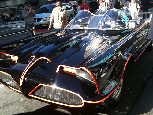
The Batmobile!? And the fanboy gets excited...

A Long Awaited Return...

Thor has, since its JMS driven relaunch a couple of years ago, consistently been one of Marvel's best books. Handled, as it should be, by premier talents like JMS, Olivier Copiel and now Matt Fraction and Pasqual Ferry (with fantastic up and comer Kieron Gillen acting as a bridge between the two), there hasn't been a bad issue of the book in a long, long time.

And Thor #615 may very well be the best of them.

Months and months ago, with the announcement of the creative team of Fraction and Ferry, Thor fans rejoiced- maybe the book will finally ship on time, we said. And ship on time it did, but with a pretty decent six month run written by Gillen that tied into the larger Siege storyline and acted as both prologue and epilogue to the larger shared universe story while tying up JMS's last loose threads. Now that Fraction and Ferry are here, though, aided by John Hollingsworth and John Workman doing colors and letters respectively, Thor fans should again rejoice, and doubly so: this is great comics, some of the best straight up superhero work Fraction has ever done.

Although we've seen great Thor writing from him in the past, this blows all of that other stuff straight off the world tree. The scope here is huge, epic and cosmic and takes its influences from the Thor greats of years past, greats like Kirby and Simonson (and if you don't believe that that's what Fraction and Marvel have in mind, then why do you think they brought Workman, who lettered on Thor for Simonson, back on board?). Fraction not only has a handle on all of these characters and their relationships- this is clear from the Thor/Donald Blake dialogue (which is a home run) and the way in which the titular character mourns for his half brother- but also the way a book like this should feel. The sense of impending doom, expressed explicitly near the end, that lurks underneath the whole story, that imbues it with a sense of urgency is an indication of just how brilliant, in both subtle and straight up ways, the writer can be.

Pasqual Ferry's art is soft in all the right ways, and his slight redesigns of the Asgardian garb to give it a more sci-fi feel and help signal the shift away from a fantasy based book. His art, although stiffer than I like generally, has a certain diffuse energy to it and his line, thin and soft, moves the comic away from Copiel's hyperrealism into a more mythic territory- this is not something you could walk out of your house and see going on down the street, and Ferry does a great job expressing it. Hollingsworth's soft colors and, in particular, Workman's fluid lettering help this impression as well.

If the next issues of Thor can be as good as this one- or, imagine, if they could be better- we have a new classic on our hands. Fraction and Ferry were a long time coming, but now that we have them we should feast and rejoice- they just don't make comics like this anymore, even if sometimes they try.

Talk Over Balloons: artist Shawn Martinbrough

This past February, after attending a Meet the Artists night at "Marvelous Color", an exhibit held at the Gallery of the Caribbean Cultural Center African Diaspora Institute, I had the stroke of luck to meet Shawn Martinbrough, the artist who drew "Luke Cage Noir", a Marvel Comics mini-series I'd recently reviewed. We've been in contact since and Shawn is highly appreciative of the type of work we do here at The Long and Shortbox Of It so he agreed to answer some questions about what was, in my opinion, one of last year's best minis. You, the reader, get to enjoy the dividends of our good luck in the form of this, our second interview on The Long and Shortbox Of It!

Jon Gorga: Shawn, thanks for answering some questions for us! So you're credited as penciler on "Luke Cage Noir" but I can see from your website that you did a great deal of reference research and I know that you were invested with the character from way back. I'm curious how much input, if any, did you have on the plot?

Shawn Martinbrough: No. When I came on board the script was already written by Mike Benson and Adam Glass. My role was to design the characters and visualize the script.

JG: Was that final plot presented to you 'Marvel style': outline without dialogue, or full-script: panel-by-panel descriptions with completed dialogue?

SM: I received a full script complete with dialogue and general panel descriptions. For the most part, the details were described very well in the scripts by Benson and Glass. I was really fortunate to have a ton of freedom to recreate the 1920’s Harlem and to create the look of the characters.

JG: You described the two common scripting styles in your book "How To Draw Noir Comics" as the simple script and the wordy script. Do I detect a preference there for you, as a penciler?

SM: For me, a simpler script is always better. It might create more work for the artist to interpret fewer descriptions but it also leaves more room to be creative. More importantly, a simpler script allows the art to have room to “breathe” and helps to tell the story visually.

JG: Makes sense. I always think of it as a balancng act: enough information to move the story, but not so much information that you bore the fuck out of the artist. I was really curious (and, honestly, at first skeptical) about how and why Tombstone was chosen as the 'super-villain' of the piece. Could you talk a bit about how you see his role in the story?

SM: Well, the decision to include Tombstone was totally up to writers Benson and Glass. Visually, he is an interesting character and his look is adaptable to the time period. In terms of his role in the story, Tombstone is the antagonist in both the past and present scenes in the story. When I first got the script I didn’t realize Benson and Glass’s version of Tombstone was supposed to be an albino African American so I designed him to resemble a John Gotti type. Later, I decided to pattern him after the famous Black activist Marcus Garvey. Tim Bradstreet, the cover artist for the miniseries, did an amazing rendition of Tombstone for the cover of part two. I plan to frame that print and put it on my wall.

JG: On the subject of drawing 'adaptable' to the time period, it must have been difficult to find the research materials necessary to give us a believable Harlem in the Twenties. Did you primarily use period photographs or some other method?

SM: Being a native New Yorker, I took numerous reference shots of present day Harlem. I always make mental notes of interesting locations for future projects and there’s so much beautiful architecture that’s still preserved in Harlem. The challenging thing about assembling photographic reference from that period is that there were not a lot of pictures taken in Black neighborhoods. Many of the famous photographs have been used repeatedly over the years. Certain locations in the script, such as the historic Theresa Hotel, are now office/apartment buildings so I had to extrapolate from past architectural reference to figure out what the hotel entrance and interiors would look like at the time.

I bought a few books on the Harlem Renaissance as well.


JG: One of my few critiques of "Luke Cage Noir" was the flashback scenes. I found them confusing for the first two issues until a bit more context was established in the third. So my two-part question is: Did you have a chance to talk with Benson, Glass, and your colorist, Nick Filardi, to strategize about the flashbacks? and Were you happy with the way they turned out on the printed page?

SM: I didn’t strategize with colorist Nick Filardi on his approach to coloring the flashbacks sequences. It’s always a little challenging from a writing standpoint to jump from present to past without actually stating “Flashback!” in a caption. I thought Nick did an interesting job of using black and white/grey tones to distinguish the flashback scenes from those that took place in the present.

JG: I loved that many of the scenes and pages in the series work fantastically as stand-alone one-page comics stories. Was that a conscious consideration for you and/or the writers? And, if so, would you recommend it to others as a way of constructing a story visually?

SM: Thanks. It’s funny. I remember when Axel Alonso, my editor at Marvel, first approached me about doing the project. Axel really stressed that he wanted simple layouts. No fancy floating, weird shaped panels, etc. He just wanted clear storytelling. I thought this was great because that’s pretty much my style of telling a story. If anything, with "Cage Noir", I probably simplified the storytelling layout even more.

I definitely try to make each panel interesting and strong enough to stand on its own as a single illustration but more importantly, to work as one part of a sequence. As an artist, the top priority is to tell the story that the writers have written in the most effective and interesting way to the reader.


JG: If I could move way off the main target for one question, I didn't realize until doing some research that you were one of the many artists working on the Batman character during the "No Man's Land" story-line, or 'event', whatever you want to call it. Those were the comics that brought me back to Batman after a long time in the Marvel camp. DC editor Denny O'Neil's description of the working process for that project from his "DC Comics' Guide to Writing Comics" paints a pretty interesting picture. Could you talk a bit about working on a project that massive, with so many different writers and artists?

SM: It was a fantastic experience working as the regular artist on Detective Comics during the 2000 relaunch. When the new creative teams were selected for each title they were given a new bible of Batman designs to follow and new elements to redesign. In regards to Gotham City, I was assigned specific neighborhoods to design from scratch. When working on Detective Comics, it was primarily writer Greg Rucka and I working with group editor Denny O’Neil and associate editor Joseph Illidge so it felt pretty insular from the other books.

JG: Wow. A chunk of an immortal imaginary city has your stamp on it, Shawn! Switching gears and looking forward: What's your next project in comics? And outside of comics? I know your company Verge Entertainment does film work as well as illustration and design.

SM: I’m pretty happy that my art instruction book “How to Draw Noir Comics: The Art and Technique of Visual Storytelling” which is published by Random House was recently selected for their e-Book series and is in its second printing. My company Verge Entertainment co-created with writer/artist Kevin McCarthy www.expoweekly.com, an entertainment website using an ensemble cast of fictional characters to comment on real-world celebrities, politics, and pop culture.

Imagine New York Times columnist Maureen Dowd and Travis Bickle of Taxi Driver working on staff at a Hip Hop inspired news/blog/gossip site. We’ve partnered up with Rodney Barnes the executive producer of the “The Boondocks” cartoon to develop EXPO for television.

We also have a number of original projects that we’re working on for animation, graphic novels and children’s books.


___________________________________
That all sounds pretty damn cool, right? A big thank you to Shawn Martinbrough for making the time to answer some questions from a reviewer (and a fan) for our readers!

Shawn keeps a personal site up an' running that you can see here and his production company Verge Entertainment can be found at Verge.tv

This Is A Good News/Bad News Kind Of Situation..

The bad news first: Danny Lewis, friend of the Long and Shortbox of it, has put his wonderful webcomic No One Believes In Monsters on hiatus.

The good news is that, in its place, Danny is posting a preview from a graphic novel he's working on called Raven Steals the Sun. The first page went up early this morning, and I want to be the first to say that it's absolutely gorgeous.

You can check out Danny's work here and if you like it you should check out his etsy store.

Heroes for Hire!

Not only are we going to see a new Power Man and Iron Fist mini from Fred Van Lente come December, but we're also going to see a Dan Abnett and Andy Lanning penned Heroes for Hire ongoing, featuring Iron Fist as well as Moon Knight, Ghost Rider, Elektra, The Punisher, Falcon, Misty Knight and Paladin (although the last three are missing from this preview image). All in all December is going to be a good month for Danny Rand, who is (have I mentioned?) one of my favorite comics characters.

For the record, I disagree with FVL that the Frubraker mythology from The Immortal Iron Fist has dried up. I think there are all sort of stories to tell using those ideas and those characters. With that said, though, I'm glad to see Iron Fist at all and in the hands of writers as talented as Fred and DnA. Those Immortal Iron Fist stories are great not only because of those ideas but also because, when written well, Iron Fist is a very, very strong character and I trust that both FVL and DnA have the task well in, uh, fist.

To say that I'm looking forward to this, which could ultimately amount to what I expected of the new New Avengers, is a little bit of an understatement.