No Sleep Before Brooklyn Comics and Graphics Fest
Filed by
Josh Kopin
on
Monday, November 19, 2012
The Brooklyn Comics and Graphics Fest was a week ago Saturday, so all of this is a little belated, but I just wanted to take a second to say that, as someone attending the festival for the first time, I kind of loved it and I kind of hated it. Although my initial impressions, all formed during two panels featuring Art Spiegelman, Chris Ware and Lilli Carre, among others, and moderated by festival cofounder Bill Kartalopoulos, were all very positive, my quick jaunt in the show area of the festival itself left my sweaty and breathless. I can see why the fest's organizers like the space, at Our Lady of Mt. Carmel Church, but the sheer number of people milling around made it impossible for me to enjoy myself and, more importantly, to do the discovery that I came to do. Of the eleven books I went home with, I had walked into the show intending to buy six, with an established desire to also check out Blexbolex, whose books I ended up buying at Desert Island later, rather than in the exhibit hall itself.
That I shimmied out of Our Lady of Mt. Carmel as fast as I could manage isn't any kind of tragedy, but I would have liked to have been able to investigate more stuff before I became too flustered to function, particularly since the festival did a very good job of attracting European and Canadian publishers with whom I have very little experience or exposure. I also would have liked to have spoken to Jordan Crane; although I purchased all four volumes of his Keeping Two collection minis, I would have liked to have had his ear for awhile, if only to say that I give The Last Lonely Saturday to anyone who doesn't believe that comics are worthwhile. That I didn't feel like I was able to is, I should add, my fault and my fault alone.
Obviously, I think its good that people are showing up to shows like this, and, obviously, I'm happy for the BCGF people that their show was such a rousing success. But I also want to say that I don't think that the organizers were prepared for the kind of crowd they were going to get: the day's first panel, which featured Spiegelman and Ware, was standing room only, and a few people were sitting in the Knitting Factory's bar and listening in to the discussion as it was going on. Kartalopoulos, for his part, seemed genuinely surprised that there was going to be such good turnout for Art Spiegelman and Chris Ware. I don't really know how to explain that. I want to like BCGF, I really do, but unless they move venues next year I don't think I'll be going again.
What I might go to, though, are happenings associated with festival but outside of the exhibitor hall. I thought all of the events and showings that I attended were excellent, and over the next few weeks I want to pick apart a few of things that Chris Ware and Art Spiegelman said in that first panel, as well as think about the gallery settings for the work of Lilli Carre and Blexbolex which, as always, is an exceedingly difficult venue in which to approach comics as a kind of readable art. I first wrote about Carre's art in a gallery context almost two years ago, and its going to be satisfying to approach again, particularly since the work she showed at Desert Island comics was much more appropriate for gallery walls that what I saw before. The work of Blexbolex and Oliver Schrauwen was similarly suited for viewing in this way, although, I think, for much different reasons, and I'll talk about that too.
All of this is to say that I think BCGF was extremely stimulating from an intellectual point of view, so much so that I'm going to spend some time writing about it, but that I wish that it had done a better job of allowing for the serendipity of discovery at the tables of the people who had come to share their work.
Process Variance: Stephanie Hans
Filed by
Josh Kopin
on
Friday, November 16, 2012
Stephanie Hans did this neat .gif of her process for her Young Avengers #2 variant cover.
And, NOW!: Iron Man #1
Filed by
Josh Kopin
on
Tuesday, November 13, 2012
And, NOW! is a series of posts about Marvel NOW!
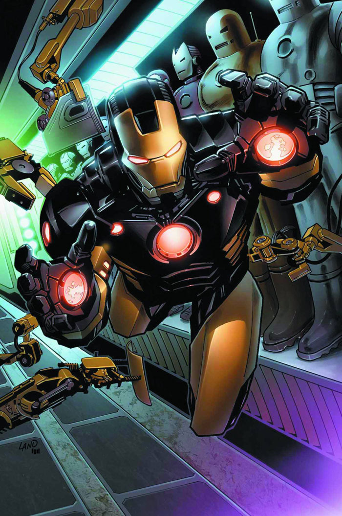
Let's get one thing straight: Greg Land is not a bad artist. He's not a good artist, either, but I think I've been hyperbolic about his work in the past and I just wanted to clear this up. Although I'm not attracted to his artificial style, which is a stiff and lightboxed parody of photorealism, I am willing to admit that his lines are solid and that his characters have a certain boldness, a kind of magnetic density that draws the eye towards them and away from the rest of his compositions, which, themselves, merely suggest scene dressing.
Part of the problem with that kind of composition, though, is that individual panels often closely resemble one another. To avoid a repetitive page, then, Land is forced to pull the reader a great distance in between panels, effectively slowing any natural movement from one to the next by forcing the reader to close more space than he or she should have to. Since the relaunch of Uncanny X-Men, a year ago, though, he's been doing a few things that ease the reading experience, like varying compositions in interesting ways and, most importantly, allowing panels to interact with each other through the gutter. In the sequence below, for example, the cell phone flies out of one panel, up and over the gutter, and into the next one. The move between individual compositions is kind of awkward, the first indicates movement and while the second is still, but the airborne phone suggests, very deftly, how the character in the white shirt moves while the reader is in the space between.
All of this to say that I'll defend Greg Land, yes, but only up to a certain point-- his human characters all have exaggerated soap opera facial expressions that leave much to be desired. Like Sal Larroca before him, though, his style lends itself to the drawing of machines, so that his version of the Iron Man armor is dynamic in the same way that his drawings of people are stilted, at least in terms of the individual panels. This seems to make him a perfect choice for Iron Man and he may indeed prove to be, but only if Kieron Gillen does his damnedest to keep Tony Stark in the suit rather than leave him out of it.
Basically, its up to Gillen to write for his artist's strengths, in a way that Matt Fraction didn't always manage to do when he was writing for Larroca. Reading this first issue, it seems likely that this will be the case, since Gillen is eschewing Fraction's fascinating corporate espionage angle in favor of a more traditional man-of-action faces down terrorists kind of plot, one that will require Greg Land to draw more than one kind of armor. For his part, the writer does a pretty good job, even managing to relatively concisely explain a piece of information from an old Iron Man arc, even as he's placing it at the center of his own story. It's a masterful example of how good shared universe writers can relay enough information to keep new readers in the loop while still managing to keep old ones interested. Gillen has experience with this particular kind of counterterrorism story, often pulling it out during his Uncanny X-Men work, but much of that stuff was sort of out there and I expect that he's going to play Iron Man much more traditionally.
I think Fraction and Larocca's work with Tony Stark is probably definitive for the next little while, but if Gillen can keep it up, and if Land can behave, then we may very well have another classic on our hands.
Let's get one thing straight: Greg Land is not a bad artist. He's not a good artist, either, but I think I've been hyperbolic about his work in the past and I just wanted to clear this up. Although I'm not attracted to his artificial style, which is a stiff and lightboxed parody of photorealism, I am willing to admit that his lines are solid and that his characters have a certain boldness, a kind of magnetic density that draws the eye towards them and away from the rest of his compositions, which, themselves, merely suggest scene dressing.
Part of the problem with that kind of composition, though, is that individual panels often closely resemble one another. To avoid a repetitive page, then, Land is forced to pull the reader a great distance in between panels, effectively slowing any natural movement from one to the next by forcing the reader to close more space than he or she should have to. Since the relaunch of Uncanny X-Men, a year ago, though, he's been doing a few things that ease the reading experience, like varying compositions in interesting ways and, most importantly, allowing panels to interact with each other through the gutter. In the sequence below, for example, the cell phone flies out of one panel, up and over the gutter, and into the next one. The move between individual compositions is kind of awkward, the first indicates movement and while the second is still, but the airborne phone suggests, very deftly, how the character in the white shirt moves while the reader is in the space between.
All of this to say that I'll defend Greg Land, yes, but only up to a certain point-- his human characters all have exaggerated soap opera facial expressions that leave much to be desired. Like Sal Larroca before him, though, his style lends itself to the drawing of machines, so that his version of the Iron Man armor is dynamic in the same way that his drawings of people are stilted, at least in terms of the individual panels. This seems to make him a perfect choice for Iron Man and he may indeed prove to be, but only if Kieron Gillen does his damnedest to keep Tony Stark in the suit rather than leave him out of it.Basically, its up to Gillen to write for his artist's strengths, in a way that Matt Fraction didn't always manage to do when he was writing for Larroca. Reading this first issue, it seems likely that this will be the case, since Gillen is eschewing Fraction's fascinating corporate espionage angle in favor of a more traditional man-of-action faces down terrorists kind of plot, one that will require Greg Land to draw more than one kind of armor. For his part, the writer does a pretty good job, even managing to relatively concisely explain a piece of information from an old Iron Man arc, even as he's placing it at the center of his own story. It's a masterful example of how good shared universe writers can relay enough information to keep new readers in the loop while still managing to keep old ones interested. Gillen has experience with this particular kind of counterterrorism story, often pulling it out during his Uncanny X-Men work, but much of that stuff was sort of out there and I expect that he's going to play Iron Man much more traditionally.
I think Fraction and Larocca's work with Tony Stark is probably definitive for the next little while, but if Gillen can keep it up, and if Land can behave, then we may very well have another classic on our hands.

Process: Pasqual Ferry
Filed by
Josh Kopin
on
Monday, November 12, 2012
Pasqual Ferry draws Wakanda. I was determined to avoid A+X, but this looks good enough that I'll have trouble passing it up.
Subscribe to:
Posts (Atom)