Showing posts with label underground. Show all posts

Ilias Kyriazis Self-Publishes New Mini-Comic

Mister Ilias Kyriazis, Greek comicsmith of "Falling For Lionheart" (the graphic novella of last year I had huge anticipation for, really enjoyed, and included on my Best of 2o1o List), has a brand new short comic called "The Dragon And The Ghost" soon to be self-published and available exclusively on his website.

[via Ilias Kyriazis' Google+ account]

Look at this gorgeous thing:
"Falling For Lionheart" was sad, funny, beautiful, enlightening, smart, explosive with action, delightful with romance, and still clear in its main plot-line. Drawn in smooth, simple, cartoony lines, still solid enough to give weight to the characters' realism, and colored vividly and dramatically. Further, the use of the two very divergent styles: slick superhero and rough underground make the story tick in a new beat from one moment to the next.

The comic is so good, it nearly defies description. And that is only part of why a review of it never appeared here from me. I really should have completed one, because there is not nearly enough awareness of European comics here in the US.

His few comics online are also great. If you're a Beatles fan, prepare for a mind-fuck of a comic in "The One and Only Billy Shears". Marvel at his adaptation "The Iliad in Sixteen Pages". The two pages of POV from within an ancient Greek helmet deserve an award in and of themselves.

"The Dragon And The Ghost" has been previewed here (in Greek) by Comicdom.com and I'm excited even though the article isn't in a language I can read. The comic's promotion is for several reasons... inscrutable.

The opening line of the comic's short description up on the website is:

"Deep in the forest lives Therr Zon Aakh, the last American dragon."

This is the three-quarter splash page that got me a bit tingly:

Yes, that does appear to be a cavern full of treasures of history, art, and nature. I'm not entirely sure what all that means? At all? But I'm in.

"The Dragon And The Ghost" mini-comic is available exclusively directly in his online store that opened here yesterday.

~ @JonGorga

Xeric Foundation Announces Grants for Comics Will End Next Year

Since 1992 Peter Laird, co-creator of "Teenage Mutant Ninja Turtles", has awarded through his small organization called the Xeric Foundation an astronomical amount of money to various charitable groups but also to aspiring comics creators who could produce work of high quality that was ready to be published.

(As I understand it, a comicsmith or creative-team had only to show their completed work, argue its merit, and lay-out a budget/plan for publication to be eligible for the Xeric Award, a one-time grant that simply paid out that planned publishing cost-budget.)

I can imagine few more beautiful things.

Ryan Alexander-Tanner (@ohyesverynice) was a winner of the Xeric for his short piece "Television" #1 back in 2oo7. He created with education reformer Bill Ayers (@BillAyers) a graphic novel about teaching I reviewed last July. Brendan C. Leach (@iknowashortcut) also won just this past year for his "Pterodactyl Hunters in the Gilded City". We spoke together at great length about it back in October. Both works were named by me among the best of the best last year. You can see the full list of grant recipients including Megan Kelso, Jason Lutes, Adrian Tomine, James Sturm, Jason Little (@beecomix), Danijel Zezelj, Josh Neufeld (@joshneufeld), Ryan Dunlavey (@RyanDunlavey) and Fred van Lente (@fredvanlente), Nathan Schreiber (@nathanschreiber), and Jeff Lemire (@JeffLemire), on Xeric's website here.

Unfortunately, according to this announcement on Xeric's website, they will cease the annual giving of the Xeric Award in 2o12.

[via The Center for Cartoon Studies' Facebook wall]

In Laird's own words:
"Roughly twenty years ago, I started something called the Xeric Foundation. It came about because, with the success of the "Teenage Mutant Ninja Turtles" property that Kevin Eastman and I had created back in 1983, there were a lot of people asking for money. Many of these requests were legitimate and came from real need, and I wanted to find a way to deal with them in a fair and organized fashion.

I also wanted to help out struggling comic book creators. Having started TMNT with Kevin as a self-published venture, I knew very well how critical even a relatively small amount of money could be for success at that nascent stage.

...

The advent of essentially free web publishing has forever altered the way aspiring comic book creators can get their work out into the public eye. With this in mind, I have decided that it makes sense that the Xeric Foundation will no longer provide grants to self-publishing comic book creators, and instead devote all of its available grants funds to charitable organizations."

Yeah. That last part is a little weird. But logical.

On the other hand, are we really to believe that this has nothing to do with the current economic recession?

This truth is the Xeric has come to stand as a mark of quality, an indicator of who might be expected to produce remarkable work in the coming years, as well as a piece of concrete proof that the American comics industry is a small community in which the large figures interact with the small ones and really GIVE BACK.

Taking that away from the world is a sad thing.

~ @JonGorga

P.S. ~ Of course... more money being donated to charity. Who's going to argue with that? Not this guy.

One Expanding Comicsmith in DC's Reboot, Many More in Other Avenues

Is a filmmaker better if he plays several roles in the creation of his film, like a writer/director or writer/actor? Is a film better for having a single authorial voice or better understood for being watched expecting a single voice? This guy thought so:

Francois Truffaut first advanced the position that the director of a film was its primary creator in France in the 1950s

Auteur theory (auteur is merely the French word for author) is a term for the theory or concept that states: the director takes control of a film, therefore he/she is responsible for it. It seems to me, the term could apply to any of the other principle craftsmen on a film, and I prefer the less-pretentious filmmaker. Film + maker.

Firstly, as I understand it from studying the industry, the closest parallel to the director in comics is the editor. The editor coordinates and guides the writer, artist(s), colorist, letterer, etc. to make a single cohesive work of art. The Japanese already have a word for a one-man-comics-machine as their comics industry is primarily made up of writer/artists leading teams of assistants. They call creators manga-ka. Manga = comics + ka = person. This is as similar as we will get to auteur in comics. As a parallel and as a hopefully more down-to-earth option, I have been referring since sometime in college to someone who undertakes several roles in the creation of a comic as a comicsmith. Comics + smith, a synonym for maker.

-Language lesson OVER.-

Storytelling in comics is a unique game. It requires visual/space thinking but also narrative/time thinking to do both sides properly. Doing both well is a rare thing.

MajorSpoilers.com has posted a simple list of the new series debuting from DC's re-boot in August/September you can read here. Out of the 53 titles they list, one of them will be written and drawn by the same person:

"Detective Comics" will be scripted and penciled by Tony Daniel. [The cover of the new #1 by Daniel is at left.] After illustrating Grant Morrison's scripts for a few years, Daniel held-up both ends of the creative exchange on "Batman" from issues #692 to #699 and then from #704 to the most recent issue, #711.

CBR interviewed him about his work at the keyboard and the drafting table twice. Once when his first run was about half over and again recently when his part in the relaunch was announced.

My opinion?

Sadly, Tony Daniel's issues of "Batman" were some of the most boring superhero comics I can remember reading. Very nice art. Nothing in the writing made me want to continue reading it. And sometimes I felt that things in the art seemed rushed and I suspect that it looked as good as it did thanks to inker Sandu Florea.

I thought of Daniel's first stint as a comicsmith as an exciting experiment for contemporary American mainstream comics and expressed that I would be curious to see how it was way back when we were posting weekly looking-forward-to posts here on The Long and Shortbox Of It. But as an experiment, I was sadly dissatisfied with it. DC doesn't seem to think along the same lines. According to Daniel's second interview linked-to above, he was approached by the company to do the writing for a second series as part of the upcoming relaunch. He is now also writing "The Savage Hawkman", to be drawn by Philip Tan (@philipsytan) according to Daniel's scripts, as well as swapping Batman titles with Scott Snyder (@SSnyder1835) and Francesco Francavilla (@f_francavilla), who were the team on "Detective Comics" previously and will now work on "Batman" instead. And Daniel is actually just one of several comics-artists being given a crack at writing scripts for another artist to illustrate. They might all turn out to be excellent writers, but it seems like a dangerous chance to take at such a crossroads for the company and the whole industry.

(Before I move on I have to say: "Batman" #702 written by Morrison, drawn by Daniel, and inked by Florea made it to my Best of the Year post. So I've got nothing against Tony Daniel. Truly and wholeheartedly, I wish him luck writing two series and drawing one of them. A challenge for anyone.)

Why is it the Japanese mainstream makes the comicsmith position the norm, and the American mainstream makes it the exception? I suspect a great deal of it lies in the aforementioned art teams the Japanese creators regularly employ. Here, artists do often ask the help of their fellow artists to complete their work, but only in a time-crunch, and always under the radar. Americans have this silly concept of the individual against the world, fully self-reliant. Which brings me back, of course, to the main question: Why so few creators who do it all themselves?

Mind you, that's entirely untrue outside of the American mainstream, these are all American comicsmiths:

Jason Lutes
Jason Little (@beecomix)
Chester Brown
Jeffrey Brown
Peter Bagge
Gary Panter
Gabrielle Bell (@luckygab)
Brendan Leach (@iknowashortcut)
Julia Wertz (@Julia_Wertz)
Dennis Pacheco (@dpacheco)
...

THAT list goes on far too long to name them all.

So could it be that being a good comicsmith, making quality comics all on your lonesome, simply takes time? Time not available to the maker of the monthly 22-page corporate comic-book? Seems possible. Could it be that the simple exchange required with an editor, inker, colorist, production man, etc. makes it far too messy? Seems equally possible. (As someone who makes comics without any collaborators himself and does it very, very slowly... I can tell you those ones make sense.)

There's a new comic-book called "All Nighter" I'm looking forward to reading, available in comics shops across the country from Image Comics, written and drawn by one man: David Hahn (@david_hahn). Looks good. Look for a review of that book from me in the coming months with a bit more commentary on this subject.

~ @JonGorga

P.S. ~ This gent over at CBR has some excellent and clear things to say about both DC's reboot and the digital release news in general.

I've written three articles that at least touch on the DC re-boot now. I think I'm done talking about that whole mess for now. Until the books are actually on the shelves, at least. Josh looks like he has a bit more to say on it. You'll get your fix from him hopefully.

The Mini-Market

If you think you know comics, and your main comics-reading staples are Batman and Spider-Man, I suspect you'd be surprised to know about the whole world of comics work coming out of the culture I label (for lack of a better term) the self-publishing underground.

Let's breakdown the American comics publishing market into strata of scale: The mainstream. The independent. & The underground. I see everything that comes out as existing along a spectrum that passes through those three levels.

There's the mainstream superhero material coming out of Marvel (@MARVEL) and DC (@DC_NATION) at the top and the guys like Image (@imagecomics) and Dark Horse (@DarkHorseComics) who produce very mainstream things, sometimes copying the Marvel/DC model sometimes not, just below them. Then there's the fine companies like Boom (@boomstudios) and Oni (@OniPress) producing material slightly off the beaten path, but still very commercial. Then there's the boutique publishers like drawn & quarterly (@DandQ) and Fantagraphics (@fantagraphics) releasing graphic novels and reprinting stuff from the group in question:

The creators of mini-comics.

"Mini-comics" is a term I don't use often on this blog but it serves a purpose. A zine is a self-published booklet, a short cheap magazine -- a 'zine. There's an entire culture of writing, printing, distributing, and trading these 'little' magazines. A similar culture exists for minis. And just as with zines, minis are not always small, I use mini-comics to mean self-published print comics. And some of them are amazing.

Pete's Mini/Zine Fest is an annual event in NYC to showcase the smallest of the small press of comics at a bar in Brooklyn. You should go to Pete's Candy Store (@petescandystore) tomorrow (Saturday, the 28th) because although this show is small, I assure you the surprises in store are big.

~@JonGorga

Boredom Brings Tall Tales and Good Comics.

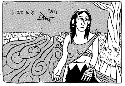
"Lizzie's Tale Tail" from Darryl Ayo

In a world of huge superhero event-comics (Marvel (@Marvel) has begun "Fear Itself" and DC (@DC_NATION) has released the first issue of "Flashpoint" this past month) and unnerving underground sexual-confessional comics (Chester Brown just spoke at The Strand bookstore (@Strandbookstore) yesterday on "Paying For It: A Comic Strip Memoir About Being a John") and comics from different world cultures crowding my brain (these past months I've been introduced to the work of comicsmiths from Japan, Denmark, and Romania)... it's really nice to read a short, simple, well-made, (and best of all) FUN mini-comic.

Darryl Ayo (@darrylayo) puts heart and mind into his comics full-throttle:
This one's got a fawn, a magical mermaid, a guy with dreads and four arms, and one bad-ass humanoid main character with a tail named Lizzie! And the whole thing can be read between average NYC subway stops.

Ayo's art is not supremely polished here, he is not a master draftsman, but his storytelling technique is excellent. Note the depiction of a few feet of water in which hides our hero's rescue in the form of a mysterious mermaid! A simple double smooth stroke denotes the water-line and all items below said water-line are ever-so-slightly distorted to give us that underwater fish-eye-camera view.

The action is smartly realized on the page (most of the time...) despite the fact that the piece is pure comedy and the action could have looked like crap and we would have gotten the jokes just as well.

My favorite panel is the climactic moment two pages later in which the mermaid smacks into the four-armed dude! The figures don't seem to have the proper weight of collision but the composition of the panel is dramatic and FEELS accurate (the four-arms on the single torso rarely works as well as it does here), and the cartooning-work in the faces of all three figures belies this great surreal feeling for me: Each character clearly has a distinct thought in their head at this exact moment. I love it.
A good amount of the faces in the comic in general are delightful actually. Lizzie's near-constant look of nonplussed bravado in the face of chaos makes for great deadpan humor.

She battles these various creatures to a stand-still and is finally gifted a bronze pendant by her silent aquamarine saviour. But the entire delightful little pseudo-mythological story is a framed story, opening and closing with a simple interaction between friends in a typical urban setting.

A simple question lead to this grandiose over-the-top spun tale of courage and violence and it ends with:
"
Oh come OFF it!
You got that pendant at Medusa's antique shop. I was there.

Oh yeah.
Yeah.
"
Priceless.

"Lizzie's Tale Tail" premiered last month at MoCCA 2o11 where I met Darryl and bought the mini on the recommendation of Mike Cavallaro. Darryl maintains a website with a lot of comics and excellent comics commentary at Let'sGoAyo.com Check out his stuff.

~ @JonGorga

Last Weekend's MoCCA Festival Got The Voice

If you happen to be a comics creator and a comics journalist you probably got the same weird experience I did from reading the latest issue of The Village Voice, "The Comics Issue". The main article is about how underpaid comicsmiths really are. The article is quite good from a journalistic point-of-view: honest and comprehensive. But tremendously depressing from an artistic one. The article is well worth checking out if for no other reason than to hear in first-hand quotes how hard it is for even fairly well-established comics creators to make some money.

On a lighter note, just try and tell me that cover isn't hilarious! Wonder Woman as if drawn by Lynda Barry! Charlie Brown as if drawn by Jack Kirby! The Thing as if drawn by the SpongBob SquarePants... guys. Dilbert as if drawn by Dan Clowes! Dagwood as if drawn by Chris Ware! Archie as if drawn by Peter Bagge staring at the ass of an Olive Oyl as if drawn by R. Crumb!

I love it. It's wrong and disgusting and clever and true all at the same time.

MoCCA Festival 2o11 - The Floor
On a MUCH more positive note, this year's MoCCA Festival was great! The Voice issue was obviously timed to coincide with the Festival and they were smart to do so as the The Museum of Comic and Cartoon Art's (@MoCCAnyc) annual fund-raiser has grown to be the premier event of the New York City indie comics year. It also drives in loads of alternative/indie/hipster/zinester/curious types who may have never picked up a comic in years. And this makes me feel good about the health of the industry in general, and the print and independent elements in specific. Jon Lewis, creator of some very cool comics, [pictured at the left below] and I talked about that specifically. Underground people making comics intended to be PRINT comics, as I wrote about for the blog here.

I met, re-met, bumped into, and passed by more people than I can remember.

Jason Little (@beecomix) was there, as was Josh Neufeld (@joshneufeld). Comicsmiths Danny Lewis (@dannydoodar) and Jen Overstreet (@streetoverjen) shared a table. I met Melvin Ylagan, who was once an assistant to Joe Quesada, former EiC of Marvel Comics. Near him was a very talented artist and new friend to me in comics, Miguel Guerra (@SamuraiElf). Steve Seck and Sara Lindo rocked me with their mini-comics making knowledge as usual. They tabled with Lance Hansen of Kettle Drummer Books this time around. Morgan Pielli (@UltraMorgnus) was in the back, holding the fort with his awesome comics [he's one of the fuzzy heads in the phtoto below!] The very talented Mike Cavallaro and Dean Haspiel (@deanhaspiel) were in attendance representing the ACT-I-VATE folk! Plus the always lovely Gabrielle Bell (@luckygab) was selling her minis near the Pizza Island Collective (@Pizza_Island) booth.

The two most exciting moments for me (other than actually working behind a table a little bit for the first time!) were: A sighting of the true gentlemen of comics, Jerry Robinson. And meeting Julia Wertz (@Julia_Wertz) creator of the wonderful autobiographical series "The Fart Party" and graphic novel "Drinking at the Movies", which feels very much like what it is to be in your twenties, living in New York City in a recession, making comics but no money. (I know from experience.)

I wrote some shout-outs right after leaving the convention on the @LongandShortbox Twitter account! Check them out.

MoCCA Festival 2o11 - Jon Lewis Tabling
I also picked up a SLEW of comics, some of which I will review over the next few weeks here on The Long and Shortbox Of It.

~ @JonGorga

Talk Over Balloons: Anders Nilsen

During the last week of my winter break this past January, I made it to Chicago's Museum of Contemporary Art to see an exhibition called New Chicago Comics. While there, I encountered the work of cartoonist Anders Nilsen and was immediately enthralled. Anders recently finished up work on the collection of his many-years-in-the-making opus Big Questions, and kindly took the time to answer some questions for me.

Josh Kopin: What are you reading (comics, prose, poetry, whatever) right now?


Anders Nilsen: I recently read The Reluctant Mr. Darwin by David Quammen. And God is Not Great by Christopher Hitchens. What else? I just had dinner with Jeff Brown and he gave me a stack of stuff. He did a little minicomic about stuff his son says. Which is awesome.

JK: Are there particular artists or writers that you feel indebted to as an artist?

AN: Sure, tons. Since finishing Big Questions I've been reflecting about it a fair amount. It occurred to me the other day that it might be my best approximation of Herge combined with Daniel Higgs, formerly of the band Lungfish.

JK: You live and work in the city (Chicago) that I consider key to my own cultural growth. Can you talk a little bit about what, if any, artistic relationship you have with the city?

AN: I don't know. The Department of Cultural Affairs gave me money several years ago to help with printing costs when I was still self publishing. People often ask why so many cartoonists come from, or live in, Chicago. I really have no good answer for that. Part of the reason I'm here is that I'm from the midwest originally, and after living in other places for a while I wanted to be back here (even though Chicago is in many ways very different from Minneapolis, where I grew up). The people are down to earth in a way that I appreciate. There's a sense among the artists and creative types that I know, that we're all in this together, us against the world. A place like New York feels much more competitive and cut throat to me. Which has its good points certainly–the place is brimming over with interesting art and culture–but it's not an atmosphere I'm suited to.

JK: I was first introduced to your work at the Museum of Contemporary Art's New Chicago Comics exhibition. How did you get involved in that show?

AN: The curator, Michael Green, emailed me and asked if I wanted to do a studio visit. It sort of fell in my lap.

JK: Taking that exhibition in, it was striking how truly bizarre it is to see comics art presented outside of the context of its original sequence. As not only a comics artist but also a visual artist, what do you think about comics art presented in that way? Do you approach drawing and writing comics differently from the way you would approach drawing or painting?

AN: I selected the work I did with that in mind. I tried to pick out pages that worked in some way as single images--as drawings by themselves. Obviously, since they were all from a single long story my hope was that they would work for the viewer as single drawings, but also as a kind of 'trailer' for the book. A group of highlights. That people would begin to draw connections between them that would suggest the larger whole.

Obviously drawing comics is different than doing single, stand-alone drawing or painting. Every page of comics is going to be preceded and followed with more related information, so it doesn't have to convey everything that you need to know. Whereas with stand-alone images, everything has to be there, in one frame. Also with single images you can kind of pack it, more. You can hide things, on the assumption that the viewer will take a little more time. With comics you need to be pretty direct. A reader may linger, but ideally they are absorbing the relevant information and moving on. Reading, rather than looking.

JK: Last year Drawn and Quarterly released the last issue of your series Big Questions and later this year they're also releasing a volume collecting the series' entire run. Can you talk a little bit about the history of Big Questions?

AN: It's hard to talk about without going on and on. It's a long history. The first strips in the book are 15 years old. I actually just finished writing an Afterword for the book which deals with that. Where it came from, how and why it evolved the way it did. In a way the story of the book is the story of me figuring out how to make comics. How to draw, how to tell a story. It started out as a series of single page gag strips about these little birds that I was drawing in my sketchbooks. I thought I was going to be a painter, or an installation artist. The birds held my interest and I just kept adding elements, expanding the story, adding characters. It was very organic. I self-published it for the first six issues, but that became prohibitive both time-wise and financially, and Drawn and Quarterly was good enough to take over with #7.

JK: What is it like to create a single work with so many small pieces over so long a time? Do certain issues of Big Questions now remind you of moments in your life?

AN: Oh, yeah, totally. I can remember when I did stuff by picturing what house, or what room I was in when I was drawing it. Part of the reason I felt like I needed an Afterword was that the drawing style changes pretty dramatically from beginning to end. Partly that was because I was getting better at drawing, but it was also because I wasn't entirely sure how I wanted the drawings to look, how careful and clean, for example. I don't think I really settled on that question until around issue seven or eight. And yeah, there is something sort of bittersweet about finishing the book, because it has been such a huge part of my life for so long. It feels very much like a chapter of my life is closing or something.

JK: Similarly, how did you plan Big Questions? Did your intentions for the series change from the time you began the series to the time you ended it?

AN: For the most part, by the time I was working on #4 I had a pretty good idea of where the story would go, what the major plot points were. But it expanded. New characters continued to be introduced into issue nine or so.

JK: Have you gone back and reworked some of the earlier issues for the collection?

AN: Yeah. There was one plot thread that became more important than I had expected and I did have to go back and add a short scene here and there, change some dialogue in a few places. There were also a few places I felt like I wanted to give the scenes a little more space than I'd been able to in the single issues.

JK: How do you see the collection as different from the original issues?

AN: Because the issues came out only once or twice a year, and the action tends to be fairly slow and dreamy, I think a lot of readers experienced them almost as short story collections. To me there is a very strong thread running through them, but because it's split up so much, between characters and between books, I think it was a little hard to follow. The fact that all the birds basically look exactly the same didn't help. Having it all in one place, to be read in a single chunk will make a huge difference in that way.

JK: How would you describe Big Questions to someone who'd never heard of it?

AN: An epic existential fable with talking birds.

JK: Now that you're done with Big Questions, what's next?

AN: Catching up on my sleep. Getting this book done has been a bear. I have several half finished projects to tie up. There's a book I did with Fantagraphics called The End that I may do a second volume of. I'm planning to do a collection of the strips I do in my sketchbooks. I've done two books of more stream-of-consciousness comics, called the Monologues, and I'm planning a third and final volume of that.

JK: Is there anything else you want our readers to know?

AN: Maybe this falls in the category of 'what's next', but I'm about to release a self-published version of the giant sized, fully painted strip I did for Kramer's Ergot #7 back in 2008. It's called The Game. It features an angel with a machine gun and a boy with an antelope's head.

JK: When is The Game coming out and where will we be able to find it?

AN:
The Game should be out sometime in mid-April. I'll have an announcement on my blog , and it'll be sold in my webstore. I'm also selling it to shops around the country that sell that sort of thing: Quimby's in Chicago, Family in L.A., Desert Island in Brooklyn, places of that sort.


Many thanks to Anders for taking the time to speak with me, and look for the Big Questions collection, out from Drawn and Quarterly later this year.

Some "Gimmick"s, With Surreality and Hints of Danger

"Gimmick Illustrated" #1 from Beekeeper Cartoon Amusements (i.e. from Jason Little!)

Where is the nation that speaks this odd language, where frogs hop through the city's alleyways, a nation with craters in the streets, and heart-breaking poverty?

Perhaps it is nowhere but in the fevered mind of comicsmith Jason Little and the pages of his new story "VLAK" in "Gimmick Illustrated", which premiered at the Brooklyn Comics and Graphics Festival last month.

Simpler in visual style than much of Little's past work, all black and white and simple, cartoony figures, each panel has a photo-frame-corner shape to match the shape the comic-book itself is cut down to. (Makes me think about the paper printouts in TV's "Battlestar Galactica".) The unique shape and size of the comic makes for a strange feeling of the macabre, like a dark comics nickelodeon.

Quite honestly, the plot advances very little for a first issue. A man loses his hat, buys a new one, boards a train, discovers a pornographic image inside his new hat... and begins to masturbate with it. The fun is in the character moments, the embarrassed looks on the main character's face for instance are priceless. The horror is in the things he discovers along the way.

Little has chosen a very strange pattern of panel-layouts with which to tell his story. Each page's panels move not rectal-linearly like comic-strips, but circular-linearly like old medieval manuscript sequential illustrations. Clockwise on some pages. Counter-clockwise on others. The result is pretty confusing upon first reading: Which panel is Panel One, the one on the top-left or the one on the bottom-left? The reader might be able to get acquainted sooner if each layout moved the same way. Small visual cues like a leaf blowing in the wind or the sound effects of the train chugging along the track serve to direct the reader's eye, but the trick doesn't always work. The panel layouts do feel like a "Gimmick".

To me, the highlight is the page with a large panel in which the main character opens what he hopes is the door to another compartment of the train, only to discover: two men feeding the train's fire with BOOKS.

Truly disturbing.


Especially in concert with the symbol on the side of the train seen five pages earlier: a star with blocky angular lines splayed from the tips.

Look closer.

'Where are we dear readers?' I hear Little asking us. I suspect he will tell us more in "Gimmick Illustrated" #2 and 3, which will give us the continuation of "VLAK".

THE LONG AND SHORTBOX OF IT?
There's a shortage of plot and a confusing panel structure at work here BUT there are also very intriguing hints of future plot points. The idea of a combined Communist-Nazi country setting for a surreal sexual spy-thriller? Count me in.

~@JonGorga

Ich Bin Ein Berliner!

"Berlin" #17 from drawn & quarterly

American jazz musicians, Communists, Socialists, Jewish immigrants to Berlin, a self-hating writer and Hitler himself have all been characters at one time or another in Jason Lutes' long-running series about the Weimar Republic and its slow, sad, disintegration into the despot state that was Nazi Germany.

I LOVE "Berlin". (I also didn't mind Berlin, incidentally. Beautiful city.)

With all that said I felt let down by this issue. Is this issue at the same quality level as the other issues? Or are my opinions colored by the long wait since the last issue? Issue #16 was my first flush with the pleasure of reading Jason Lutes' brilliant work. Followed by a slow process of collecting most of the previous issues of "Berlin" finally allowing me to read the earliest ones. In which I discovered, in issue #3, Lutes' brilliant use of sound effect lettering which I detailed recently in an editorial here on The Long and Shortbox Of It and which I used as an example in my college Senior thesis.

(For the sake of accuracy and honesty, you should know I have not read "Berlin" #5 through #14. Certain details are lost on me as a result.)

"Berlin" is broken into eight-issue arcs; there will be three of them when the series is complete and then Lutes will move on to another project. So this issue is the first of the third, and final, story-arc of the series. I wonder if the series suffers from the same effect that many superhero series do: after the exciting feeling of an arc's conclusion the shift to an arc's beginning leaves the reader with the 'nothing happened here' feeling. This issue will undoubtedly go down as an important one in the series as it is the first time Hitler himself is shown on-panel.

"Berlin" #17 details several character interactions that don't lead much of anywhere:

-Four farmers work in a field. A very good scene.
-Hitler speaks with a propaganda man (Goebbels, I presume) in a dimly lit train-car.
-Our quasi-main character, the writer Kurt Severing, walks into the Communist Party headquarters, argues with an old acquaintance and leaves disgusted with what he sees.
-Silvia, a young girl, leaves the Communist headquarters and has a night-time conversation about the nature of political organizing and sabotage. Excellent scene!
-Finally, we are treated to young lesbian lovers being discovered in bed but treated as an innocent pair of friends comfortably naked with a member of the same sex. Another great scene.

Only about half of these scenes include involving details or revelatory moments, all are probably necessary set-up for what is sure to be a brilliant final story-arc bringing the entire sad story to the finish line, but still... What gives? 'Writing for the trade' in an underground comic? If there is over two years between issues, there should be a modicum of a self-contained nature to the story. drawn and quarterly's website even bills the new issue as:
"The beginning of the third book of the acclaimed historical trilogy. The long-awaited first chapter of Berlin: City of Light, the final volume of Jason Lutes' epic historical series."
~ publisher's online product description
Come now. Any product should awesome on its lonesome and the story feels incomplete here. Though, the issue undeniably ends well.

Lutes' art is as sharp as ever. Smooth and fluid. Never a line out of place. Beautiful street scenes. A character's facial reaction upon being kissed is ever-so-slightly spied in the quarter of her face visible to the reader while adorable squiggles and a sweat drop (synesthetic visual character 'emanata') spring out of the spot their faces touch.

THE LONG AND SHORTBOX OF IT?
A bit of a lagging story in this one, but gorgeous art and smart storytelling more than make up for it. I am unshaken, still looking forward to more. I am a "Berlin" fan.

It's still the best indie comic-book coming out right now. Ich bin ein Berliner.

~@JonGorga

Festive Curated Conventioneering

I love 'comic-cons'. From stories of Phil Seuling's New York Comic Art Conventions of the 1970s to the current annual monster known as San Diego Comic-Con or attending the wonderful annual Museum of Comic and Cartoon Art Festival in Manhattan, events to celebrate the comics medium have, and still do, vary in surprising ways. Gail Simone (@GailSimone) just wrote on Twitter about a new convention in LA specifically to celebrate LGBT comics creators and fans called Bent-Con[be warned, some stuff on their site is sexually explicit].

At the Brooklyn Comics and Graphics Festival!The concept of the comics convention is evolving into some interesting avenues, and a new example of what it can be was put-up for the public this past weekend: The Brooklyn Comics and Graphics Festival. Entirely supported by Brooklyn, NY comics shop Desert Island Comics and publisher PictureBox, who together sent out requests for participation only to the creators, collectives, and publishers whose work they most enjoy. This allowed the event to be small, curated, and best of all FREE for all to attend since no fee was exacted from the exhibitors or artists to hold a table!

Why? In the words of the organizers themselves:
"It’s good to try new approaches to old models! We like this approach better than your standard free-for-all, and it makes a better experience for the random spectator, which is good for comics in general. It’s less like a typical small-press fair and more like an art fair or edited comic anthology. It’s frankly an expression of our own interests, which is intended as a positive contribution to the larger comic and art world." (from the festival website)
But if the Brooklyn Comics and Graphics Festival is an experiment, it appears to be a highly successful one as this is the event's second year and everyone I communicated with had a great time. That's, both, on the exhibitor floor and on Facebook and Twitter after the fact.

One of the many pleasant shocks of the Brooklyn Comics and Graphics Festival for me was the discovery that the Jack Kirby Museum offers, as a reward for membership sign-up, a mini-comic version of the singular example of the famous Jack Kirby making comics without editorial interference: "Street Code". It's about Jack growing up in New York City in the 1920s and it had never before been printed as a stand-alone comic. This is the guy who co-created characters like The Hulk, Captain America, and Darkseid bringing his fantastic design sense to the gang violence within, and the architecture of, the ghettos he grew-up in.

This is the museum's Rand Hoppe holding the comic in question:
Rand Hoppe of the Jack Kirby Museum holding a very important comic: "Street Code"!

I also saw the excellent comicsmith Jason Little (@beecomix) [who's in the above photo to the right] and spoke with him about publishing in print after publishing on the web, and bought his brand new mini-comic "Gimmick Illustrated" #1! And I saw and bought comics from the fine folk of Sparkplug Comic Books and the people who work together on the Sundays Anthology.

Bill Kartalopoulos (@bkny) ran SIX creator discussion panels from about 1 PM till just 40 minutes before the show's close at 9 PM. All the panels were held in the basement in which was built an impromptu stage and a screen with a small projector.

One of them was an introduction (for me) to the work of comicsmith Anders Nilsen. Guy creates some smart comics. He recently released "Big Questions" #15. (Nilsen maintains a website here.) This is Bill and Anders talking while the screen displays a page from a previous issue of "Big Questions":
Folk listening to Bill Kartalopoulos ask questions of Anders Nilsen (comicsmith of "Big Questions")!

Another of the panels was on the concept of editing comics. Who better to get than Francoise Mouly, the woman who edited her husband's famous comic "Maus". And another on hyper-detailed or hyper-textured art and whether or not it disturbs the flow of the reading experience in the comics medium. The answer-like thing we got was: No matter what the art looks like, the eye must be somehow guided though the images or the comic will fail to be readable. Which makes sense and is damn key to understanding comics!

The exhibitor hall (well technically it was a basketball court but who's counting?) was closing down as I was leaving and I took this photo on my way out the door:
Closing time for the Brooklyn Comics and Graphics Festival

I had a damn good time!

As I've said many times before, the fact that there are different kinds of comics is healthy and keeping that variety will depend largely on people being interested in them.

As such?

Events like this are important and I'm glad this one was packed.

~ @JonGorga


P.S.

The day afterward there was a nice festival tie-in event around the corner at The Knitting Factory:
Mark Newgarden's 35mm reels "Cartoonists and Comics On Camera: 1916-1965"
[12/9/2o1o EDIT: Make that 16mm!]
35mm Cartooning 101 (2)
This was in "How to Draw Cartoons #3 - Expression" with Fred G. Cooper from 1944.

Very... edu-taining.

Godly Movements and Maimings

"Dawn of the Black Age" Part 1 from Shapeshifter Comics

The first thing that jumps out at you about this self-published comic isn't the gorgeous painted artwork. It's the production quality. Slick paper just shy of the quality Marvel and DC publish their corporate comics with, at the size of a double-sized issue (by the Big Two's standards). Plus the art reproduction is fine, the colors are sharp and the line-work clear. But there is a serious problem with the production involving the text and its integration with the page distracting the reader from the art and, more importantly, the story, that I'm going to explain later.

That said, the fully-painted Renaissance-style Jack Kirby-design influenced art itself is absolutely breathtaking. Especially on the splash pages: It seems that the wider a canvas Zack Stella has to play with, the more remarkable the result. Makes lots of sense if he is using actual oil-paint, as it sometimes appears he is. The visual storytelling on the simpler pages is also very strong, a sign not only of Stella's skill but the inspiration in writers Daniel Agatino and Nicholas Franco. An early page composed of just four panels shows Umbra, one of the gods in the multi-cultural pantheon Franco and Agatino have brought together, turning into the villain of the piece. [The page above is the one before this transformation; although it is also a fine example.] Sliding steadily into darker visuals and more vengeful dialogue, both directly inspired by Lucifer's turn away from the Christian god in the opening chapters of John Milton's epic-poem "Paradise Lost".

Even better is this moment in which the archangel Mithra stands and challenges the corrupted god Umbra:


The art that sold me on the comic-book is on pages 2-3, a double-splash page revealing the pantheon presiding over multitudes of angels. Another standout splash page is the supreme moment of betrayal when an angel spills the blood of an archangel for the first time. (I suspect it won't be the last before the story is done.) And all of those pale in comparison to the introduction of the Broken Tower, Umbra's base of operations in the celestial city of Prana. My god, this art! Unbelievable work. Stella undoubtedly brings a 'fine art' sensibility to the comic.

Although, the smaller panels cramp Stella's art and details have a smudgy look to them. It was once said that the proof-in-the-pudding of the medium of comics would have been a comic-script written by Shakespeare with visual art by Michelangelo, in the words of good ol' Stan 'the man' Lee:
"If Shakespeare and Michelangelo were alive today, and if they decided to collaborate on a comic, Shakespeare would write the script and Michelangelo would draw it. How could anybody say that this wouldn't be as worthwhile an artform as anything on earth? Comics are merely a method of telling a story through words and art." (Stan Lee Conversations, 105)
"Dawn of the Black Age" is as close as we are ever going to get! The weird thing is... it's a rough mix: the ornamental prose gets ahead of itself and covers the art at times when the visuals could use space to breathe and the paints are occasionally ostentatious and squeeze the text out from its proper placement. Comics is not "merely a method of telling a story through words and art", but a separate medium requiring visual storytelling, and as such the visual progression from moment to moment needs to be clear and smooth. Agatino, Franco, and Stella hit that sweet spot on several pages, but not consistently.

Truly the worst thing about the book is the lettering. Not the actual letters, mind you, but the text-containers and their placement are awful. The choice to letter the entire comic with basic text fonts and photoshopped balloons and boxes made of unique colors is not a bad one (in fact, every god character gets a unique color, balloon-shape, and font and that's AWESOME), but when your text containers are carved out of the rest of the image instead of drawn free-hand, the balloon tails are going to look awkward. Worse still, in showcasing the art, the dialogue and narration was sometimes moved to the edges of panels or right into adjacent ones! [See examples at left.]

If you don't think speech balloon's tails and placement are important in comics, imagine trying to watch a movie so badly sound-mixed that you can't tell which character is speaking, when, or from where! [Again, see left.] No bueno.

THE LONG AND SHORTBOX OF IT?
This work is proof that good comics can come from the mixture of visual art and literature, but truly exceptional comics come from a careful synthesis of different skills that make something else entirely. "Dawn of the Black Age" itself is exciting, gorgeous, and smart, even though it's missing one of the key production/design elements of a good comic: lettering. I am being critical specifically because there is quality and professional effort in every other element.

Shapeshifter Comics needs to solve this problem (by hiring a professional industry letterer, perhaps) because some great material is getting lost inside a muddle of colored balloons and boxes and it keeps this comic from being really great. However, if the true litmus test is whether I'll buy the next part when it comes out next year, I'm too curious as to how this epic tale continues not to. Franco and Agatino have me.
"for neither gods nor angels must ever forget..."
~ @JonGorga

About Your Paper Renewal?

I wrote an editorial not a long while ago subtitled "The Death of the Great Prints" about the distinct possibility that within our lifetimes all comics publishing will be mainly digital in nature. Every single last publisher will have either taken a leap of faith into the digital ether or perished gasping in trying to sell a physical object to a market that's no longer there.

BUT...

At least one publisher is making that great leap BACK into print. There were about 150 issues of the original print comic-book since the inaugural issue of "Dark Horse Presents" in 1986. The company made a dramatic change when Dark Horse partnered with website MySpace.com to create "MySpace Dark Horse Presents" and there were 36 issues of the MySpace version of the anthology. The last one hit the web in July 2o1o and now, starting in 2o11, "Dark Horse Presents" will be a print comic-book once again after 3 years online. Editor Scott Allie said: "When we launched "MDHP," MySpace was the world's leading website, at a time that you could actually have a clear-cut world's leading website, and we felt that we had the opportunity to do something exciting and new. MySpace was the perfect place to get tons of attention" and publisher Mike Richardson said: "We were excited about [it] because it took comics to a much larger audience". Comics will be available (still for free!) on Dark Horse's website here.

[via Newsarama and CBR/CBR]

Presumably, the company thinks that without one website reigning supreme they would do better to bring the successful anthology back to its paper roots. Simultaneously, some independent creators have begun to take back the printing press as a means of disseminating underground comics, which is, of course, how they did it back when underground comics were called comix.

About two months ago the Museum of Comics and Cartoon Art (@MoCCAnyc) held a panel discussion about the comic-strip as a form and how it stands now in a world of newspapers closing down. The panel was called "The Future of the Traditional Comic Strip in the Era of Dying Newspapers". The solutions as presented were two-fold: become a webcomic or join together in a collective. Or both.

Yes, tremendously cleverly comicsmith Bill Roundy makes a comic called "The Amazing Adventures of Bill" that is posted as a webcomic (available at the previous link) and a newsprint comic-strip in a publication called "Coffee Talk", available in various Brooklyn locations. The newspaper comics-section without the newspaper. Brilliant, really.

"Dark Horse Presents" and "Coffee Talk" aren't the only comics enjoying the old musty smell of paper. Several examples of other comics utilizing newsprint were held up by "Coffee Talk" mastermind Tony Murphy at the MoCCA event: (1) a copy of New York City comic-shop Desert Island's local comic, a large-format newsprint comic called "Smoke Screen" and (2) a copy of Brendan Leach's comic: "Pterodactyl Hunters in the Gilded City" (the subject of one of my recent interviews here on The Long and Shortbox Of It), with a cover mimicking an old-style newspaper front page. Printed on newsprint.

Now I had this editorial all planned out in my head up until this point:

Both comics companies and individual comicsmiths have made a move away from the digital realm and back to newsprint. Plain, simple, interesting. Right?

That was before these double announcements from the day before the recent New York Comic-Con (@NY_Comic_Con):

DC Comics (@DC_NATION) will in January 2011 reduce the baseline prices of their entire line of 22-page comic-books from $3.99 back to $2.99.

and an hour later:
Marvel (@Marvel) will lower SOME of the prices of their comic-books from $3.99. Called a "partial move away" from $3.99, Marvel has stated that they can afford this because of the money they're making from their iPad app's digital comics sales.

[via CBR- DC announcement/Marvel announcement] (I really recommend taking a peek at CBR's DC article as they actually breakdown exactly which DC comics will now be $2.99.)

I was in the room at the "DC Nation" panel at Comic-Con where a huge screen displayed a defiant Wonder Woman in the famous 'Rosie the Riveter pose' with the famous statement "We Can Do It!" replaced with something like: "HOLD THE PRICE LINE!" DC Comics SVP and Executive Editor Dan DiDio also made it clear that although this means the back-up stories DC added to the books last year when the prices were raised are disappearing, the characters and stories in them will not.

What does this mean?

Well, obviously, it means we all get to save a little money on our monthlies AND more importantly it means when I recommend a monthly comic to YOU the readers, or to a friend in person, there will be a bit less 'sticker-shock' when we all say: 'Damn, comics used to be 10 frickin' cents!' In fact: 10 cents, 12 cents, 15, 20, 30, 35, 40, 75, $1, $1.25, $1.99, $2.99... I believe this is the first time in the history of the American comics industry that the baseline price has gone DOWN.

But, in the long run? What does this mean for paper?

I'm not sure if it's a vote of confidence in the format or a signal of its demise. Since people have been clamoring for the prices to go back down and the Big Two are giving them what they want, it shows that the big companies care about what their paper customers want. Theoretically they can now give it to them because, according to Marvel SVP of Sales David Gabriel, "We found that in a week's time, the download of the day-and-date [digital iPad app] comics were a little bit less than what [New York City's] Midtown [Comics] orders. They're one of the top retailers in the country, so it gives you an idea of where we're at." So are they giving the comic shop-pers what they want as a temporary appeasement as they phase them out? Meanwhile the guys like Brendan Leach and Tony Murphy are printing on the cheapest paper they can find to keep their decidedly not-corporate costs down.

It seems that if anything can be said about the entire comics industry in America from Marvel Entertainment right down to free comics newsletters at this moment, it's that while there is an ongoing serious flirtation with the digital format, paper still has a major, although changing, place in the distribution of sequential art.

~ @JonGorga

Honest Harvey

To me Harvey Pekar wasn't just an underground comics creator. He was the underground comics creator.

He died this morning at about 1 A.M. 70 years young.
[via @Newsarama & @NBMPUB & @DarkHorseComics & The Cleveland Plain Dealer]

I grew up reading superhero comic-books (and I still do), but actually, the truth is I grew up reading Marvel Spider-Man comic-books. Only in high school did I begin to branch out from Spidey and only in college, when a friend named Abbie lent me a collection of stories from "American Splendor" (the title that became Harvey's most used vehicle for telling the story of his life), did I begin to really 'get' underground comics. In fact, I know the exact moment I understood why this girl was raving about this man's work and I first appreciated the beauty of both underground comics and autobiographical comics: The moment I read a full story titled "Kaparra" drawn by Gerry Shamray originally from "American Splendor" #5. A single page of panels depicting the reminiscence of an old man's narrow escape from the possibility of a Nazi death squad because of some triviality. One page. Whole story. There was no drama, no tension in the story. There didn't need to be. It was a true story. At least as told to Harvey Pekar.

Harvey met R. Crumb in the 60s and as Crumb slowly began throwing off the shackles of the American Greeting Card Company and started making self-published comics he spurred a wave of similar projects from the people around him. Pekar sat Crumb down and asked him to illustrate some very simple stories of Pekar's life. In 1976 Harvey self-published the first issue of "American Splendor" with art by Crumb. The series was such a cult hit there were multiple trade-paperbacks published reprinting stories from the comic-book long before such a thing became the norm. In 1994, a graphic novel co-written with his wife Joyce Brabner titled "Our Cancer Year" followed. "American Splendor" continued on in various forms, finally under the DC Comics' imprint Vertigo.

Harvey Pekar was the kind of man who would get married and then write a comics story titled "Harvey's Latest Crapshoot: His Third Marriage to a Sweetie from Delaware and How His Substandard Dishwashing Strains Their Relationship" in the tenth issue of his comic-book. A remarkable, curmudgeonly, honest kind of man. Harvey's willingness to be entirely transparent with the details of his life has been an inspiration to my prose, to my comics, to my reporting, and to my personal style. I recognize that things were probably changed here and there to make things move, to simplify them. But Harvey never skimped on the details. The awesome little things that made his stories human and true.

If you've happened to read my comics, especially the comics I've been making over the past few years? Single pages that tell stories with details I observe, striving to find things both human and true.

A lot of underground comic creators get so busy trying to be ironic they forget they were telling a story. Some of the guys (and ladies) doing autobiographical comics (even people doing GREAT autobiographical comics) inject a little too much... drama, a little too much 'woe is me'. Give me honest Harvey's work any day.

Crime novelist Elmore Leonard has 10 rules for successful writing put down first in an article in The New York Times, then later in a short book. Rule #10 is "Try to leave out the part that readers tend to skip" which I always translated as 'Take out the boring parts'. It's damn good advice. Advice I don't follow nearly enough in my own writing. But that was the truly remarkable thing about Harvey Pekar. I suspect he didn't think of parts of a story as boring or exciting.

He told it like it was.

R.I.P. Harvey

~ @JonGorga

Great News, Everyone!

Despite the unfortunate implications of the Futurama reference in the title, I actually do have some good news:

Remember a couple of weeks ago, when Jon posted about Bergen Street Comics on FCBD?

Well, it turns out that they've done something really cool- they've started carrying Danny Lewis' brand new mini-comic Slantwise! Danny, for those of you who don't know, is a webcomics artist, friend of The Long and Shortbox Of It, and all around cool guy. His strip, No One Believes In Monsters, has just started up again after a short hiatus, and is well worth your time.

Danny gave me a copy of Slantwise a couple of weeks ago and, although I haven't had time to review it yet, I've read it several times over and I can guarantee you that it's a fine read. If you happen to be in Bergen Street Comics, please check it out, so that when Danny makes more, Bergen Street will continue to carry them.

Honest Sequential Self-Image(s)

"When I Was A Mall Model" from Lipstick Press

It feels like it's been a long time since I've reviewed something out of the mainstream. Hell, it feels like it's been a long time since I reviewed anything...

Years ago I discovered a mini-comic while I was on vacation with my parents here in NYC at Jim Hanley's Universe (that great store on 33rd St in Manhattan). I picked it off the shelf of mini-comics because its cover is shocking and brilliantly well-designed. That mini-comic was Monica Gallagher's "boobage". My poor mother was scandalized. Well, you know, a little bit. But I was shocked to discover that it wasn't just a comic about boobs with an eye-catching cover, it was an honest presentation of some human truths about growing up as a woman in America that, as a male, I had never fully understood. I didn't think much of it at the time other than: I should share this with the women in my life. But it grew on me. In fact, my opinion of it grew with each person I showed it to. Women and men of all kinds are pleasantly surprised by it almost without fail. It does what all good art should: Clearly shows us something about our world we didn't see before.

[At left, a page from Monica's first autobiographical comic "Survival of the Fittest: Middle School Popularity Camp" available in its entirety online for free here.]

But I'm not here to review "boobage" [or "Survival of the Fittest"] because it is a few years old now and in an attempt to keep myself honest I've been restricting myself to reviewing things published within the previous three months.

What I am reviewing is Monica Gallagher's latest mini-comic: "When I Was A Mall Model"

In the years since her older works, Gallagher has grown as a visual artist and lost none of her honesty as a writer. The faces of the characters are more striking and well-composed, the figures well-proportioned. As the stories she's telling are beginning to catch up with her adult-self, I am beginning to recognize the woman I have met in the drawings of the girl she used to be. Her line-work is gorgeous and strong in many places.

Her cartooning choices have also grown by leaps: a roller rink's decor is called-up in our collective memory simply by a single Seventies-style wall-fixture against a blank background, two swooping lines create a naked buttocks. (Yeah, that's right. I said it: BUTTOCKS. Deal with it.)

The story is great because (like in "boobage") it starts with something so simple that it appears to be the beginning of a story-track we have seen many times:

1-Girl has dream of success in specific field
2-Girl gets discovered in chosen field
3-Girl becomes big success in said field

But we all know that the truth of human existence is rarely so clean -so Hollywood- and what Gallagher gives us is that true, human version of the story.

Instead of an immediate and persistant dream of a modeling career, Gallagher depicts herself as a girl in her late teens who wanted to be a model when she was 10. It was a dream she'd decided to give a pass on, but suddenly gets sucked back into. The following pages show us the awkwardness and embarrassments of being a seventeen-year-old struggling female model.

The story self-consciously (in both senses of the word) lays bare an anti-Hollywood, realistic structure. Gallagher allows us into her inner hopes and self-doubt, the rising and crashing of her emotion as well as her self-image (another element from "boobage"). The mini-comic ends with her being denied entrance to an elite modeling agency (It's actually called "Elite." God, what an industry.), told that she's "too 'edgy' for Chicago, but not edgy enough for New York", and deciding to leave modeling behind. She had tricked herself into thinking, as we all do sometimes, 'I just need someone to see me under their nose and they won't be able to miss my natural talent!' The prospect of years of future hard work for something she didn't really want was enough good reason to end her time as a model.

Lucky for us she made the decision to pursue digital art and visual storytelling instead!

THE LONG AND SHORTBOX OF IT?
While it may not be Eisner-winning material, "When I Was A Mall Model" is another wonderful and straightforward autobiographical comic from Monica Gallagher. Each is better than the last. In the opinion of this writer, Gallagher is on her way to being among the stronger autobiographical comicsmiths in America.

You should look it up and purchase a copy so we can all continue to see new work like this from her! Here's a link to her online store (with a list of the 'brick-and-mortar' stores which carry her stuff), where I'm sure it will be available after her current signing tour ends.

Would You Accept Candy From These Strangers?

Jon Gorga: "Strange Tales" #2 has come out (in fact number 3 has come out, but let's not talk about that) and we have both read it. So now it is time to review it! I found this issue much more balanced than the first one, do you agree Josh?

Josh Kopin: Yea, I think that's true. There was still a lot of parody, but some of the funnier strips (in particular, Lookin' Good Mr. Grimm) took advantage of how absurd comics can be without really lapsing into parody and I appreciated the more serious stuff towards the back of the anthology.

Gorga: HA! "Lookin' Good, Mr. Grimm!" Delightful. Jacob Chabot's art is even better than his writing, and that's impressive. Those last two panels crack me up every time I read them. But I REALLY appreciated finally seeing an interpretation from one of these artists (many of whom I have tremendous respect for) that had some fun with a Marvel character without being purely comedic. "The Black Widow" by Matt Kindt is definitely in the running for my favorite piece so far in this series. Although I still have a soft spot for the M.O.D.O.K. story from the first issue and the awesome "Anything but RETAIL!" by R. Kikuo Johnson from this issue couldn't fail to amuse and excite me, as it hits real close to home for a recent college grad!

Kopin: Speaking of things that hit you as a recent college grad, how do you feel about what may be the most experimental piece in the anthology: Jonathan Hickman's series of advertisements seeking heralds for Galactus? It, beyond all the other works in the issue, takes the idea and runs with it- it's the least the comic-y thing we've seen in the series so far, it references the absurdity of comics (and of Galactus in particular), but it doesn't feel like parody to me- how about you?


Gorga: Oh, it's a parody. It's just not a story. It's a satirical poster series (or video?). Galactus doesn't need to advertise, he's a goddamn god-like being. I know that sounds worthy of parody. I'm not arguing it's not. I'm just saying that if you were a Devourer of Worlds, you wouldn't need a poster campaign... I don't know, am I being far too loose in my use of the word parody? To my mind, a parody comes from a different frame of mind than the thing being parodied, specifically the constructed, mocking frame of mind. Maybe I'm just too sensitive about people poking fun at my favorite funny-books.

Kopin: Well, I'm not sure Hickman's posters fit into that particular definition of parody- they are poking fun at Galactus, of course, but I'm not sure they're doing it from a mocking place.

Gorga: Well, it feels mostly that way to me. But Hickman in particular has always rubbed me the wrong way for some reasons I can't put very articulately: He appeared out of nowhere with strange comics in which it is difficult to discern what's going on, to both my eyes and my mind (while they're certainly still not BAD, just NOT GREAT). I heard one of the iFanboy boys (possibly Ron) say that "The Nightly News" was (paraphrasing here) 'the future of comics' and I thought 'If this is the future of comics I hope that future is populated with creators with some sense of restraint.' I feel about the same way toward this short experimental-comic/faux-posters-thing. I see more lost potential. But maybe turning 23 has finally turned me into the old-fuddy-duddy I always was on the inside. [Note: At the time this section was written, my birthday had recently come and gone.]

Kopin: Well, I'm an old-fuddy-duddy at 19, so there you go. Pardon me while I go chase some kids off of my lawn.

Sorry, I'm back. Having not read that much of Hickman's stuff, I have trouble agreeing or disagreeing with you [Note: Since the time I wrote this sentence, I have read and reviewed an issue of Hickman's Fantastic Four for this site]. I am curious about his presence here, though- given that he's been writing Secret Warriors for almost a year and also that he's been handling Marvel's first family for a little bit, it's hard to argue that he's "an indie creator" at this point. Do you feel any better about the way Marvel has handled this issue, simply in terms of their labeling it an "indie" book?

Gorga: Yes! Specifically, because it has so much more variety than the last one. We got a hilarious and warm story from a cartoonist-cum-New-Yorker-cover-artist ("Anything but RETAIL!" by R. Kikuo Johnson). A spy-story from the master of subtle spy comics ("The Black Widow" by Matt Kindt). AS WELL AS an ironic abstract piece by one of the more unique artists working anywhere ("The Invincible Iron Man" by Tony Millionaire), a pulpy 'blaxploitation' comedy piece ("Brother Voodoo: Death Rides A Five-Dollar Bag!" by Jim Rugg and Brian Maruca) and a faux-document parody piece ("Feed Galactus, See the Universe" by Jonathan Hickman)! That is much closer to an accurate representation of what 'indie' comics is.

Kopin: Got any new favorites, then?

Gorga: I did really enjoy the Brother Voodoo story! one panel: "The building is too qui--" next panel: "KA-BOOM" That's great. But other than that it's still hands down the Black Widow story by Kindt and the R. Kikuo Johnson story about poor blind recent college grad Alicia Masters and her father the Puppet Master! The dog! It can talk! But you don't know until the end! Great! What are your favorites from this issue?


Kopin: Well, I think my favorite one from this issue that I haven't already mentioned is Jhonen Vasquez's M.O.D.O.K story. What is it about the Model Organism Designed Only For Killing that works in this format so well? Is it just that he's so damn ridiculous? I mean, he is a giant floating head-chair.

Gorga: Galactus is an equally easy, but always welcome, target isn't he? Although Vasquez's style often comes with stuff that makes me want to throw up, it also comes with an equal amount of things that make me weak in the knees with laughter. (His "Fillerbunny in My Worst Book Yet!" is the funniest comic I've ever read.) Galactus munching on Mars (ever so delicately poised between two halves of a sesame bun) with a planet-gut hanging out of his purple outfit is one of the latter! I imagine, if you were a Devourer of Worlds, you might need a slice of bread every now and again. Well, I feel as if we've said everything that needs to be said about this issue and this post has taken longer to gestate than some babies! What say we turn it loose on the world, Mr. Kopin?

Kopin: And loose it shall be, Mr. Gorga.