
Hi all. I'm sorry I've been away-- finals are here and I've needed a little time to focus on some other stuff. Back soon.
Wednesday's New Things: Open Rebellion
This is the week we take what's ours. Click on the covers for a preview, where I could find one.

Convergence #1, written by Jeff King and Scott Lobdell, art by
Carlo Pagulayan and Jason Paz, colors by Peter Steigerwald
I've bought only a few DC comics since the relaunch, which is now approaching the four year mark, and I haven't exactly been quiet about what I think about the general quality of those books, which is to say that they're largely bad. This linewide Convergence event pits characters from different iterations and eras against each other and was necessitated by the publisher's ongoing move to the West Coast, though, does have the potential to be a little fun. In some ways, the kinds of comics being put out here-- much like the comics that Marvel will put out during Secret Wars a few months from now-- are my favorite kinds of superhero comics, remixes of characters and ideas into something recognizable but different. This kind of recycling is precisely what superhero comics do well, and here there are actually stakes within stories because the stakes involved in publishing are so unbelievably low-- this event is going to do whatever kind of business it does, since it'll only run for two months, and then it'll be over and there won't be any consequences. It's a quick, broad version of Marvel's old Exiles series, great because it's fun to see what creators come up with when the editorial reigns are a little looser. I may try out a couple of these books if any catch my fancy-- and the Chip Kidd variants do look good. At $5, though, I'll leave the main event book on the shelf.

All-New Hawkeye #2, written by Jeff Lemire, drawn by Ramon Perez, colored by Ramon Perez and Ian Herring
This is a good comic book, everything I hoped it would be. Lemire is running a kind of two-stories-at-the-same-time gig, something he's been experimenting with for a while, and it allows the book to run at two emotional registers at the same time. One of the reasons it works so well is that Perez is drawing the hell out of the both stories and in much different styles. Unlike the similar thing they've been trying on Bucky Barnes, though the two styles aren't so wildly different as to be jarring, with the more traditional superhero comics pages united with the dreamy flashbacks through, most prominently, the color palate. Looking forward to more of this one.

Jupiter's Circle #1, written by Mark Millar and Wilfredo Torres
A spinoff of Millar's much delayed collaboration with Frank Quitely, Jupiter's Legacy, this is a retro-styled styled comic with relatively simple art sporting flat colors, which makes explicit reference to the old Superfriends cartoon, the kind of intertextual element that's supposed to point you to a certain way of feeling about the book, which, presumably Millar will then juxtapose with a fair amount of sex, drugs, and other adult stuff. From the preview, it's got a similar effect to the Criminal: Last of the Innocent mini, which takes a similar perspective on Archie, transforming those comics into a site of everything Frederich Wertham was afraid of. This is therefore slightly less trod ground than the kind of superhero realism Millar is trying with this book's parent, at least insofar as it's work is formal as well as narrative; I think it might work better.

Nameless #3, written by Grant Morrison, drawn by Chris Burnham, colors by Nathan Fairbairn

Rebels #1, written by Brian Wood, drawn by Andrea Mutti, Jordi Bellaire
I haven't read a book by Brian Wood in a while, but I remember liking DMZ a fair bit, at least in the early going. As an American Studies grad studies currently TAing for the first half of the American cultural history survey, this one may prove a little too hard to resist. Probably I'll spring for the first issue, just to see if I might want to try it in trade, later.
Wednesday's New Things: It's a Hit!
This week, crime comics next big thing is back... click on covers for a preview, where my cursory googling could find one


.jpg)

Hit: 1957 #1, written by Bryce Carlson, art by Vanesa Del Rey, colors by Nikos Guardia, letters by Ed Dukeshire
Hit was one of my favorite books from 2013, a worthy, if a stylistically stilted, entry into the crime comics genre drawn by then-new comer Vanesa Del Rey, whose super thin line and hyper awareness of shape was the real attraction. Set in Los Angeles, it's got clear vibes from Chandler and Chinatown, which could have been a real stretch, but the book worked, enough that I think it's one of the great crime comics of the last few years. Having retroactively titled that book Hit: 1955, Boom's brought the series back as Hit: 1957, I guess with the idea being that it'll move forward in time, sort of a Mad Men gimmick. As before, even if this genre doesn't do it for you like it does for me, take a peek for the sake of Del Rey. I could look at her art forever, and comics can only be better when such a talented artist is a proven sale.
The Autumnlands #5, written by Kurt Busiek, art by Ben Dewey, colors by Jordie Bellaire, letters by Comicraft
The Empty #2, by Jimmie Robinson
They're Not Like Us #4, written by Eric Stephenson, drawn by Simon Gane, colors by Jordie Bellaire, letters by Fonografiks
The Wicked and the Divine #9, written by Kieron Gillen, drawn by Jamie McKelvie, colors by Matt Wilson, letters by Clayton Cowles
A quartet of quality books from Image this week. Autumnlands has been quietly very good, particularly since Busiek dumped some of the details that were a little too cute from the first issue. A sprawling fantasy piece of the first order, it's worth a looksee if you like Redwall or a politically oriented, vaguely retrofuturist kind of fantasy. The Empty is worthwhile, although the first issue was a little inconsistent and very on the nose; I'm interested to see where it goes. They're Not Like Us is a neat deconstructionist riff on the X-Men, and, although it's surprising to say this since superhero deconstruction is thirty years old, it's pretty fresh. I've been wanting to write about a particular physical element of that book that I really love, so maybe this week's the week I do that, and it may also be the week I write about how crazy issue #8 of WicDiv was. After largely avoiding the formalism that made Young Avengers so interesting, Gillen and McKelvie went all out last issue. Even if this book doesn't feel as vital as their work sometimes does, I'm all in here, particularly if they're headed back towards forward formal thinking.
Past Aways #1, written by Matt Kindt, drawn by Scott Kollins, colors by Bill Crabtree
Something sort of fun from Dark Horse, a sort of Booster Gold-style time travel story, with an exploring the past kind of angle. Parts of it seem a little trite, but Scott Kollins's art is simple and slick, and the colors are bold. Writer Matt Kindt is always best when he's working as his own artist (and his art is really something), but its good to seem him get work like this.
Nemo: River of Ghosts, written by Alan Moore, drawn by Kevin O'Neill
New Alan Moore is always news (did you hear we're finally going to see his million word novel Jerusalem? Can you imagine holding the damn thing?! In hardcover?! Coming 2016). I'm really pleased that he's still playing in the League of Extraordinary Gentleman sandbox; in some ways, Moore's real talent is for taking the elements of mainstream superhero comics, tearing them down to their base parts, moving them around or redressing them, and then turning something recognizable and also somehow unrecognizable back out into the world. I would have figured that he was bored with that by now, but there's something about doing patchwriting with literature that keeps him going, and I'm very glad for it.
Wednesday's New Things: Trapped In A Blog He Never Made!
It's a slow week, so I'm going to get the duck on with it already. Click for a preview, where I could find one.

Howard the Duck #1, written by Chip Zdarsky, drawn by Joe Quinones, colors by Rico Renzi
I think that Howard the Duck may be the hero my generation needs. Trapped in a world we never made? Check. Have to endure articles about how terrible we are based in part on lazy reporters looking in the wrong place? Also check. In fact, I think what we really might need is Steve Gerber's version of the character but, in Chip Zdarsky, we've got someone who's interpretation is going to be anywhere from passable to good. Zdarsky, who came to prominence working with Matt Fraction on Sex Criminals, has a very well developed sense of humor and comically exaggerated, probably affected, sense of self importnace that leads him to do things like throw his own little convention, dedicated to himself, in a Toronto park. He is, in other words, more or less the perfect person to write a contemporary Howard the Duck. Some of the jokes in the preview do fall a little flat, but I think they'll probably play better in a form that's got actually context and flow, unlike a comic book preview. And he might need a few issues to get his sea legs anyway; this book, more than most, probably needs an investment of a few issues before deciding whether or not to keep pulling it. Joe Quinones's art is good, relatively simple and straight cartooning, but lacking the design influenced and retro style of Paolo Rivera, Javier Pulido or Marcos Martin. In a good example of form following function, though, Quinones's cartoony style does sign a particular kind of humor and irreverence even if, like Zdarksy, he might need a couple of issues to get his sea legs.

The Surface #1, written by Ales Kot, drawn by Langdon Foss, colors by Jordie Bellaire, letters by Clayton Cowles
Ales Kot, who seems to have exploded into comics 18 months ago or so and just taken off since then, is working here with his Bucky Barnes colleague Langdon Foss, who's straight style, sort of like the vaguely Euro-look of Frank Quitely or Nick Pitarra but with a smoother line, is weirdly matched with Marco Rudy's experimentation on that book. Here, they're working on a soft sci-fi/hacking adventure story set in Africa, which seems like it's worth a look.

Southern Cross #1, written by Becky Cloonan, drawn by Andy Belanger, colors by Lee Loughridge
Wednesday's New Things: The Man From Essex County
A rare small week. Click on the covers for previews, where I could find one.
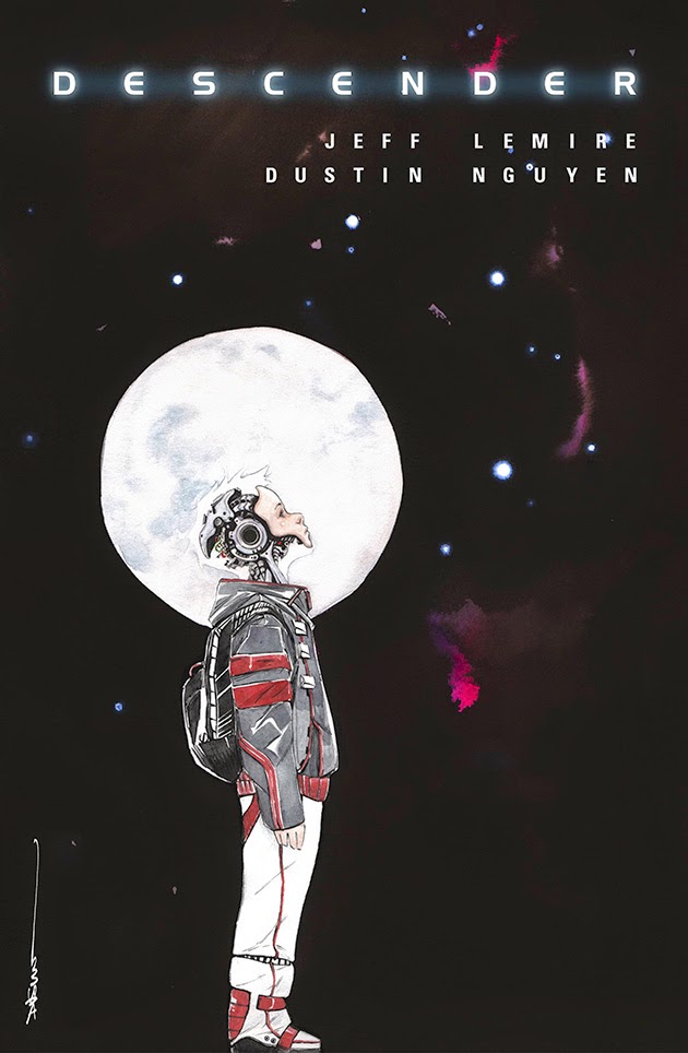


Descender #1, written by Jeff Lemire, art by Dustin Nguyen
All-New Hawkeye #1, written by Jeff Lemire, art by Ramon Perez
Two new books from cartoonist extraordinaire Jeff Lemire, who seems to have settled in to the role of mainstay mainstream funny book writer quite nicely. The sci-fi Descender is the heir to his creator owned Sweet Tooth and Trillium books and seems, in particular, to pick up on the themes of the latter. He's working with Dustin Nguyen, who has painted all of the art. Painting seems like a sort of weird strategy for attacking sci-fi and, in general, I find painted art to be static and ugly, but Nguyen's is beautiful, and subtle, adding a soft atmosphere and has a nice texture. That it's dissonant with the tone of the scene in the preview only serves to make that scene that much eerier. More interesting, if only because it's kind of out of left field, is Lemire's All-New Hawkeye. The series that he's following, Matt Fraction and David Aja's very well regarded Hawkeye, has been released at inconsistent intervals since about six months in, and isn't concluding until next month. Despite it's frustrating pace, Fraction and Aja's work is very well liked, in part because it's about how unglamorous super heroics can be; in terms of genre, its an espionage cloak covering a story about what happens when Marvel's vaunted man on the street happens to be so skilled at one particular thing that he can use it for good. It's also deeply, deeply engaged with comics as a form, with the extraordinarily talented artists Aja and Annie Wu, along with colorist Matt Hollingsworth, breaking the form and putting it back together on a semi-regular basis. Thankfully, Marvel seems to have figured out that it's not just the character that's bringing people to the book, and by tapping Lemire and artist Ramon Perez (the kind of worthwhile and intriguing creator choices they were making a year ago before abruptly pulling up), they've put themselves in a position to maintain a fair bit of the audience they've built up. Perez's art is slick and cartoony, with a little bit of Bruce Timm influence, and Lemire is well aware that this book plays to his strengths, which are more in the realm of thick characterization than in traditional superheroics. Part of the book is going to be flashbacks to Clint Barton's childhood and about his relationship with his brother Barney, which makes me hopeful that what we're getting is the other side of Lemire's work on Essex County, just with the Marvel insignia on the front cover. If, in fact, that's what's in store, then we'll have a transcendent comic book on our hands, the fulfillment of Lemire's promise as a writer of mainstream comic books.
Big Man Plans (1 of 4), written by Eric Powell and Tim Weisch, art by Eric Powell
The Goon's (man, I just love the Goon) Eric Powell turning his attention to a more or less straight crime comic? That's something sweet.
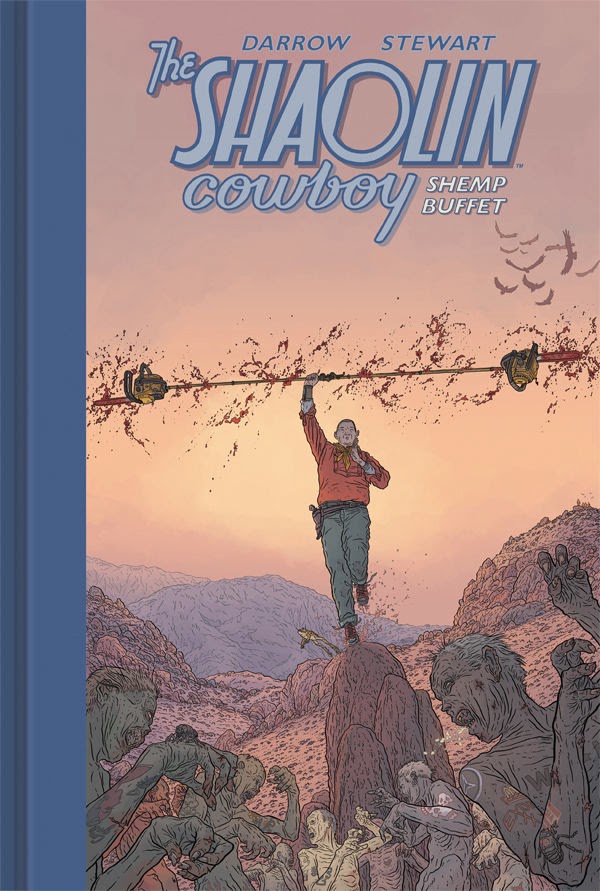
The Shaolin Cowboy: Shemp Buffet, by Geoff Darrow with colors by Dave Stewart
Princess Leia #1, written by Mark Waid, pencils by Terry Dodson, inks by Rachel Dodson, colors by Jordie Bellaire
Wednesday's New Things: It's Just Criminal
Ed Brubaker and Sean Phillips's finest series returns. Click the cover for a preview, where I could find one.

.jpg)


Criminal: Special Edition One Shot/Criminal: Savage Edition Magazine Variant, written by Ed Brubaker, drawn by Sean Phillips, colors by Elizabeth Breitweiser
If this new issue of Criminal were the only comic book released this week, I would come home from my LCS a happy man. Criminal is my absolute favorite of the very long running and more or less uninterrupted-from-the-first series of collaborations between Ed Brubaker and Sean Phillips; of all their work Criminal plays it the straightest. Even so, the most recent series, "The Last of the Innocent," was a riff on Archie comics, and it presaged their more recent work with genre experimentation in Fatale and the attempt at meta-Hollywood-melodrama in The Fade Out. I liked those recent series, but I've often wished they'd come back to Criminal and now, happily, they've done so, in a double length one-shot that comes smack dab in the middle of Image's lovely rereleases of the trade paperbacks. Perhaps most fun of all, Brubaker and Phillips return here to Teeg Lawless, a character that popped up in the series in its earliest iterations. The kernel of the idea here is that Lawless is in county lock up and reading a Savage Sword of Conan-style comic, something that Brubaker says he thought up after learning what kinds of comics were popular with prison populations in the 70s and 80s. Presumably, the two stories proceed together, which squares with the kind of experimentation that they've been doing over the last couple of years (and has fun resonances both with the earlier "Last of the Innocent" serial and Watchmen) but makes me pessimistic that we'll ever see Criminal comics that are quite like the early ones. There's also a neat publishing thing going on here, since the regular edition is being released alongside a slightly more expensive magazine sized edition, which presumably also has some extras. This is a gimmick they tried a few months ago with an issue of The Fade Out and, although I liked the idea, I passed because the magazine variant followed the regular edition by a couple of weeks, and I didn't want to pay for the same content twice. If the two editions are released together, however, (EDIT: both Ed Brubaker and Sean Phillips tweeted at me to say that they came out on the same day; my mistake) I'll absolutely pony up the extra buck for the slightly bigger one. I hope that this strategy works; I'd like to see it more often. For what it's worth, I'd love to see more Criminal, too.
Love: The Tiger, written by Frédéric Brrémaud, drawn by Federico Bertolucci
This one's an award winner from France, totally wordless and the first in a series dealing with the life of an animal in a particular kind of environment. Written for an audience at the intersection of children and adults, it has the kind of charm that books meant for wide audiences often rely on. The art is very highly rendered, somehow both stiff and lithe, but it gives a real and detailed sense of the world of the tiger, which is what Bertolucci is probably going for. From the preview, the utter silence of the pages seems extraordinary, emphasizing what's going on in individual panels in away that more cartoony silent comics, like Jason's, don't manage (although, for Jason, that's not the point). I have hunch that, for that reason, this book, and the ones that follow in the Love series, are unusual reading experiences, certainly worth a look.
Prince Valiant #1, written by Nate Cosby, art by Ron Salas
I'm on the record as liking the idea of these King Features/Dynamite comics, and this Prince Valiant comic looks like the best of the bunch. As a corollary to WHO IS THIS COMIC FOR?! though, one wonders if it wouldn't have been a better idea, in terms of sales, to go full on Hal Foster, in order to bring in those who like the original Prince Valiant strip for its storybook feel, as well as for its content.
The Wicked and the Divine #8, written by Kieron Gillen, drawn by Jamie McKelvie, colors by Matt Wilson, letters by Clayton Cowles
Coming Soon To A Spinner Rack Near You: Astro Boy

In September, Dark Horse is putting out a 700 page Astro Boy omnibus. 700 pages. Somehow, Amazon has the retail price listed at $20, which seems impossible, but, hey, I'm in. Tezuka is such an important creator, and Astro Boy is such a well known property, that I'm positive that this isn't the first time we've seen this work in English. I can't, however, ever recall actually seeing it in a comic book store, so I'm looking forward to cracking it open.
Wednesday's New Things: Gone Digital
Digital is a place. Or something. Click on the covers for previews, where I could find one.


Atomic Robo: The Kinghts of the Golden Circle, written by Brian Clevinger, Scott Wegener
Atomic Robo is a comic book I've always wanted to read. I mean, it's got adventuring robots and a dinosaur and it just looks like a lot of fun. In what longtime readers will recognize as a theme of this column, I just never got around to it. In part, that's because I was never really looking for it, but also because it wasn't really at hand--I would have had to go looking for it--and so I never gave it a shot. But this release is the last time that's going to be a problem since, as of mid-January, the Atomic Robo team has ditched their publisher and gone totally digital, using the webcomic model. They're in the process of uploading all of the previously released content, at the rate of about three issues a week, and they'll say that'll put them in a position to start releasing new stuff sometime in mid-May. This is the only time I've heard of someone doing something like this, the transition usually goes the other way and is rarely a total one, but I think it has the potential to expand their readership exponentially, putting it within the reach of many more hands (or, in this case, cursors). It's a pretty bold strategy, although probably a cost effective one insofar as it drastically reduces costs and has the potential, with exposure, to actually increase physical circulation. It's certainly an interesting alternative to the comixology strategy of digital archiving, insofar as they're betting on the community of the internet. It'll be interesting to see how this works out for them, and if anyone follows suit. In the meantime, there's robots and dinosaurs-- what's not to like?
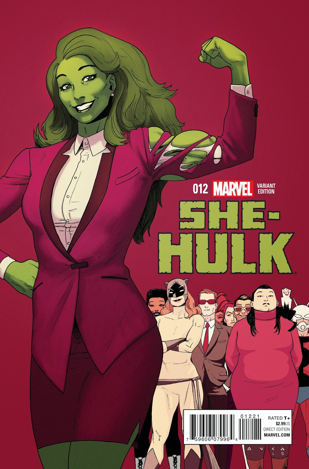
She-Hulk #12, written by Charles Soule, art by Javier Pulido
This book was one of the good ones, a memory of a moment just a year ago when Marvel was combining good concepts with talented writers and dynamic artists to make a bunch of really good comic books. Not all the books are gone, but the company has moved on, and, although there's no more definitive sign of that than the upcoming notareboot, the end of She-Hulk, which was announced first, certainly felt like a mortal wound to any hope that that moment was going to have any real duration. The economics of comics are what they are, but it's a real shame, if not necessarily an indictment of anyone, that we're going to lose this super smart, super well drawn comic book.
Black Widow #15, written by Nathan Edmondson, art by Phil Noto
Multiversity: Master Men #1, written by Grant Morrison, art by Jim Lee
Bitch Planet #3, written by Kelly Sue Deconnick, art by Valentine De Landro
The Autumnlands: Tooth & Claw #4, written by Kurt Busiek, art by Ben Dewey and Jordie Bellaire
Wednesday's New Things: The Shortest Distance Between Point A and Point B, No Matter How Far You've Gone
Let's get mathy...


Displacement by Lucy Knisley
I had the good fortune to read this book's twin, An Age of License, just after the new year. That book is about what happens after we grow up, and Displacement is its other side, what happens when our loved ones grow old. Knisley's work, delicately colored and generally free of the visual structure provided by panels, has an easy touch, but also hits right where it hurts-- something about just how diagrammatic it is, something about how all the open space draws you in, something about her inward focus, makes for very effective memoir, like Lucy Knisley's books are, more or less, guides to being Lucy Knisley. I'm looking forward to this one. Preview here.
The Sculptor by Scott McCloud
Help Us! Great Warrior by Madeleine Flores, colors by Trillian Gunn
Speaking of McCloud, one of the things he talked about on Sunday, something I didn't write about yesterday, was the fact that, for aspiring cartoonists, putting your work out online is never a bad idea. If it's good, if it's interesting, if people like it, then either companies will come calling or you'll be able to put the work out yourself. Help Us! Great Warrior is a good example; formerly a webcomic, Flores has recently been working for Nickelodeon, and also managed to get Boom to put out her sweet and funny comic in physical format. Seems like a win win.
The Empty by Jimmie Robinson
It's curious that comics haven't really embraced the trends that have emerged from YA literature over the last decade or so and then proliferated into television and movies, notably dystopian fiction and vampires. You see bits and pieces, here and there, and, as the eighties showed, any world with superheroes in it is, in one respect or many, a dystopian one. Jimmie Robinson's The Empty doesn't quite fit in with that paradigm, seeming to align more in tone with sci-fi comics like Prophet and Saga, but, from the preview, it does seem to share the deep darkness and cynicism of the former genre. I've never read Robinson's long running Bomb Queens, but The Empty, with its wide open imagination and its melodramatic beats, seems like its worth a look.
Satellite Sam, written by Matt Fraction, art by Howard Chaykin
Satellite Sam's third act is upon us. In some ways, I think the television murder mystery represents the positive side of a shift, as of maybe 18 months ago, to a later stage in Matt Fraction's career, in which he's only working on projects he really cares about (and, not coincidentally, that are largely creator owned). This book, too, has grown up a lot-- I found Chaykin's black and white art hard to follow in the beginning, and several of the characters hard to tell apart, but he quickly straightened everything out. I've been trade waiting this one; I think perhaps it's time to catch up.
Darth Vader #1, written by Kieron Gillen, art by Salvador Lorroca, color by Edgar Delgado
The great licensing comic conundrum returns! Gillen is usually an auto buy for me, although this is the second of his recent comics about which I'm unsure (the first being Angela: Asgard's Assassin). I have no doubt that this comic is good, and I bet Sal Lorroca's sheen is perfect for it, but at $4.99 I think I'll see if I can't read someone else's copy. Preview here.
The Cartoonist and The Sculptor
.jpg) |
| I was so engrossed I only remembered to take one picture! That's McCloud on the right. |
He was, unsurprisingly, gregarious, and very funny. The afternoon was a Q+A moderated by the Austin Chronicle's Wayne Allen Brenner, who also did an interview that ran in the alt-weekly last week. The Q+A, like the interview, was wide ranging, with Brenner asking McCloud to return to and elaborate on several themes and specific questions from their earlier conversation. The early going was taken up with a discussion of McCloud's imminent graphic novel, The Sculptor, a project he's been working on for about a half a decade. Using powerpoint, he shared with us his all digital workflow, which, at the thumbnail stage, includes sequences many pages long. This setup, he says, prevents him from getting "hung up on a given page" and enables him to see the forward flow more clearly. It also makes for an easier revision process, allowing him to move pieces around-- or take them out-- like sentences or paragraphs in a word processor. Using photoshop further allows him to draw layers on top of layers, he estimated an average of 40 per drawing, making complex illustration easier to do, undo, or redo. Ultimately, McCloud says, he likes digital because it allows him to stay focused on his work all day, getting caught up on the art rather than the tools that he uses to make that art. The only time he ever prints the sequences out is to see the whole flow-- and he does that at a very small size.
This idea of a comic's flow, and flow's relation to length, seems central to McCloud's thinking these days-- he spent a lot of time talking about how American comics are limited by the 22 page average. Citing his friend Kurt Busiek, he called that standard "the original sin of American comics," and suggested that the industry made a mistake half a century ago when it chose to keep prices steady rather than keep page count high (the idea that we might have even had a choice, that it was one or the other and not both, now seems utopian). As McCloud describes it, this compression has lead to a problem where both words and pictures are used as shorthands, with art talking precedence over characterization and words used as a short cut to the kinds of description proper to the juxtapositional grammar of comics. Later, during audience questions, he said that he believes that this is why we get the same stories over and over; there's only so many things that "fit in the shoebox." Comics that are longer have more room to breathe, and both elements of the invisible art become more effective, and you get an entire page of a character coming to a realization or actually get to work out the rhythm of a conversation--silences, essential to any natural talk, are impossible when every panel needs to be action packed.
With this in mind, and with prompting from Brenner, he praised several creators. Most notably, he cited David Aja's work on Hawkeye, saying that the Spaniard's work with Fraction on that series represents nothing less than a deconstruction of the form of the 22 page comic (which, I think, we can generally understand as superhero-length) in order to try find a way around some of the problems with that duration. He also mentioned Jillian and Mariko Tamaki's This One Summer ("it's like virtual reality, you just plunge right in") and James Sturm's Market Day, which he called "bulletproof" even as he described it as a story about a rug merchant having trouble selling his rugs. He finally turned to Raina Telgemeier, whom he praised in both formal and cultural terms, saying that she solves the compression problem by giving every emotion a panel, while also putting her at the vanguard of a group of young, largely female, fans who have comics for childhood and adulthood and every step in between. This group, McCloud says, is charging over the hill-- "in nine years, the industry will be majority female."
That last little bit was, I think, the most important of the afternoon, in both its generalities and its specifics. At this point, McCloud is an optimist before all else, and what he sees in a medium constantly in the process of reinventing itself is infinite possibility, much like the infinite time and infinite space signed by the gutter.
I'm very much looking forward to reading The Sculptor.

Wednesday's New Things: The Goon Runneth Over
Man, I just love the Goon...


The Goon: Once Upon A Hard Time #1 by Eric Powell
In Eric Powell's recent Reddit AMA, he suggested that things were about to change for the Goon:
All that's very exciting, but I'll be a little sad if this is the last we see of him. I'm way behind, and now seems like a good time to catch up on what I've missed, maybe even to fill up my bookshelf and start from the beginning. I just love the Goon.Once Upon a Hard Time is the climax to everything I’ve done in the Goon so far. In fact, it may be the last story entitled “the Goon” I ever do. The mythology I’ve created will keep going. But I’m creating new characters to interact with the old ones, shifting barely used characters to the limelight, and putting everyone in different environments. The next mini-series I do involving this mythology will have a different title and will feature a large cast of characters including several who survive the last Goon series.
Love and Rockets New Stories #7 by Gilbert Hernandez and Jamie Hernandez
As always, Los Bros speak for themselves.
Nameless #1, written by Grant Morrison, art by Chris Burnham
It's good to see that Morrison and Burnham, who together concluded Morrison's Batman, Inc. story line, are still working together. Although is a little unfair to Burnham, I think part of the reason that Morrison likes working with him is that he works with a thin, hairy line that makes color is the dominant art element on the page, a style that very closely resembles Frank Quitely's (with one of the differences being that the colors in Quitely's work are often slightly darker and more muted than the ones that Burnham uses). That style seems perfect for what Burnham has called "the ultimate horror comic," so the key here is going to be which Morrison shows up, which side of what Jon calls "cuckoopajamapants" is the book going to be on. The preview has me a little worried, but new Grant Morrison is always worth a look.
Stray Bullets: Sunshine and Roses #1, by David Lapham
Saga #25, art by Fiona Staples, written by Brian K. Vaughn
Two Image series returning from short breaks, each of which I need to catch up on (well, in the case of Stray Bullets, which I need to read any of at all). The question, as always, is in what form?
Velvet #9, written by Ed Brubaker, drawn by Steve Epting, colors by Elizabeth Breitweiser
Velvet is the best espionage comic on the market right now. It just comes out... so... slowly...
Captain America: Fear Him #1, written by Dennis Hopeless, art by Simon Kudranski and Mast & Geoffo, colors by Andres Mossa
I thought I would always buy Captain America, but Rick Remender runs so hot and cold I just couldn't take it anymore (I think it was the issue long straw man argument between Captain America and Nuke that really did it in for me). I'm waiting out the rest of his run on the character before I give it another shot, which is too bad because I think putting Sam Wilson in the flag is a fun and interesting idea, and I expect by the time we get a new writer that we'll have Steve back to full strength That's why this is sort of exciting, even though I don't really like to buy mini series and the art looks a little goofy. I don't know if it's a buy. But it's certainly worth a look.
Jungle Jim #1, written by Paul Tobin, art by Sandy Jarrell
As part of a celebration of King Feature's hundredth birthday, Dynamite put together a small run of series featuring characters from the syndicate's strips, which I think is a pretty cool idea. I haven't seen any of these out in the world, and $3.99 seems like a lot for a comic book that seems to be largely written in the stilted dialogue register comic strip... but it also looks kinda nuts. If the trade is more reasonably priced, I think I'd like to give it a shot.
Atomic Size Matters

Way, way back, Veronica Berns and I went to high school together. Not for very long, mind you, since she was a senior when I was a freshman. Veronica has since gone on to do a lot of cool stuff, including getting a PhD in chemistry, turning her dissertation into a comic book in the process. That comic, Atomic Size Matters, is funding on kickstarter right now. She and I recently spoke about chemistry, comics, and grad school.
Veronica Berns: I'm a solid state chemist, and I did graduate work on the crystal structures of metals, that is, the way that atoms arrange themselves in solid compounds. The Fredrickson Group (the research group I did graduate work in) focuses on the complexity in intermetallics. It may be surprising, but we still don't have a good idea of why certain compounds form one arrangement over another. And we certainly don't have a good way to predict when a structure will be really simple or really complicated.
My project specifically dealt with the influence of atomic size on the resulting crystal structure. Intuitively, the size of one atom should impact the arrangements that it can make, but it turns out that is a really hard thing to test. So I did a lot of calculations to draw conclusions about the connection between size and structure. The project is ongoing, as other students have taken over, but my portion of the work culminated in a connection between a very simple compound called CaCu5, and an icsoahedral quasicrystal, a material that contradicts our definition of "crystal"; they have 5-fold rotational symmetry, but no translational symmetry. Quasicrystals are seemingly impossible materials, but they actually do exist! And their discoverer recently won a Nobel Prize in 2011.
JK: Writing a dissertation is a long and complicated process; why did you decide to do the extra work of turning your dissertation into a comic?
VB: You're right, writing a dissertation is really hard!
About a year before I intended to graduate, I thought about how long and complicated the dissertation writing process would be. And I thought about how much I loved my graduate work--I often stayed late at work not because I had a deadline (though I had plenty of those too!), but because I was lost in the joy of what I was doing and I would forget that I needed to sleep. Ultimately, I was excited about the prospect of creating a thesis, a document that would make all of my efforts tangible, but I was sad that my family wouldn't understand it. My field is really specialized, and the academic language we use is very efficient and necessary for talking to other experts, but those same academic words are admittedly impenetrable to most people who haven't studied chemistry since high school.
It started off as a fun thing to do for the benefit of a few people, and I ended up with a fairly long comic book. Yes, it was hard to do in addition to the work of writing a thesis, but it was ultimately worth it.
JK: Can you describe the differences between the two versions of your dissertation?
VB: There are a few differences. The dissertation covers more ground. There was just no way I could cover everything in a comic book. I chose the chapter with the broadest appeal to turn into a comic.
The dissertation goes into a lot of mathy detail about the programs that my colleagues (Kale Engelkemier and Yiming Guo) coded. I used those programs to run calculations, and then I drew conclusions about the results. Though the comic explains the gist of the calculations, it focuses more on the conclusions.
The dissertation also includes a few things completely left out of the comic. Though I did a lot of theoretical calculations, I also did experimental work: I mixed metals together to make the compounds we were thinking about. A few new compounds came out of those efforts, but nothing that connected to our work on icosahedral quasicrystals.
I should also point out that the comic book is actually the last chapter in the thesis itself. So soon the University of Wisconsin's esteemed library will include a silly drawing of me as a runway model.
JK: What did your committee think of the comic book, and how did they feel about it being included in your finished product?
VB: One of my committee members, when I handed him the thick, paper dissertation, immediately started thumbing through it. Suddenly he saw a flash of color, and had a very confused look on his face. So I explained the whole thing, and he giggled excitedly! He told me later how read that part with his school-age kids, and he was very impressed that they could follow what I was saying.
I didn't plan to mention the comic at my defense, but they brought it up first! Our department has open defenses, and my committee wanted me to show a few pages to my classmates who hadn't seen it before. They encouraged me to do something with it, and approved of the idea to self-publish on Kickstarter. I think one or two of them has even bought a copy!

JK: What, if anything, were the particular difficulties in the creation of Atomic Size Matters? Are those difficulties different to those you encounter trying to explain you work conversationally, or are they more or less the same?
VB: Ironically, it is difficult to remember the difficulties I had in making the comic. I know I struggled with simplifying certain concepts, but ultimately it was something I was doing for fun and at those times I would take a break, and return to the work later. What got me through the hard parts was thinking about a metaphor that my dad or mom would understand. Like I would revise the comic by asking myself, "What question would dad have after he read that?"
I think the difficult concepts are always difficult, no matter the medium. I see the comic as a practical substitute for having a face-to-face conversation with someone.
JK: Some comics makers, including Art Spiegelman, have described comics as essentially diagrammatic. What's the relationship between your work and more traditional chemical diagrams?
VB: I tried to incorporate as many traditional chemistry visualizations as possible. It was important to me for someone who reads the comic to be able to pick up one of my academic papers and look through the figures and say "Hmm, this looks familiar. Maybe reading this isn't going to be as difficult as it seems." I get very jazzed up about demystifying and making hard science less intimidating to people who don't think about that stuff daily.
A few examples of this are the diagrams of crystal structures, the Chemical Pressure plots, and the "Energy-distance diagram" that appears pretty early in the book. We draw these a lot, especially in chemistry classrooms, to talk about distances in a molecule.
JK: What parts of the book were particularly fun or challenging to make?
VB: There are a lot of Easter eggs in the book. Because I made it for my family and friends, I tried to put in a lot of stuff that would just make them laugh. I don't know how much I want to give away, but there's a spaceship from one of my favorite videogames and a famous internet cat that were really fun to draw. There's also a picture of me as Ron Burgundy, which was really fun too.
It was hardest to draw the Chemical Pressure diagrams. They obviously come from a computer program, but I was really set on making those in the style of the comic book. Oh man! Getting those the proper scale and shape was really rough! I scaled everything as accurately as possible, but every drop of ink you see is a drawing, not a computer generated image.
JK: Do you have any particular influences, even outside of comics in more traditional science writing?
VB: In my Kickstarter video I mention that I loved Magic School Bus and Bill Nye the Science Guy as a kid. Obviously, those materials are geared towards a younger audience, but the spirit of them is something I would like to carry forward. Even if someone is a fan of dinosaurs or space travel or whatever as a kid, I think at some point most adults stop talking about science in an excited way. In high school or college, many people decide that they're never taking a science class again because they don't like it, or it is too hard. But that shouldn't stop the ideas from being exciting! There's so much out there that people are just learning right now, and it is all just as cool as T-rexes and triceratops. Figuring out how to present it is often a problem.
There's one episode of Radiolab called Tell Me a Story, where Robert Krulwich basically lays out an argument for talking about science in a graduation speech. I listened and relistened to that piece quite a few times when I was making the comic.
So anyway, I would say that I really respect that essence. I think Bill Nye has done some awesome work recently, especially with Neil deGrasse Tyson on Star Talk Radio and Cosmos. Though I read a lot of comic books and graphic novels, most of the influences on my art come from Sunday comics strips like Peanuts and Pearls Before Swine. A thick black line, bold color, and handwritten text.
JK: Do you think that the fact that comics are words and pictures working together in a particularly close way makes it a particularly useful medium for science writing?
VB: Yes! Whenever I'm talking about science--to either an expert or a novice--I rely heavily on pictures. I think most scientists do. It's natural to want to support your assertions with evidence, and that evidence is often a graph or an image. If you think about it, a really good power point presentation is basically a panel-by-panel view of a comic book: a few sentences that refer to an image on a slide is just like a panel with a caption.
I think comic books are a great way to explain a lot of things, beyond science. I'm just most able to talk about chemistry.
JK: Would you be willing to share what it is you're working on now that you're done with your PhD. program? Are you hoping to turn further research into comics as well, or to help other interested scientists do the same?
VB: I am a research scientist for a company called Honeywell. I can't really talk much about the materials that I make, but my day focuses on making things that have never been made before, and finding the most efficient way to make them.
I'm going to continue making comics, but my work now is confidential, so I'll be tackling other topics.
I would love it if more people made their work into comics. Even if it isn't a comic. Maybe someone is really good at music or creative writing or claymation, who knows! Forcing myself to think differently about my work had huge benefits--both in the lab and out-- and I think more people should try it out. And if they need help in any way, I'm available!

Subscribe to:
Posts (Atom)