
In my teenage years I used to say "the comic-strip is to the comics medium as the music video is to the video/film medium." My thinking was (a) length = complexity and (b) something produced mainly for commercial, dispensable uses could only be artistic in the rare exceptions.
Especially since I grew up mouthing off about the artistic and profound nature of the Stan Lee and/or J.M. DeMatteis Spider-Man. If the comic-book isn't a near equally commercial and ephemeral form to the comic-strip, well... few things are. (Not to mention, the comic-strip was first. As I've noted elsewhere on The Long and Shortbox Of It, the first comic-books were reprinted comic-strips.)
The strip, as a work of small units, has been an excellent format to dive into this year, one of the busiest of my entire life thus far: retail-management, freelancing and on and on.
But all has really just been prelude, -just mere preparation- for the mother of crazy, brilliant, exciting comic-strips: "Dal Tokyo" by Gary Panter. Also, yes, recently purchased from my store. (I'm not a complete retail whore, I swear.)
Although I didn't avoid it or anything, I wasn't a voracious reader of the Sunday comics section as a kid. As I wrote at the top of the post, I looked down on them! But the moment I reached the second corner room at the Jewish Museum of New York in the late Winter of 2oo5 (after the room of Eisner work and the Kirby corner, after the long thin room in which I discovered Harvey Kurtzman and delved deeper into R. Crumb) I saw for the first time in my life, outside of "Pee-Wee's Playhouse", the art of Gary Panter. The Masters of American Comics exhibit had on display the full original art pages for "Jimbo at Hiroshima." HOLY CRAP. Life-changing. And several of the "Dal Tokyo" strips in their original art sat in a glass case opposite. Finally, I'd found something that used the slim rectangular block of a mere four panels to smart visual-storytelling effect. 'Why couldn't it all be like this?' I opined. The Masters of American Comics exhibition was the FIRST eye-opener for me. (Not just in terms of strips, obviously. But that's what we're talking about today.) Check this out:

Break a single landscape into panels. Give us four instants that add up into a moment taking place across that landscape. The background becomes a passive but strong frame for the action of the story-- everything feels grounded, more real. Simple idea that had never occurred to me!
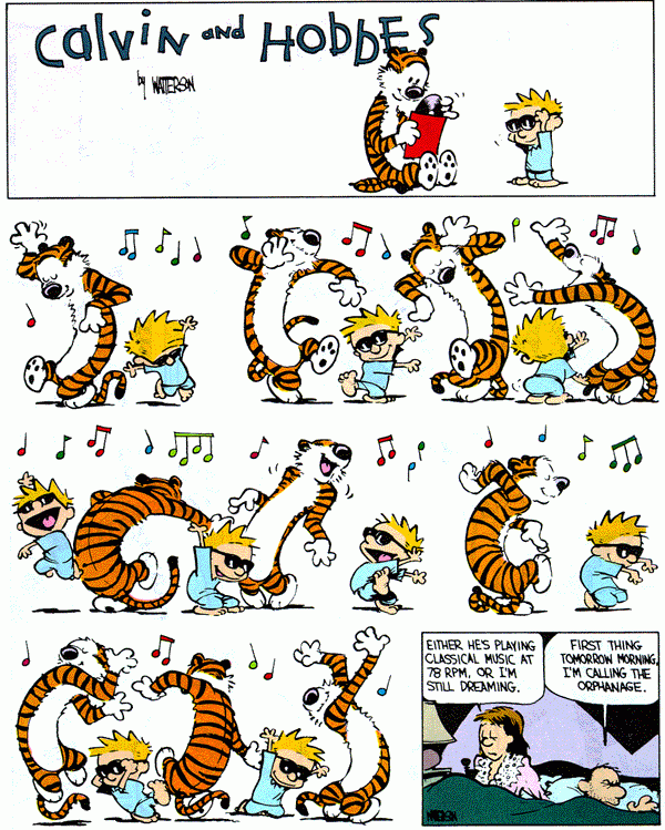
Even "Calvin and Hobbes" does something like the reverse of this in small doses but with more flexibility, more child-like fluidity:

The background is merely background, totally blank, the characters in full detail, total character hyper-focus. Watterson's neo-"Peanuts" style plus whimsical internal imagination is a powerful combination that understandably speaks to people of all ages. And it's beautiful.
Watterson cleaves out the background and just lets the characters dance in the spot-light while Panter etches out a detailed landscape to reel in the background behind his characters, grounding them in the setting. Which just happens to be a post-punk post-apocalyptic colonized Mars.
Katchor's work... defies description. Subtle. So subtle sometimes you're almost not so sure it's doing anything. But often filled with such simple eloquent beautiful ideas that you keep coming back for more. (At least I do. I love his work so much I interviewed him for LongandShortbox.com back in 2o11.)
He, too plays with landscape, but it's all about vintage urban ones. And it's more intellectual. Tearing apart and laying bear the little weirdnesses of modern life. Even the strip in which he posits the idea of a minisculey thin but extremely long nation nestled into the border between two other nations uses a New York City-circa-196os-style traveling bus between the two normal 'large' nations. Among Katchor's most famous works is the 23-page-long story "The Beauty Supply District" about a neighborhood that specializes not in fashion nor Indian food, but the application of aesthetics.
The opposite cultural force is at work in this later 2oo1 work by him:
 I find a great deal of his work endlessly fascinating! And quietly hilarious.
Kane, too, in the Batman strip is interested in a fictional urban world. Just one entirely focused on crime and punishment. Comic-strips and comic-books, with their geometric blocks in rectilinear arrangement are perfectly suited to describing urbanity. Squares and rectangles.

The classics are the ones I have the most trouble with. The Batman newspaper comic-strip wasn't the first appearance of Batman, but it was the first print appearance of the Batcave (and home is where the heart is!).
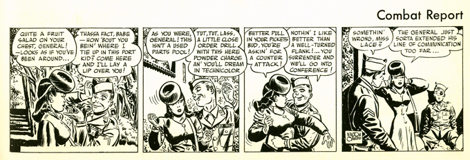
The evidence in Milt Caniff's abilities as an artist and storyteller is that I cannot deny that this strip "Male Call" made exclusively for the US Army during World War II as a just-for-the-enlisted-man spin-off of his extremely successful "Terry and the Pirates" war/adventure strip is eminently enjoyable. I do find myself suddenly sucked in much like I do with "Calvin and Hobbes."
The strips can be like candy. Short and sweet. You can't read just one.

These are the pieces that interest me least now as an adult who never fell in love with the comics section... Give me kooky ideas in even kookier settings with meta-commentary on the nature of comics plus a message of beauty and art and truth-- I'm right at home. Three panels of set-up and a fourth panel punchline and suddenly I'm a judgmental 15-year-old again: "There's nothing going on here!" whines the academic in me. But there's something to appreciate in everything. There's even oft-times an element that's excellent to appreciate. Whether adventure, superhero, comedy, romance these strips are bite-sized sequential art explosions of awesomeness! From the childlike charm of "Peanuts" to the brilliantly hilarious biting political wit of "Dykes to Watch Out For" or the radiant psychedelic beauty of "Little Nemo in Slumberland" (that stuff is truly astounding if you've never read it) to the unique cultural perspective of "The Boondocks."
I suppose that's all to say there's unknown depths to art, even when short and ephemeral.
The comic-strip was the first form. Not the first art, but the first artFORM! The first time artistic expression was recorded, trapped, frozen in a physical form, stained on cave walls to be viewed repeatedly. Shared. Preserved. In a simple, short, digestible form. Perfect for the modern man on the go. Or the homo-neanderthal searching for the meaning of the hunt.
~ @JonGorga
P.S. ~ Except for "Doonesbury." Stay away from that junk.
P.P.S. ~ Disclaimer: I have read very little of "Doonesbury." Do not take my opinion of it seriously.
That was dumb.
Especially since I grew up mouthing off about the artistic and profound nature of the Stan Lee and/or J.M. DeMatteis Spider-Man. If the comic-book isn't a near equally commercial and ephemeral form to the comic-strip, well... few things are. (Not to mention, the comic-strip was first. As I've noted elsewhere on The Long and Shortbox Of It, the first comic-books were reprinted comic-strips.)
The strip, as a work of small units, has been an excellent format to dive into this year, one of the busiest of my entire life thus far: retail-management, freelancing and on and on.
Of late, to make myself feel like I'm not a complete drop-out from the hard school of reading difficult, brain-breaking comics, I've read the collection of the first year of Bill Watterson's "Calvin and Hobbes" on the subway. When I'm not sleeping on the N train from exhaustion.
That's as a break from reading the satirically genuine depths of Ben Katchor's comic-strip about travel "The Cardboard Valise." Ben Katchor (@benkatchor), whose previous collection "The Beauty Supply District" (collecting his strip "Julius Knipl, Real Estate Photographer") I am a HUGE fan of, is the creator of the driest, smartest, wittiest comics you'll find in newspapers, books, on the web or any other sequential art delivery method yet to be invented. My discovery of his work at the Museum of Comics and Cartoon Art (@MoCCAnyc) in their recently abandoned location in SoHo was the THIRD sign I was a fool for thinking so little of these 'little' comics. (Wait for the other two, they're coming!)
And, as we had a big Batman sale at my store Manhattan Comics & More (@MnhtnComicsMore) recently, I bought a lonely, unwanted, dusty, old volume I'm working through: the Batman newspaper dailies first year collection. The Batman strip is interesting because, if nothing else, it's quite nearly the only Batman material actually drawn by Bob Kane, the character's celebrated 'creator.' (As opposed to his army of in-studio writers and artists responsible for the creation of the Batman comic-books. [See this strange but informative article on Dial B for Blog.]) Most of the Batman stories in the books or the strips were written by the man many now recognize as being the real force behind Batman: Bill Finger.
The SECOND major wake-up call for me was in the early stuff. A college friend showed me a hardcover collection of "Little Nemo in Slumberland" by Winsor McCay. The realization that a comic in a newspaper could have at one-time been so big, so beautiful, so colorful and detailed! 'You've never read this?!' she said incredulously. (You can read some for free here and I highly recommend you do.) And Lyonel Feininger! I have a collection of his work sent my way by Fantagraphics (@fantagraphics) last year lying in wait. His work lacks McCay's smooth flourish but makes up for it with his sharp angular expressive characters in "The Kin-der-Kids." Those first newspaper strips from the turn of the Twentieth Century are the best ever. Truly, not hyperbole because they were produced before the newspaper strip syndicates arose and determined rich full-color engraving an unneeded expense in a section predominantly for children. I've also perused Milton Caniff's collected "Male Call" hardcover from Hermes Press (@HermesPress), a Christmas gift from a different college friend. Caniff is universally-regarded as among the best to ever have a contract with the syndicates. ALSO bought at the store, it is very much a traditional comic-strip: humour, romance, and a pretty lady at the center of it all.And, as we had a big Batman sale at my store Manhattan Comics & More (@MnhtnComicsMore) recently, I bought a lonely, unwanted, dusty, old volume I'm working through: the Batman newspaper dailies first year collection. The Batman strip is interesting because, if nothing else, it's quite nearly the only Batman material actually drawn by Bob Kane, the character's celebrated 'creator.' (As opposed to his army of in-studio writers and artists responsible for the creation of the Batman comic-books. [See this strange but informative article on Dial B for Blog.]) Most of the Batman stories in the books or the strips were written by the man many now recognize as being the real force behind Batman: Bill Finger.
But all has really just been prelude, -just mere preparation- for the mother of crazy, brilliant, exciting comic-strips: "Dal Tokyo" by Gary Panter. Also, yes, recently purchased from my store. (I'm not a complete retail whore, I swear.)
Although I didn't avoid it or anything, I wasn't a voracious reader of the Sunday comics section as a kid. As I wrote at the top of the post, I looked down on them! But the moment I reached the second corner room at the Jewish Museum of New York in the late Winter of 2oo5 (after the room of Eisner work and the Kirby corner, after the long thin room in which I discovered Harvey Kurtzman and delved deeper into R. Crumb) I saw for the first time in my life, outside of "Pee-Wee's Playhouse", the art of Gary Panter. The Masters of American Comics exhibit had on display the full original art pages for "Jimbo at Hiroshima." HOLY CRAP. Life-changing. And several of the "Dal Tokyo" strips in their original art sat in a glass case opposite. Finally, I'd found something that used the slim rectangular block of a mere four panels to smart visual-storytelling effect. 'Why couldn't it all be like this?' I opined. The Masters of American Comics exhibition was the FIRST eye-opener for me. (Not just in terms of strips, obviously. But that's what we're talking about today.) Check this out:

Break a single landscape into panels. Give us four instants that add up into a moment taking place across that landscape. The background becomes a passive but strong frame for the action of the story-- everything feels grounded, more real. Simple idea that had never occurred to me!
Even "Calvin and Hobbes" does something like the reverse of this in small doses but with more flexibility, more child-like fluidity:
The background is merely background, totally blank, the characters in full detail, total character hyper-focus. Watterson's neo-"Peanuts" style plus whimsical internal imagination is a powerful combination that understandably speaks to people of all ages. And it's beautiful.
Watterson cleaves out the background and just lets the characters dance in the spot-light while Panter etches out a detailed landscape to reel in the background behind his characters, grounding them in the setting. Which just happens to be a post-punk post-apocalyptic colonized Mars.
Katchor's work... defies description. Subtle. So subtle sometimes you're almost not so sure it's doing anything. But often filled with such simple eloquent beautiful ideas that you keep coming back for more. (At least I do. I love his work so much I interviewed him for LongandShortbox.com back in 2o11.)
He, too plays with landscape, but it's all about vintage urban ones. And it's more intellectual. Tearing apart and laying bear the little weirdnesses of modern life. Even the strip in which he posits the idea of a minisculey thin but extremely long nation nestled into the border between two other nations uses a New York City-circa-196os-style traveling bus between the two normal 'large' nations. Among Katchor's most famous works is the 23-page-long story "The Beauty Supply District" about a neighborhood that specializes not in fashion nor Indian food, but the application of aesthetics.
The opposite cultural force is at work in this later 2oo1 work by him:

Kane, too, in the Batman strip is interested in a fictional urban world. Just one entirely focused on crime and punishment. Comic-strips and comic-books, with their geometric blocks in rectilinear arrangement are perfectly suited to describing urbanity. Squares and rectangles.

The classics are the ones I have the most trouble with. The Batman newspaper comic-strip wasn't the first appearance of Batman, but it was the first print appearance of the Batcave (and home is where the heart is!).
The evidence in Milt Caniff's abilities as an artist and storyteller is that I cannot deny that this strip "Male Call" made exclusively for the US Army during World War II as a just-for-the-enlisted-man spin-off of his extremely successful "Terry and the Pirates" war/adventure strip is eminently enjoyable. I do find myself suddenly sucked in much like I do with "Calvin and Hobbes."
The strips can be like candy. Short and sweet. You can't read just one.
These are the pieces that interest me least now as an adult who never fell in love with the comics section... Give me kooky ideas in even kookier settings with meta-commentary on the nature of comics plus a message of beauty and art and truth-- I'm right at home. Three panels of set-up and a fourth panel punchline and suddenly I'm a judgmental 15-year-old again: "There's nothing going on here!" whines the academic in me. But there's something to appreciate in everything. There's even oft-times an element that's excellent to appreciate. Whether adventure, superhero, comedy, romance these strips are bite-sized sequential art explosions of awesomeness! From the childlike charm of "Peanuts" to the brilliantly hilarious biting political wit of "Dykes to Watch Out For" or the radiant psychedelic beauty of "Little Nemo in Slumberland" (that stuff is truly astounding if you've never read it) to the unique cultural perspective of "The Boondocks."
I suppose that's all to say there's unknown depths to art, even when short and ephemeral.
The comic-strip was the first form. Not the first art, but the first artFORM! The first time artistic expression was recorded, trapped, frozen in a physical form, stained on cave walls to be viewed repeatedly. Shared. Preserved. In a simple, short, digestible form. Perfect for the modern man on the go. Or the homo-neanderthal searching for the meaning of the hunt.
~ @JonGorga
P.S. ~ Except for "Doonesbury." Stay away from that junk.
P.P.S. ~ Disclaimer: I have read very little of "Doonesbury." Do not take my opinion of it seriously.


