Barton. Clint Barton.

I've been waiting for this book for a long time. Or, more precisely, I've been waiting for the successor to this book for a long time-- four years too long. Those first sixteen issues of The Immortal Iron Fist, those issues that Matt Fraction and Ed Brubaker wrote, those issues that David Aja drew, are certainly among the best superhero comics of our young century, and may very well be the best superhero comics produced in that century's first decade. But then Brubaker, after a little more than a year on the title, went back to concentrating on Steve Rogers for a living. Soon after, Fraction and Aja wrapped up the run, with the writer becoming Marvel's golden boy and Aja retreating, for the most part, back to Spain, doing an issue here and an issue there, dropping a few covers when he could.

I return to The Immortal Iron Fist on a pretty regular basis, out of nostalgia as much as awe, and, last April, it was good to hear that two thirds of the band was coming home for a series featuring the newly famous purple archer. Although Jeremy Renner's Hawkeye was the least developed and least seen presence in Joss Whedon's movie, the character still represented newly fertile ground for a decidedly West Coast Avenger-- if Fraction and Aja could drag Iron Fist back into the spotlight, after Brian Bendis, through sheer force of well, had done the same with Luke Cage, surely they could do the same for the Archering Avenger, right? Even though his last crack at an ongoing series was a massive, relationship ending, flop?*

Well, it turns out, they could. Hawkeye #1 is so close to a perfect 32-pages-with-advertising comic that pointing out its one flaw-- there's a panel that needs to be flipped in order for the characters' movement to make sense--seems like nitpicking. Fraction's writing is a joy, dense and clear, like, but not quite as much of a workout as, the best of his Casanova work. That book is probably the closest analogue to what he's trying to do here, not only because Hawkeye doesn't really resemble anything that either Marvel or DC is putting out right now, reading much more like one of those brilliant new Image books, but also because Fraction is very clearly pointing to the fact that he's going to be writing a certain kind of espionage story. The James Bond nods, one an explicit reference and the other a kind of easter egg, are a dead giveaway, but the subtler clues, the just this side of too clever references to Hawkeye's relative obscurity as a character ("...are you, like, Iron Fist or something?"), the way he passes unnoticed in his neighborhood, despite a conspicuous amount of purple in his wardrobe, suggest that this is a sort of anti-Avengers book, an attempt to figure out the hero that Barton is when no one is watching.

Given that, the closest cousin that Hawkeye does have amongst the current cohort of Marvel or DC series is Ed Brubaker's Winter Soldier, another superb spy project starring a less than well known character. But Brubaker writes a different sort of cloak and dagger than Fraction, more serious and less self aware, straight up espionage, really, while Fraction and Aja are just sort of winking and nodding at its conventions, and not those conventions alone. The duo mix their Ian Fleming references with homages to famous panels and reflections on the absurdity of an archer's presence on a team made up mostly of gods and supermortals, that is, the simple fact that a man who shoots a weapon from the paleolithic period is out of place on a team featuring Thor and a man with a reactor where his heart should be. In emphasizing these things, Fraction and Aja are reaching beyond Clint Barton and trying to say something about superheroes, or, more precisely, superhero comics, in general.
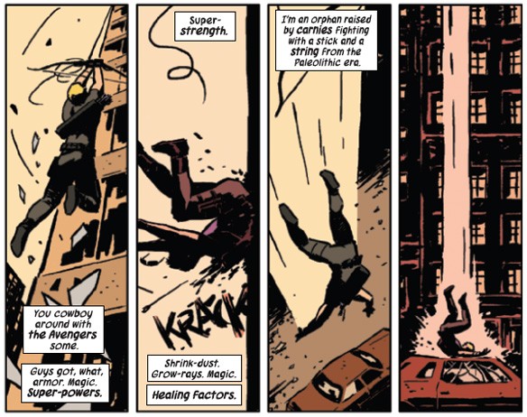

The punchline, it seems to me, goes back to how inconspicuous Fraction makes Barton, the fact that someone only recognizes him once in a while. Partially, that line is clever because it reads as a joke on how many times Hawkeye's costume has changed, but, truthfully, it moves beyond clever and into something resembling scholarly. Consider this: all comics, superhero or otherwise, work because of iconography, and not just obvious Captain America or Batman men-in-tights-with-their-own-homemade-logo iconography. We know that the talking mouse with the cigarette is Art Spiegelman the same way we know that the character with that one Curt Swan curl on his forehead is both Clark Kent and Superman. Icons are what makes comics intelligible, what makes them possible. But they're also what makes superheroes memorable-- this is why such characters found their natural home in the funny books-- and, without his bow, there's absolutely nothing iconographic about Clint Barton; as Fraction has himself has suggested, there's a much more famous character in American popular culture with that nickname:

I'd totally read a Fraction and Aja M*A*S*H comic. 
I would even go so far as to say that Barton's bow isn't iconographic the same way that, say, Spiderman's chest-spider is. The weapon represents Hawkeye, for sure, but it could just as easily represent a character at a rival comics company who is, with the exception of a slightly greener color scheme, essentially the same, or it could present him as an an American Indian stereotype or an Olympian. The bow, as a symbol, simply isn't specific enough to be powerful. Peter Parker's spider symbol, however, only really means one thing-- your friendly neighborhood Spiderman. This is why the Clone Saga, despite its poor execution, could have been terrific: the plot exploited a formal quality as the crux of the story. Fraction and Aja seem to have realized that his lack of significant or interesting iconography is Clint Barton's great flaw, the reason that he's never been successful except as a part of a group of much more immediately recognizable characters, and are making that flaw work for them rather than attempting to overcome it. 

That recognition, perhaps aided by the character's relatively limited presence in The Avengers, is why people, primarily people like me, have responded so well to the first issue of Hawkeye: Fraction is writing Clint Barton as the schmuck he's always been, he's just doing it with the mask off. It just turns out that Barton is much more interesting as himself, when someone is being honest about the fact that he lacks the heavy duty icons necessary for stardom, than he is as the purple archering Avenger.

--------------
*That's not entirely fair-- it just turns out that people were about as interested in Hawkeye and Mockingbird together, again, as they were about either alone.

Quote for the Week: Bart Beaty

Comics scholars receive very little condemnation when we teach Crumb, Spiegelman and Ware (and Satrapi and Bechdel and…). When we do receive raised eyebrows is when we teach  Archie and other works that are “not serious” or “not sophisticated”. The route that the comics world might have taken would have been to fundamentally challenge that ideology. To reject those sorts of claims altogether. If you look at the type of work that we’ve published as scholars and taught as teachers though, we’ve largely failed to do that. And I include myself in that group even as I recognize that this might have been the more productive direction to go.

- Bart Beaty, talking about his new book Comics versus Art, on the marvelous unrealized promise of academic comics studies. 

The Criminals Always Return To The...


In November, Image is reissuing Scene of the Crime, Ed Brubaker's first collaboration with Michael Lark, who would later draw much of the writer's supreme Daredevil run. Lark is a fantastic illustrator of crime comics, one of the best in the business, and the fact that he's inked here by Sean Phillips, another longtime Brubaker pal and maybe the best crime cartoonist right now, can only mean good things. If this book is half as good as those Daredevil comics or a quarter as good as Brubaker and Phillips' work on Fatale, Incognito, and Criminal, we're looking at one of the best reissues of the year.  

The Colorist As Unsung Hero

Although many comics, including a vast majority of superhero comics, are collaborative efforts, the major share of the credit for such books goes to the writer and the penciler. It's their names on the front, and when big announcements are made when creative teams change, those are the folks that everybody wants to know about. For a while, though, I've been toying with the idea that a colorist can either cement the look and tone that the penciler was going for or, even with the best of intentions, he or she could ruin it. Cartoonist Scott Kurtz, who's behind the long running webcomic PvP, recently made a change to his comic that is demonstrative of how important coloring can be. 

Although PvP was originally a black and white comic which utilized color only occasionally, for the last two or three years Kurtz has self-colored his comics. Here, for example, is his strip from Thursday, August 2nd:


One of the joy's of PvP is the way that Kurtz has, over his comic's fourteen year run, managed to maintain a very simple look, one that is clean and flat. In part, this is because Kurtz relies on his pen rather than his colors to add depth and perspective to his panels, so, while Kurtz often and successfully takes risks with his pencils, he rarely makes similarly risky decisions with his crayons, so to speak. When he does, the results are usually strips like the one above. If you look, in the first panel, at Max Powers's hair (Max is the blonde one, in the middle) or Lucille's face, you can tell that both are sort of off-colored, paler than they are in the other panels, bluish almost. I think Kurtz was trying to give his panel the feel of the club the three characters are in, but he can't quite pull it off-- look at Lucille's shirt in that first panel, or at wholes of the other two panels. It sort of looks like Kurtz gave up on the idea of a "club feel" two thirds of the way into the first part of the sequence, and decided to rely instead on the background alone to indicate setting. And so the strip, while not bad, exactly, is more muddled than Kurtz's usual work, which has this wonderful pop off of the screen.

The next day (8/3), Kurtz utilized a colorist other than himself:


Kurtz decided to ask Mary Cagle, his onetime intern and the proprietor of the webcomic Kiwi Blitz, to do the coloring while he worked on building a strip buffer, so the differences in color are individual artistic choices rather than a conscious adjustment, but I think they're demonstrative anyway. You can see, for example, the way that the color tones on the faces changes slightly as the characters move around inside the three dimensional space represented by the two dimensional panel. This solves the problem that Kurtz had encountered the day before, and I think that the punchline panel is actually much subtler and more effective than it would have been if Kurtz had colored it. Much more importantly for the general appearance of the comic, however, is the fact that Cagle uses shadow in a way that Kurtz doesn't, imagining an off panel light source and then changing the tones on certain parts of the figures (again, look at the faces), which gives the panels a lot more depth than Kurtz's colors do, at the cost of some of his pop.

I want to reiterate that, while the timing of the coloring changeover fixed a certain problem that Kurtz was having with a specific setting, I generally think he's a very good colorist, particularly because he made his strip in black and white for almost a decade before switching over to color on a regular basis and somehow managed to keep the strip feeling the same after the switch-- simplicity in coloring goes a long way. Cagle, too, is very good, and, because neither Kurtz's nor Cagle's color work is peculiar or distracting, a preference for one or the other ia a simple matter of taste. For what's its worth, I actually think that I like the former better than the latter, if only because, somewhat ironically, the realism that Cagle adds by making the panels deeper makes some of Kurtz's character design less amusing, and more sort of bulbous and silly. Whichever one you prefer, though, there's little doubt that color changes the strip, changes the way pencils are perceived. Those pencils might be direct a comic's look, but the color confirms it, and a good color artist can rescue a poorly drawn strip the same way that a poor colorist could ruin a good one. 

Here's To You, Joe Kubert


It's been a bad year for the elder statesmen of comics. Back in December, we lost Jerry Robinson and Joe Simon within days of each other and, today, Joe Kubert passed away at the age of 85. I can't say that I'm particularly familiar with Kubert's work, unfortunately, except for a Sgt. Rock collaboration written by Brian Azzerello. That book, though, Between Hell and a Hard Place, is one of my favorite graphic novels, a very honest sort of war story made all the better by Kubert's feeling impressionism. He handled all the visual elements of the work himself, and the soft lines and light colors come together to give the book a sort of distant, gauzy feel, one that contrasts with the way his storytelling ability drives home just how serious of a work Between Hell and a Hard Place and its horrific subject really are. Kubert, who served in Korea, very clearly knew that the way we remember the Second World War and the way it actually was are two very different things, and, in evoking both, his artwork reveals the flaws inherent both in an idealized view of history and in a sanitized account of the violence of war.


Because I love Between Hell and a Hard Place so much, I always sort of figured I'd take in some more of his work sooner or later and, while its never too late to dig deeper, my reading of his work will now always be marked with a certain cheapness, a certain sadness, the spectre of the fact that I started to read Joe Kubert's life work because he had died before I could get around to it. Which is not to say that I won't start in, just the opposite. It just won't be the same as it would have been if I had read it before today.

Move easy, Joe. You'll be missed.